The SD Image Map control lets you display a background image with
regions identified by its coordinates {x, y} and a size. Each defined
region can have an image to display on the coordinates defined for it
with the indicated size. Each region corresponds to one item of the
list (grid). When a region is selected, the default action associated
with it will be run.
This article explains the most important concepts related to the SD
Image Map control and includes an example of how to use it.
This control applies to the Grid control.
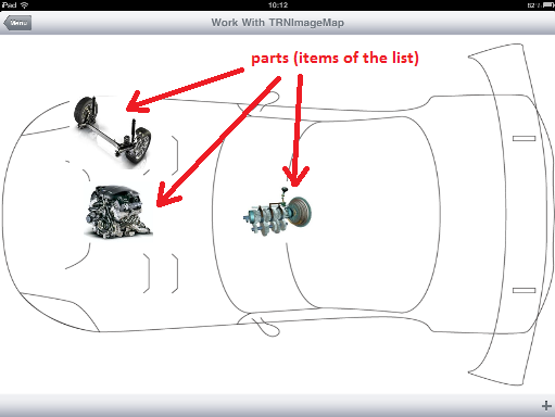
For example, we are interested in representing the parts of a car:
Let's start by defining the following transaction with the WWSD pattern applied.
Before we continue with this example, we need to set some basics we
may need to understand how this control works.
As we already mentioned, this control lets you display a background
image with regions identified by its coordinates. The coordinates
start ({o,o} coordinate) in the upper left corner of the background
image; the X axis is horizontal to the background image and extends to
the right; the Y axis is vertical to the background image and extends downward.
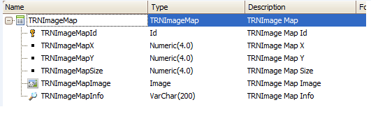
So, when we create a new transaction we need to define at least the
following four attributes, as shown in the transaction image:
- X coordinate: this will represent the x coordinate of the region
where it will have its left upper corner. In our transaction, this
attribute is TRNImageMapX and its type must be numeric.
- Y coordinate: this will represent the y coordinate of the region
where it will have its left upper corner. In our transaction, this
attribute is TRNImageMapY and its type must be numeric.
- Size: this will represent the size of the region; for example, if
we define coordinates {0,0} and a size of 100, the region will be
represented by the square defined by the points {0,0} and {100,100}.
In our transaction this attribute
is TRNImageMapSize and its type must be numeric.
- Image: this will be used to display an Image as a
layout background on the region defined by the x and y coordinates
and of the size defined. In our transaction this attribute
is TRNImageMapImage and its type must be Image.
Note: the attribute TRNImageMapInfo is not
necessary; it will be used in this example to show information about
the region when it's selected.
Once we have applied the WWSD pattern, we need to enable the Image
Map control on our grid. To do so, we open the List section, select
the grid and set the Control Type property to SD Image Map.
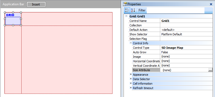
This will enable some other properties, as seen in the previous image:
SD Image Map properties:
Image | Used for selecting the
background image. |
Horizontal Coordinate
Attribute | This is the attribute that
represents the x coordinate for the upper left corner of each region. |
Vertical Coordinate
Attribute | This is the attribute that
represents the y coordinate for the upper left corner of each region. |
Size Attribute | This is the
attribute that represents the size of each region. |
SD Image Map methods (**):
Grid1.SetBackGroundImage(Image)
Where Grid1 is the control name of the Image Map grid, and
Image is a variable or attribute of Image data type
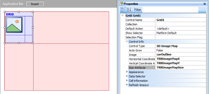
Continuing with our example let's set the properties as follows:
Image | carOutline* |
Horizontal Coordinate Attribute | TRNImageMapX |
Vertical Coordinate Attribute | TRNImageMapY |
Size Attribute | TRNImageMapSize |
* This image must be in our KB.
Then we insert, in the Grid's table, the image attribute that will be
displayed as background for each region.
The result must be as shown below:
Now we are done, so press F5.
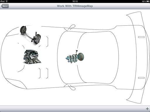
Select one of the regions by tapping on the image that represents it,
and see what happens.
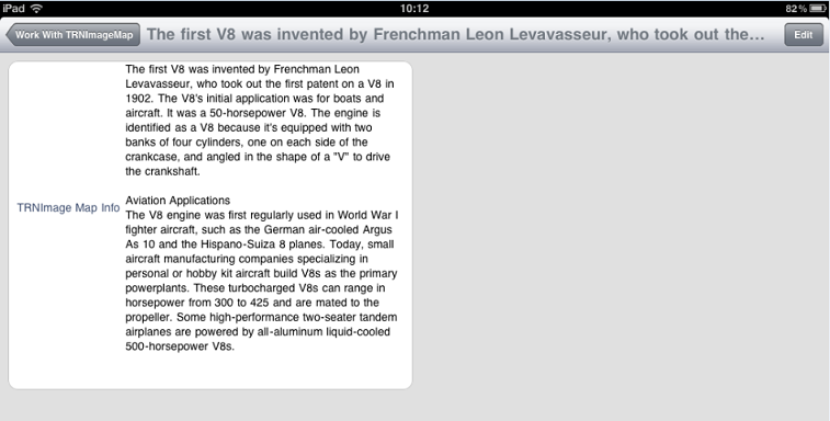
As you may have noticed, when you select a region the default action
will be run. In this case the General section is shown.
In the example, we created three new car parts (records in
transaction) and in the general section we deleted all the attributes
from the layout except for TRNImageMapInfo, because that's the only
attribute we want to have displayed.
Final notes
The coordinates are relative to the size of the background image. For
example, if we have an image of 800x600 and coordinates {500, 200} for
a region, and a resolution of 1024x768, the image of that region will
be shown at {500*1024/800, 200*768/600} = {640, 256}.
Images bigger than the device's resolution won't be displayed. For
example, if we have a device with a resolution of 1024x768 and an
image of 2048x1536, it won't be displayed.
In GeneXus X Evolution 3,
to make it easier to position the items inside the image, when
executing in the iPhone Simulator, if you tap anywhere on the image
the coordinates of the tapped point are logged to the Xcode console.
This control is available for Android and iOS as
of GeneXus X Evolution 2.
(**) SetBackgroundImage()
method is available as of GeneXus X Evolution 3 Upgrade 1
In Android, the zoom feature only works on devices with Android
version 2.2 and later.
 Work
With for Smart Devices – General Aspects and List layout
Work
With for Smart Devices – General Aspects and List layout
WorkWith
for Smart Devices – Detail Layout
9}}}