The Application Bar is used in Smart Device applications to show actions of the application's current screen. Users of the different Smart Device Platforms are used to a default behavior of actions put on the applicatoin bar, and distinguish between high and low priority actions depending on where they appear and how they look.
In GeneXus, we are enabled to set different actions on the Application Bar and by setting some properties we can customize the behavior of those actions.
This document explains how the Application Bar works in GeneXus for the different smart device platforms.
In GeneXus, we call Application Bar to the gray bar in any layout:
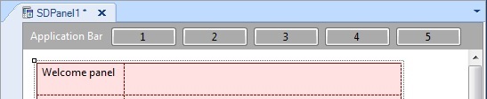
This Application Bar is a container of actions. You can drag and drop actions from the toolbox or right-click on the bar and create new actions.
Actions on the Application Bar can be customized like the buttons on the layout having a button class, image, caption and more. Also there is the Application Bars theme class, in order to configure a whole set of properties.
How the actions on the Application Bar behave (Look & Feel) depends on the priority property and the platform used.
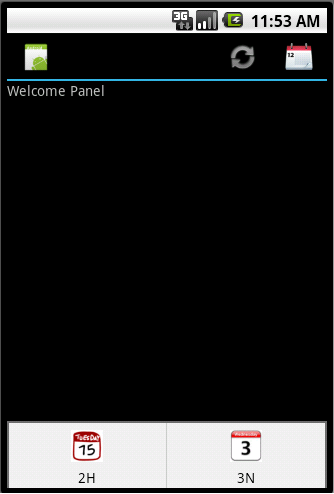
In Android OS, the Application Bar is seen at the top of the screen. In 4.X the Application Bar has the application icon and some actions that can be executed.
Actions that fit in the Application Bar are displayed in the same order as in the GeneXus layout Application Bar from left to right.
So, if the GeneXus Application Bar has the following actions:
F, A, B, C.
They will appear in the same order in Android's Application Bar.
Only the actions that fit.
At design time, we don't know which ones fit. We just know in which order the actions will try to be included on the Application Bar. If they all fit, the order will be exactly the same as the layout definition. If only the first 2 actions fit, they will be shown on the top right of the Application Bar: F & A. (There is an exception for Low priority actions, as you can see below.)
The actions which do not fit on the Application Bar will be moved to an Overflow area. Overflow area is a place where low priority actions and actions that do not fit on the Application Bar are shown.
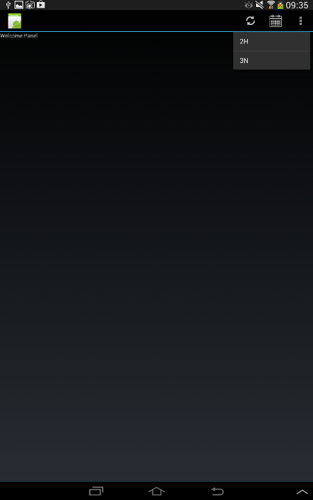
The overflow area can be accessed differently depending on the OS version; also, the look & feel of the actions differ over each OS version.
Actions appear on the overflow section when selecting the device's Menu button. Actions will appear with the image and text set on the GeneXus layout.
Overflow actions will appear when selecting the icon on the upper right corner, the overflow icon  (If the device has the Menu button the icon will not be displayed and you will be able to access the overflow actions with that button). Only the caption text set on the layout in the Caption property will be displayed.
Device with Menu button
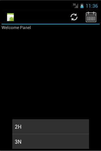
Device without Menu button
Priority of the action has direct influence on the Look & Feel of the Application Bar.
High Priority actions by definition are distinguished by the platform OS. In Android, the actions' priority sets how the action looks:
High: They are shown with the icon set on GeneXus.
Normal: Actions are shown with just the text set on the caption property in GeneXus.
Low: Actions are shown on the overflow section regardless of their position on the GeneXus Application Bar with just the text as explained above.
The iOS Application Bar's behavior directly depends on the priority of the actions and the order they appear on the Application Bar.
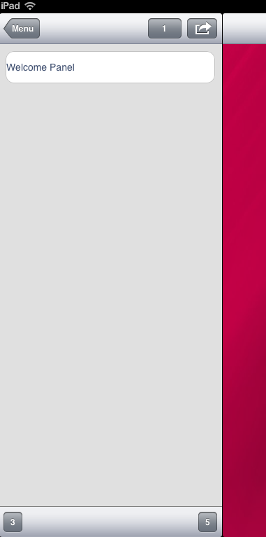
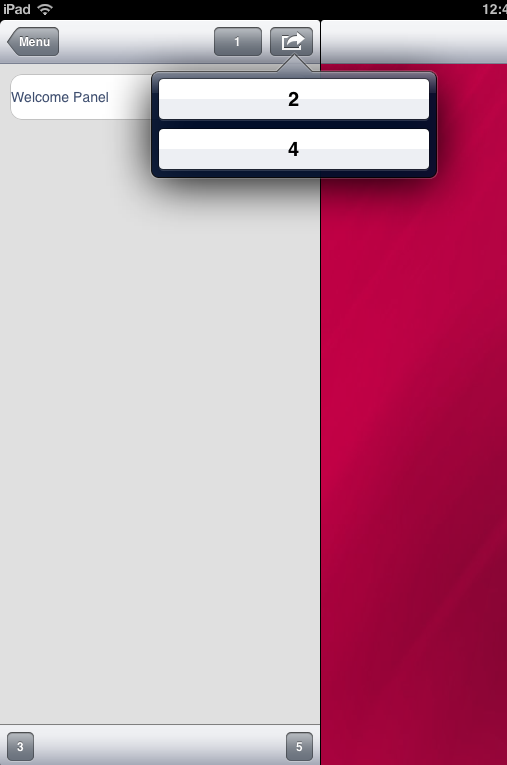
High Priority actions are shown in the Application Bar, at the top or at the bottom depending on the type of device. In iPhone, if there is no standard action (save, edit, logout) and there is a high priority action, it will be the first one to appear from left to right on the GeneXus Application Bar with high priority in the top Application Bar. In iPad, they will go on the top Application Bar and if they don't fit the lower Application Bar is used.
Normal: in both platforms they are shown on the lower Application Bar.
Low: actions are shown in the overflow menu. In an iPad you can see the overflow icon:  on the upper right corner. On an iphone: lower right corner with the same icon.
The following Application Bar:
| Action |
Priority |
| 1 |
High |
| 2 |
Low |
| 3 |
Normal |
| 4 |
Low |
| 5 |
Normal |
iPad Examples:
Action Group Control for Panels