A slider is a graphic interface element that allows users to manually slide an indicator in order to select one of the values included in a from-to range, affecting the rest of the elements on screen. The control will show changes in the elements displayed on the screen only when the user releases it, meaning that intermediate values will not be shown (increases, decreases, etc.).
This control can only be applied to Attribute/Variable of numeric type.
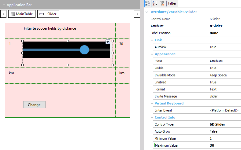
| Min Value |
Indicates the minimum value that the field can take (when the Slider is on the left). |
| Max Value |
Indicates the maximum value that the field can take (when the Slider is on the right). |
| Step |
The control can represent continuous or discrete values. If they are discrete values, it must be indicated in this property. Entering a value other than zero means that the values are discrete. For example, if the control goes from 1 to 5, a step of 1 could be indicated, and in this case the only values available for the field would be 1, 2, 3, 4 o 5, but not 1.7. The default value is 0, which means that values are continuous. |
| Display Value |
Indicates whether the control should display the value (Only iOS). |
| Value Theme Class |
Theme for Display Value. Valid classes for this property are the TextBlock class or any of its sub-classes. |
The Min value must be lower than the Max value; otherwise, default values will be used for these three properties (that is to say, Min = 1, Max = 5, Step = 0).
The valid values for any of these properties are numeric constants, which must be of the same type as the variable to which the control is applied. For example, if the variable is of N(4.0) type, the value “1” can be entered but not “1.5”. This value is valid if the variable is of N(4.1) type.
The Theme object applied to this control is of Attribute class, just like any other control over attributes and variables. Of the properties in this class, only the following ones will be taken into account:
| Forecolor |
For the selected section of the slider (iOS only). |
| BackgroundColor |
For the color of the position indicator and the slider section that isn’t selected. |
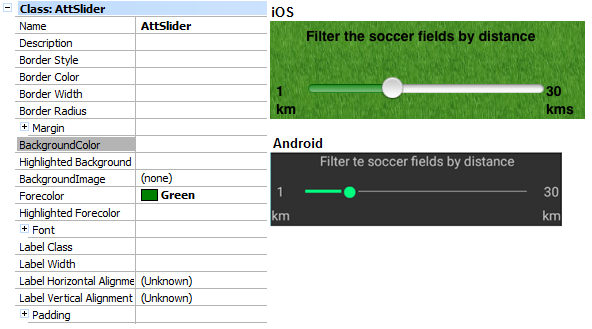
Just like any other control, BackgroundColor will also be considered as control background.
Note for Android: The ForeColor value is available from version GeneXus X Evolution 2 Upgrade 3.
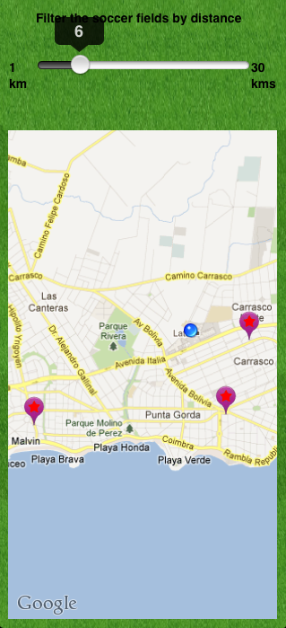
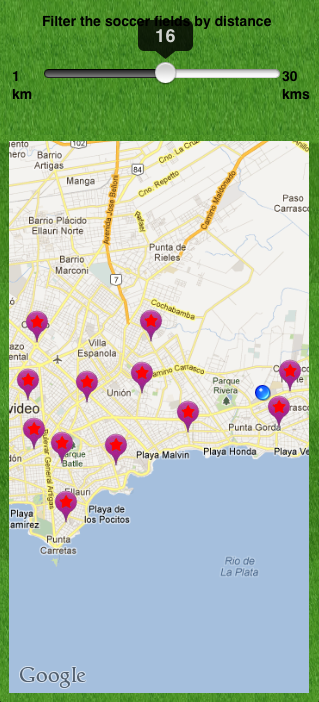
| ValueChanged |
It triggers an event when the value changes. |
For the example, if the variable associated to the control is &slider, the following event is valid:
Event &slider.ValueChanged
    // event code...
EndEvent
 Work With for Smart Devices – General Aspects and List layout
WorkWith for Smart Devices – Detail Layout