The purpose of this property is to dynamically change the layout of an SD grid’s row when we select it, in order to show more or less information, and also to enable new actions only available when the row is selected.
|
Normal |
|
"Cimas Alejandro" selected |
 |
|
 |
How it works
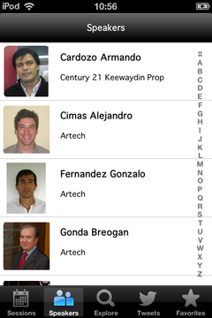
To exemplify this, let’s take the EventDay, application where we have a WorkWithDevicesSpeakers object with a grid where all the event’s speakers are loaded. Suppose we want to extend a speaker’s deployed data when we select that speaker, but without having to navigate in its Detail level. This will save navigation steps and will allow the user to remain on the speakers list when all he needs is to view the additional information provided for that case.
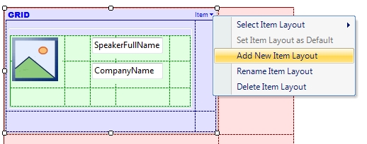
To do this, we create a new layout on the SD Grid of the Speakers List level (see Multiple Layouts per Row for more details):
-
Click on the upper right corner of the SD Grid.
-
In the menu that is displayed click on “Add New Item Layout”.
-
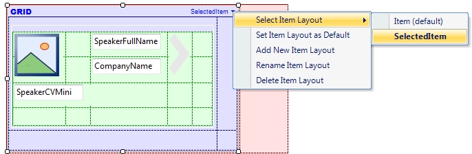
Select the name desired for the new Layout –in this case we will call it "SelectedItem". We will also rename the default layout as “Item”
-
Organize the Layout as wanted (Add/Move/Remove elements). In this example, we show a brief biography of the speaker, and an arrow-shaped image to access further information on the speaker if desired.
-
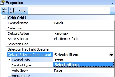
We then select the SD Grid of the Speakers List level and set the property “Default Action” as“<none>”, so that it will not go to the Detail level when we tap on a row. Next, set the property “Default Selected Item Layout” as “SelectedItem”, which is the layout we’ve just created.
-
Run (F5) and watch the result.
Additionally, in order to continue having access to the Detail level, we create the following event on the arrow-shaped image of the SelectedItem layout::
Event Image1.Tap
    WorkWithDevicesSpeaker.Speaker.Detail(SpeakerId)
EndEvent
Functionality in action
Availability
As from GeneXus Tilo Beta 1 for iOS, and as from GeneXus Tilo Beta 2 for Android apps
Scope
Considerations
For the Default Selected Item Layout property to work, the Grid’s Default Layout must be different from the layout configured in that property.
See also
Sample KB
Multiple Layouts per Row
Work With pattern and Work With object
Work With Pattern Settings
Work With Detail Node
Work With List Node