This article describes the ways to show Sections in a Work With Detail Node.
- Show all sections in Tabs. The tabs are just a way to organize the data you are going to show, even you have tabs you don't want to change your navigation style, basically, when you call another object all tabs will disappear.
- Show all sections as Links
- Show all sections in the same view (inline)
- Show a combination, some inline, some links, some in tabs. This case is quite common in cases where you have a device with a medium or large screen size.
How can you solve each scenario in GeneXus?
Scenarios 1 , 2 and 3 - <All Sections Content> with Display Property = Tabs|Links|InLine in the Detail Layout.
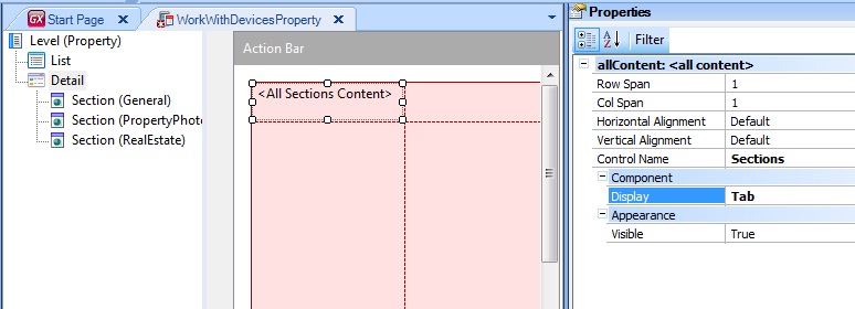
By default, in Detail layouts you have <All Sections Content> where you can specify how all Sections are rendered. This control has a property called Display = Platform Default | Tabs | InLine | Link
If you delete <All Sections Content> from the layout, you can drag it from Toolbox again. Deleting <All Sections Content> will cause to appear on the Toolbox, in addition to that control, another control for each Section, so you can manipulate them individually. This will be relevant in Scenario 4.
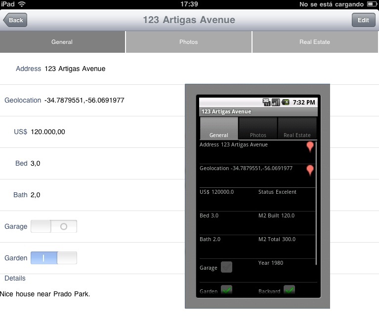
In execution time (Android and iOS) the <All Sections Content> with Display = Tab is shown as follow:
The <All Sections Content> has many benefits:
- It adds automatically to the control any section you add to the Detail
- It doesn't show sections without a layout
- It can be rendered in different ways when Type = Platform Default, this allows you to have just one layout in many cases
Scenario 4 - Tab Control + Section Content
The Section Content is really useful when you don't want to do a particular design of your Panel. In small screens, Section Content is good enough, but in medium and large screens it is quite common to try another distribution of your Sections. For example 2 inline and 1 link and a Tab Control with two more.
In order to give this full power, there is a way to create exactly what you want by dragging Section Content and containers (Tab Control) to the Detail layout from Toolbox. So that for this specific platform or size you can create your specific user interface.
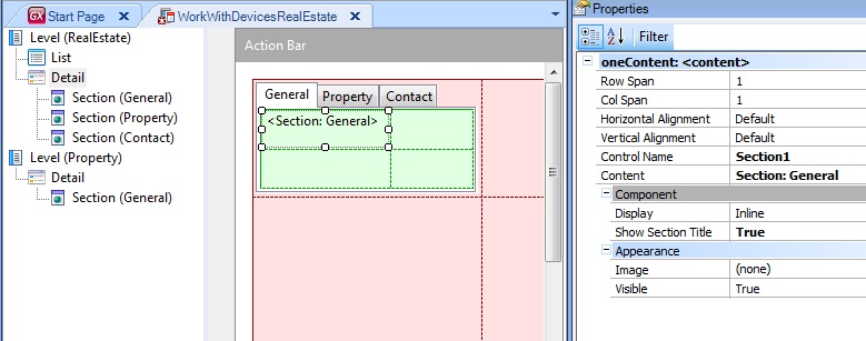
Using the Tab Control + Sections in GeneXus
You need to delete the <All Sections Content> from layout and drag the Tab Control and each Section from Toolbox to the Detail layout.
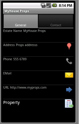
You can combine the Tab Control with the Sections and the Display property. For example, using Tab Control with Sections General and Contacts, and Display = Link for Property Section:
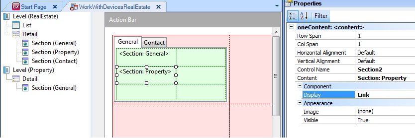
In execution time (Android) is shown as follow (Property Section is shown Link):
Each <All Sections Content> has the following properties:
- Row Span
- Col Span
- Horizontal Alignment
- Vertical Alignment
- Control Name
- Display
- Visible
Each Section Content has the following properties:
- Row Span
- Col Span
- Horizontal Alignment
- Vertical Alignment
- Control Name
- Content
- Display
- Show Section Title
- Image
- Visible
The default layout of a Detail is to have just one Section control filling all the screen size.
When the Sections control Display = Platform Default, depending on the platform (remember that the platform includes Operating System and Screen Size ), the Section control will be rendered in different ways.
- Android: Tabs for all sections
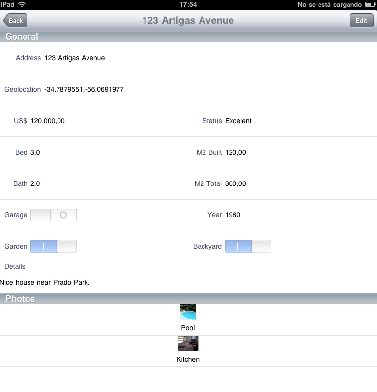
- Apple: All sections with a Grid inside are shown as Links and the remaining sections are shown inline.
In execution time (Apple) the <All Sections Content> with Display = Platform Default is shown as follow (Photos Section is shown Inline):
Several ways to show a Menu