To understand what is a GXquery Chart and how does it work we need to understand its basic structure.
The Chart is composed of the following areas:
- Page
- Series
- Categories
- Filter
- Order
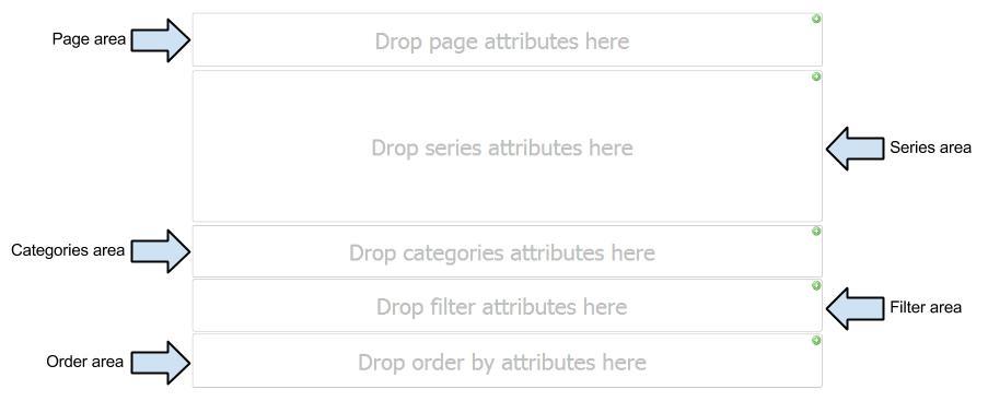
This area is located above the Chart and contains an optional group of one or more drop-down controls, similar to combo boxes.
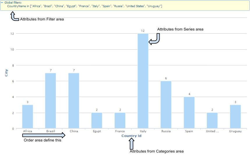
The Chart views are changed by adding (and removing) filters in this area.
Series are related points of data filled with a single-color weave or filling, which are represented in the output caption (values to be graphed). Each series will be seen on the chart with a different color. In pie charts, it is only possible to graph one single series of values, since this type of graph shows the percentage of each value compared to a total.
Categories frequencies or instances for which we want to include values on the chart. Depending on the Chart type, categories may be on the X (horizontal) axis or on the Y (vertical) axis. The X axis, also known as the horizontal axis, contains the chart categories when it is of the Column type, and the Y axis, known as the vertical axis, applies for the case of Bar-type charts.
This area is used to apply filters to the data before it is displayed on the chart.
In this area we can drag the attributes by which the query is sorted.
Attributes in Page area will not change the chart layout.