The following is a reference of Theme Classes used in RWA:
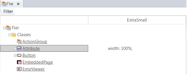
Attribute conditional class
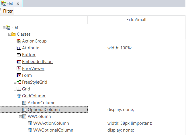
WWColumn conditional class
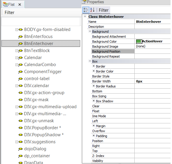
1. The custom node of the Theme is used to configure some settings that cannot be achieved using classes; for example, the effect of hovering over some buttons is configured as follows:
2. Some elements are also associated with internal CSS classes which belong to BootStrap. Those classes are not mapped to a GeneXus class; instead, they are associated with the element in such an order of priority that the GeneXus class overrides its settings.
For example, the confirm button of web transactions is associated with the classes "btn btn-default btn-primary BtnEnter".
The first ones are BootStrap classes, but the last one is defined in the GeneXus Theme and overrides the settings of the others.
Note:
The BootStrap.css file includes the following definition which is a hover effect over the buttons associated with the btn class:
.btn:hover,
.btn:focus {
  color: #333;
  text-decoration: none;
}
If the hover effect is not wanted, the user has to define the following custom node in the Theme, so as to override the default settings of BootStrap.
.btn:hover{
}
An alternative is to define the following, considering that the BtnEnter is the class associated with the button:
.BtnEnter:hover{
}
As since GeneXus 15 you can use the predefined classes on the Theme for that purpose : How to configure control effects in WEB apps.
Responsive Web Design in GeneXus
Responsive Web Design in GeneXus