There are many user interfaces where you need to show information on
demand because showing all the information at once turn the page
unusable.
A common pattern to showing on demand information is
show information when the mouse over certain elements of the user
interface. If you consider this pattern is suitable for your needs so
the Hover Panel Control is the right control for you.
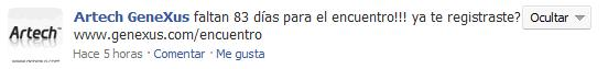
In
order to explain how to use this control, we are going to show a simple
use case . On Facebook, when you see your activity log if you over the
mouse on a particular item you can see at the top right a new User
Interface element
(In this sample a button with the "Ocultar" caption)
And if you click that element you see a drop down menu with actions
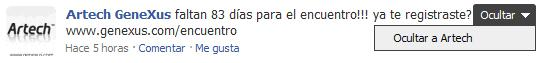
If you look this sample basically we can identify 3 elements:
- Content Section: the elements where we do the over action (in this case the text of the activity),
- Actions Section: the elements that will become visible on over (in this case the "Ocultar" button)
- Drop Down Section: the element that will become visible when a click is done on the Actions Section.
When you drag and drop the Hover Panel on a form, you are going to identify the above areas.
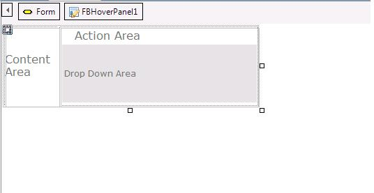
After
you drag & drop the panel you have to decide what is the content
for each area. For example in our Use Case you should have something
similar to the following picture
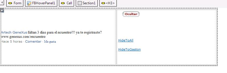
After
that you just need to generate and see the hover panel in action. Take
into account that you can add the Hover Panel in a free style grid
where the content of the sections can change for each item.
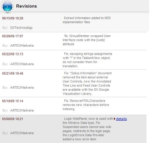
In GX Server UI we are using the hover panel control in order to give contextual information for each item in the revision log.
Category: Action Section
- Property: ActionSectionBehavior
RuntimeName: ActionSectionBehavior
Visible Name: Behavior
Values: Autohide, ShowAlways
Default: Autohide
When to use?
If
you want to overwrite the default behavior where the action section is
autohided and you need to show the action section always visible.
Category: Drop Down Section
- Property: DropDownSectionAlign
RuntimeName: DropDownSectionAlign
Visible Name: Alignment
Values: Left, Right
Default: Right
- Property: DropDownSectionVisible (boolean)
By
default when you click in the Action Section the Hover Panel will show
the Drop Down Section. Sometimes instead of showing something you need
to execute some action (For example edit, remove, etc some
information), in this cases you will need to handle the event
ActionClick in the Hover Panel. (this case is in general used in
combination with the DropDownSectionVisible = false).
Drop Down Section Behavior: FloatOnLeft, FloatOnRight, Invisible