This control allows you to display information in the form of ranges, and decide whether you want to show it using linear or circular gauges.
When you enter a variable of string type and change the value of the Control Type property to Linear Gauge, GeneXus automatically generates a new SDT called GaugeSDT, which is divided by properties and values that will affect the control as a whole; the same applies to each range.
| Title |
Text shown above the control if it is of Linear type; if it is of Circular type, it will be shown in the center of the control. |
| Type |
Allows you to choose the form in which it will be displayed. The possible values are Line, Circular. The default value is Line. |
| Thickness |
Applicable when the control is of Circular type; it allows specifying the width of the circumference. |
| Height |
Height of the range bars. |
| Width |
|
| MaxValue |
Indicates the maximum value the control can represent, i.e., the sum of all its ranges. |
| MinValue |
Indicates the minimum value that a range can represent. |
| Value |
Indicates the current value represented. |
| ShowMinMax |
Allows displaying the maximum and minimum value indicators. |
| ShowValue |
Allows displaying the value. |
| Color: |
A hexadecimal string value. Example: "#F80303" |
| Name: |
Name of this range. |
| Length: |
Length of this range. |
Now you will place a variable of string type in your Panel object and will set the Control Type property to Linear Gauge (variable called &LineGauge in this example).
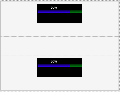
Note that changing the GeneXus control type will change the preview of the object. The image shown in the layout is merely illustrative.
In the Refresh event, you will load the data. In this case, it will be provided by a Data Provider object (called LoadData in the example). It will have the following structure:
GaugeSDT
{
    MaxValue   = 100
    MinValue   = 0
    Value      = 35
    Height     = 8
    ShowMinMax = False
    ShowValue  = True
    Ranges
    {
        Range
        {
            Color  = '#00FF00'//Green
            Name   = 'Low'
            Length = 28
        }
        Range
        {
            Color     = '#FF8000'//Orange
            Name     = 'Medium'
            Length     = 52
        }
        Range
        {
            Color  = '#FF0000' //Red
            Name   = 'High'
            Length = 20
        }
    }
}
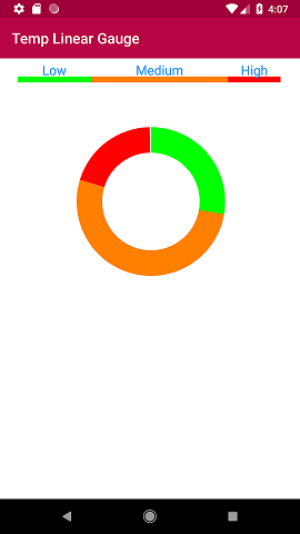
Following the same line and reusing the returned data you will change 2 properties of the control (Thickness and Type) to display the same information but using the circular type (variable &CircularGauge). The code is as shown below:
Event Refresh
//Linear Gauge
    &GaugeSDT      = LoadData()
    &LineGauge     = &GaugeSDT.ToJson()

//Circular Gauge
    &GaugeSDT.Type       = 'Circular'
    &GaugeSDT.Thickness  = 35
    &CircularGauge       = &GaugeSDT.ToJson()
Endevent
The Animated and Animated Duration properties of the Attribute class apply to this control, generating an animation that will be displayed when loading the view where it is located.

Note that, for Angular Generator you can configure this new properties for the Gauge control:
- --stroke-animation-duration: Determines how long the charging animation lasts for each Gauge range.
This property can be configured from the CarmineSD theme or from the Design System Object.
By default, it is set to 1s, which means that each range is animated for one second when the gauge is first loaded.
This applies to both types of Gauge control (Line and Circle).
To configure it from the CarmineSD theme
In an Attribute class or a subclass go to the section Advanced → Custom Properties and there you can set the --stroke-animation-duration property.
To configure it from the Design System Object
In this case, if you have a selector called AttributeStyled_1 that is used in the Gauge control class, to set the --stroke-animation-duration property, write it like any other CSS property, like this example:
styles CarmineSD
{
      .AttributeStyled_1
      {
          background-color: $colors.Background;
          --stroke-animation-duration: 0s;
          --stroke-linecap: round;
      }
}
- --stroke-linecap: Determines the shape of the initial and final edges of the Gauge ranges. This property only applies to the circular Gauge.
It can be configured with the values:
- butt (default)
- round
- square
Object: Panel
Generators: Android, Angular, Apple