This control shows an interactive Candlestick chart.
A candlestick chart is used to show an opening and closing value overlaid on top of a total variance. Candlestick charts are often used to show stock value behavior.
Follow these steps:
- Download the user control from the GeneXus Marketplace and install it.
- Drag and drop the Candlestick Chart located in the GXGoogle Visualization Library from the toolbar to a WebForm.
- Check the snippet section added automatically under the subroutine CandlestickSample. You must fill in a list of items with the following structure:
- XValue: label for the value.
- MinValue: low value.
- InitialValue: open value.
- FinalValue: close value
- MaximumValue: high value.
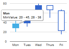
- Load the information that will be shown by the chart using the previous mentioned section using the &candlestick and &candlestickItem variables; based on Candlestick and Candlestick.Item SDTs. The image above is generated with this code:
Sub 'CandlestickSample'
	&candlestickItem.XValue = "Mon"
	&candlestickItem.MinValue = 20
	&candlestickItem.InitialValue = 28
	&candlestickItem.FinalValue = 38
	&candlestickItem.MaximumValue = 45
	&candlestick.Add(&candlestickItem)
	&candlestickItem = new()
	&candlestickItem.XValue = "Tues"
	&candlestickItem.MinValue = 31
	&candlestickItem.InitialValue = 38
	&candlestickItem.FinalValue = 55
	&candlestickItem.MaximumValue = 66
	&candlestick.Add(&candlestickItem)
	&candlestickItem = new()
	&candlestickItem.XValue = "Wed"
	&candlestickItem.MinValue = 50
	&candlestickItem.InitialValue = 55
	&candlestickItem.FinalValue = 77
	&candlestickItem.MaximumValue = 80
	&candlestick.Add(&candlestickItem)
	&candlestickItem = new()
	&candlestickItem.XValue = "Thurs"
	&candlestickItem.MinValue = 50
	&candlestickItem.InitialValue = 77
	&candlestickItem.FinalValue = 66
	&candlestickItem.MaximumValue = 77
	&candlestick.Add(&candlestickItem)
	&candlestickItem = new()
	&candlestickItem.XValue = "Fri"
	&candlestickItem.MinValue = 15
	&candlestickItem.InitialValue = 66
	&candlestickItem.FinalValue = 22
	&candlestickItem.MaximumValue = 68
	&candlestick.Add(&candlestickItem)
EndSub
There are two samples available with the User control in the CandlestickSamples.xpz file. Another example:
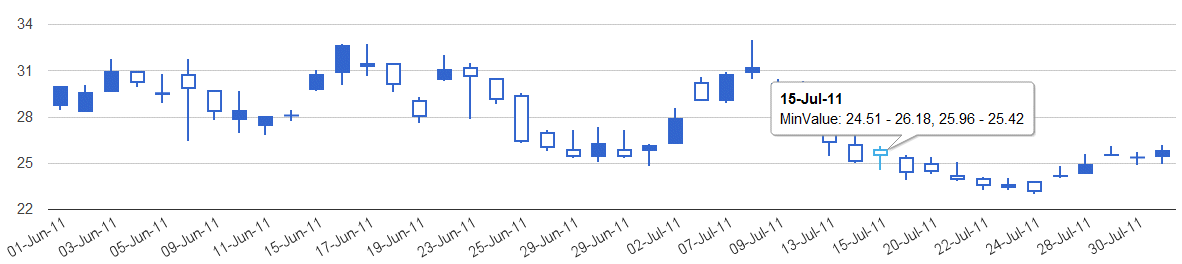
The Candlestick Chart Control is based on Google Candlestick Chart.
Use the ConfigOptions control property for advanced layout configurations. By default it is used the value "{legend:'none'}" not to show the legend on the chart.
To use this property make sure to represent as string a
JSON object with the desired layout properties modified, checking the possibilities available
here.
Some advanced configuration options examples are:
// change background color and remove legend

GoogleCandlestick1.ConfigOptions = "{backgroundColor:'red',legend:'none'}";

// change categories orders, legends

GoogleCandlestick1.ConfigOptions = "{legend:'left',axisTitlesPosition:'in',reverseCategories:'true'}"

// change title and other properties

GoogleCandlestick1.ConfigOptions = "{axisTitlesPosition:'out',title:'My Chart',legend:'none',titleTextStyle: {color: '#FF0000'}}"

// change hAxis properties, notice this is another object labeled as hAxis

GoogleCandlestick1.ConfigOptions = "{title:'An Example',legend:'none',hAxis:{title: 'Hello',  titleTextStyle: {color: '#FF0000'}}}"

// change vAxis properties, notice this is another object labeled as vAxis

GoogleCandlestick1.ConfigOptions = "{vAxis:{title:'Losses',textStyle:{color:'red'}}}"

// change chartArea properties, notice this is another object labeled as chartArea

GoogleCandlestick1.ConfigOptions = "{chartArea:{left:20,top:0,width:"50%",height:"75%"}}"
GoogleCandlestick1 represents the control in the WebForm. You can change this properties at runtine by code (detailed above) or at design time.
2011/09/08: Version 0.2 uploaded. basic version without extensibility.
2011/09/11: Version 0.3. Added a ConfigOptions Control property for advanced layout configurations, check the the control configuration options for further information.