The purpose of this guide is to explain how to create a User Control library in GeneXus, based on a javascript library.
In this article we take as an example the Telerik Kendo UIlibrary.
Kendo UI is a framework for building modern web applications with HTML5 and JavaScript. The full package includes several jQuery-based UI widgets.
In this article, we'll go over the concepts behind the creation of a user control using Kendo UI, in particular we take as an example the DatePicker control.
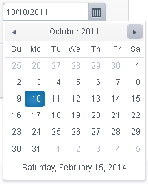
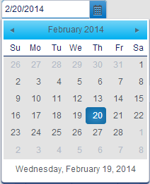
In runtime the DatePicker control looks as follows:
In order to test the user control in your application, consider the following:
- Download the Kendo UI Library (registration is required).
- Download the files of the user control from here. This is a zip file containing a directory structure where you need to copy the Kendo files that you have downloaded in step#1. The javascript and css files have to be located under the kendo\javascripts, and kendo\styles folder respectively.
- See HowTo: Install User Controls for information about installing the user control.
Here we explain the steps that need to be followed from scratch, to get the user control ready to be used. We assume that you have already downloaded the kendo UI library.
To begin with, we advise you to read the following documents to get introduced to user controls definition:
User Controls general composition
Code organization
Following the Code organization recommendations for Kendo UI user controls, we need to create a DatePicker directory under the "controls" directory, and place the User Control files there.
Let's see one by one the files needed to create a DatePicker user control using Kendo UI library.
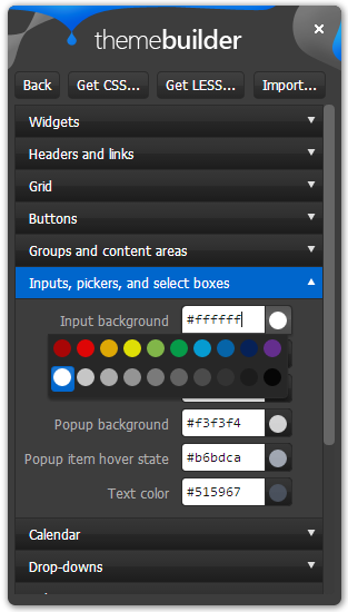
Kendo UI controls can be easily customized using the Theme Builder, available online. The Kendo ThemeBuilder is a tool that lets you modify Kendo themes so that they match the look and feel of your site or app
You can use it on your own pages as a bookmarklet too (recommended), following the steps explained in the Theme Builder Getting Started page.
To customize the DatePicker, you can change these properties, from the Theme Builder dialog:
- Widgets
- Headers and links
- Header background
- Header text color
- Groups and content areas
- Inputs, pickers, and select boxes
- Input background
- Popup item hover state
- Text color
- Calendar
- Calendar footer hover background
- Drop-downs
- Background color
- Border color
- Misc
- Border radius
- Shadow color
- Inset shadow
Once customized the theme, you can generate a new CSS file, by clicking the "Get CSS..." button. Replace kendo/styles/kendo.default.min.css under the DatePicker User Control directory, with the new CSS, to save the changes to the User Control.