- Container. Descendant of Table class. Maps to Boostrap's container class. Use Container for a responsive fixed width container.
Only one table should have this class per page.
- ContainerFluid. Descendant of Container. Maps to Boostrap's container-fluid class. Use ContainerFluid for a full width container, spanning the entire width of your viewport.
Only one table should have this class per page.
When the Container class - which is defined in the Theme Flat - is associated to the main Responsive Table of the form, GeneXus assigns to it automatically the "container" class which belongs to bootstrap.css.
In fact, both classes are associated to the table in runtime, the "container" class of Bootstrap and the "Container" class of the GeneXus Theme.
The same happens with the ContainerFluid class of the Theme Flat. When a Responsive Table is associated to it, in runtime it is associated to the classes "container-fluid ContainerFluid".
In bootstrap.css the classes are defined as follows:
container {
  padding-right: 15px;
  padding-left: 15px;
  margin-right: auto;
  margin-left: auto;
}
@media (min-width: 768px) {
  .container {
    width: 750px;
  }
}
@media (min-width: 992px) {
  .container {
    width: 970px;
  }
}
@media (min-width: 1200px) {
  .container {
    width: 1170px;
  }
}
.container-fluid {
  padding-right: 15px;
  padding-left: 15px;
  margin-right: auto;
  margin-left: auto;
}
The Main Responsive Table of default WW forms and default web transaction forms are associated with the Container class. This class is a Conditional Class that sets a fixed width for extra small screen devices.
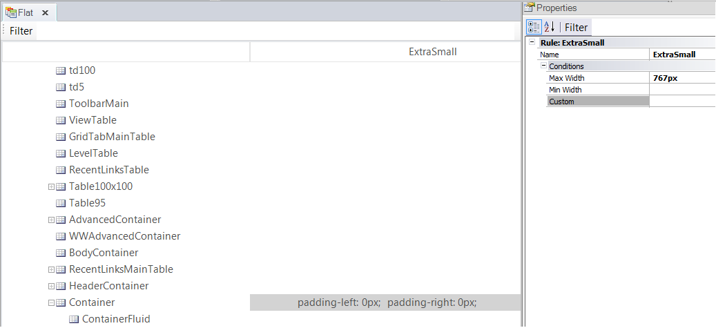
Container Class definition
For extra small devices, it sets:
Container{padding-left:0px;padding-right:0px}
Note that the responsive table is associated to the BootStrap container class in runtime, which easily center a page's contents by wrapping its contents (see here for more details).
The width given to the table depends on the screen size and the contents will be horizontally centered. The following is a screen capture which shows the css rules which apply to a responsive table which is displayed in a screen wider than 1200px.