- ResponsiveImage. Descendant of Image. Maps to Bootstrap img-responsive class. It makes the image scale nicely to the parent element.
In case of images that need to scale to the container depending on the screen size, it is advisable to use the ResponsiveImage class which is a predefined class of the Theme Flat.
When this class is associated to the image control or image variable in design, the img-responsive BootStrap class is automatically associated to the image in runtime.
In the following example three classes have been associated to the image, including the ResponsiveImage.
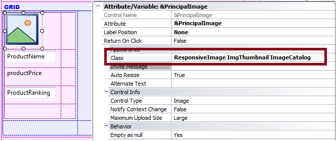
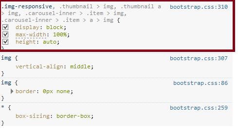
In runtime, the img-responsive BootStrap class is associated to the control. The class settings are as follows:
- display: block
- max-width: 100%
- height: auto
The image should not be associated to any other class with a fixed width or height, otherwise it won't scale to the parent element.
Look and feel of responsive web applications