This control creates a stock or general timeline chart.
Follow these steps:
- Download the user control from the GeneXus Marketplace and install it.
- Drag and drop the StockChart option located on the Extended Controls section from the toolbar to a WebForm.
- Check the snippet section added automatically under the subroutine StockChartData. You must fill in a list of items (StockChartData SDT Object) with the following structure:
- Date: label for the value.
- Low: Min value (for Chart1).
- Open: open value (for Chart1).
- Close: final value (for Chart1).
- High: Maximum value (for Chart1).
- Volume: numeric value (for Chart2).
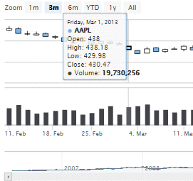
- Load the information that will be shown by the chart using the previous mentioned section using the &StockChartData variable. The image above is generated using the StockChartData sample Data Provider object. Make sure to order the data in ascending order.
The User Control is based on highstock charts; check license issues here.
The control creates two graphs with some predefined navigation options, preset date ranges, scrolling and panning. On hovering the chart, it can display a tooltip text with information on each point and series. The tooltip follows as the user moves the mouse over the graph, making it easy and intuitive to read out the values from the chart.
- Width: default 600px
- Height: default 400px
- Title: Control Title.
- Skin: Control skin (default value none).
- UseUTC: Whether to use UTC time for axis scaling (default value false).
- ShowChart1: (default value true).
- Chart1Type: Chart1 type (default value candlestick).
- ShowChart2: (default value true).
- Chart2Type: Chart2 type (default value column).
- Plot Options
- Allow Point Select: highlights the selection of a point.
- Enable marker: mark the selected point.
- Chart1: Chart 1 Options
- YAxisChart1Title
- YAxisChart1Top
- YAxisChart1Height
- YAxisChart1Offset
- YAxisChart1LineWidth
- YAxisChart1TooltipName
- Chart1 Plot Options Group
- YAxisChart1AddPlotLine: Enable or disable the generation of a Plot Line. Defaults to false.
- YAxisChart1PlotLineValue: The position of the line in axis units.
- YAxisChart1PlotLineWidth: The width or thickness of the plot line.
- YAxisChart1PlotLineColor: The color of the line.
- YAxisChart1PlotLineDashStyle: The dashing or dot style for the plot line.
- YAxisChart1PlotLineText: Text for the label.
- YAxisChart1PlotLineAlign: Alignment of the label relative to the plot line.
- YAxisChart1PlotLineX: Horizontal position relative the alignment.
- YAxisChart1PlotLineY: Vertical position of the text baseline relative to the alignment.
- Chart2: Chart 2 Options
- YAxisChart2Title
- YAxisChart2Top
- YAxisChart2Height
- YAxisChart2Offset
- YAxisChart2LineWidth
- YAxisChart2TooltipName
- Chart2 Plot Options Group
- YAxisChart2AddPlotLine: Enable or disable the generation of a Plot Line. Defaults to false.
- YAxisChart2PlotLineValue: The position of the line in axis units.
- YAxisChart2PlotLineWidth: The width or thickness of the plot line.
- YAxisChart2PlotLineColor: The color of the line.
- YAxisChart2PlotLineDashStyle: The dashing or dot style for the plot line.
- YAxisChart2PlotLineText: Text for the label.
- YAxisChart2PlotLineAlign: Alignment of the label relative to the plot line.
- YAxisChart2PlotLineX: Horizontal position relative the alignment.
- YAxisChart2PlotLineY: Vertical position of the text baseline relative to the alignment.
- RangeSelector: The user can zoom in on preselected time ranges like 1day, 1week, 1month and so on.
- RangeSelectorEnabled: Enable or disable the range selector. Defaults to true.
- AllButtonsEnabled: To enable all buttons from the start.
- RangeButtonSelected: The index of the button to appear pre-selected.
- Buttons
- MillisecondButtonEnabled
- SecondButtonEnabled
- MinuteButtonEnabled
- HourButtonEnabled
- DayButtonEnabled
- WeekButtonEnabled
- MonthButtonEnabled
- ThreeMonthsButtonEnabled
- SixMonthsButtonEnabled
- YearToDayButtonEnabled
- YearButtonEnabled
- AllButtonEnabled
- Export
- ExportChart: Export the chart to PNG, JPG, PDF or SVG format.
- DataBindings
- StockValues: SDT variable with control data.
2014/10/27: Version 0.3 Initial version
2014/10/30: Version 0.4 New properties added: ShowChart*, UseUTC,
2015/05/06: Version 0.5 New group of properties added: Chart1PlotLine, Chart2PlotLine and PlotOptions .
2015/07/10: Version 0.6 Bug fix when converting dates.