As expected, your control will have a set of properties that will be shown in the GeneXus Property Window (when the focus is in your control).
Modifying these properties will cause changes in the way your control is displayed or changes in the control's behavior.
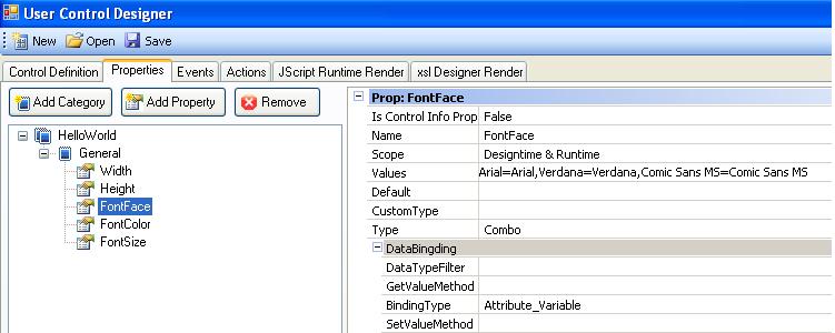
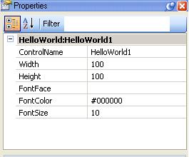
For example, the Hello World user control uses three properties to manage the way that the "hello world" message is displayed: font face, font color and size. Another example would be the GXChart control which has a Type property that indicates the type of chart to create: bars, cones, pie etc. All these properties are defined in the Properties tab of the User Control Editor.
Properties can also be located under different Categories to better understand them. As an example you could be interested in creating an Appearance category to group all the properties that have an impact in the way that your control is shown. This can be accomplished by using the Add Category button.
Property category definition sample
Using the User Control editor: First, define a new property by pressing the Add Property button. Next, enter some information about the property.
Sets the property name.
Readonly properties are not shown in the property grid and cannot be assigned (you can only read its value). They are useful for passing parameters if the control has events.
GeneXus allows changing the Control Info of attributes. For example, you can specify that the CountryID should be displayed everywhere as a Dynamic Combo Box by changing its Control Type which is located under the Control Info property group. Under that group you will also see some related properties according to the Control Type chosen.
Now, suppose that you have developed a "control info" UC (which is not displayed in the toolbox). As the control is included in the Control Info the programmer can set your control as the Control Type of an attribute and will see (as explained before) some "related properties": those properties will be the ones marked with "Is in control info prop = True".
This only applies when setting the Control Type of attributes (in the attribute definition itself) which is different than setting the control type in the web control (where you will see all the properties of the control, even the ones with "Is in control info prop = false").
You can specify the scope of properties with the following values:
|
DesignTime
|
The property can only be changed using the property grid
|
|
Runtime
|
The property can only be changed at runtime (using code). In this case the property does not appear in the property grid.
|
|
DesignTime & Runtime
|
The property can be changed either using the property grid or at runtime (using code).
|
Specifies the list of possible values for the property.
Specifies a default value of the property.
Specifies the property type. The available property types are as follows:
| Text |
Indicates that it is a text property |
| Integer |
Indicates that it is an integer property |
| Combo |
Indicates that it is a text property and its values will be displayed as a combo |
| ComboInt |
Indicates that it is an integer property and its values will be displayed as a combo |
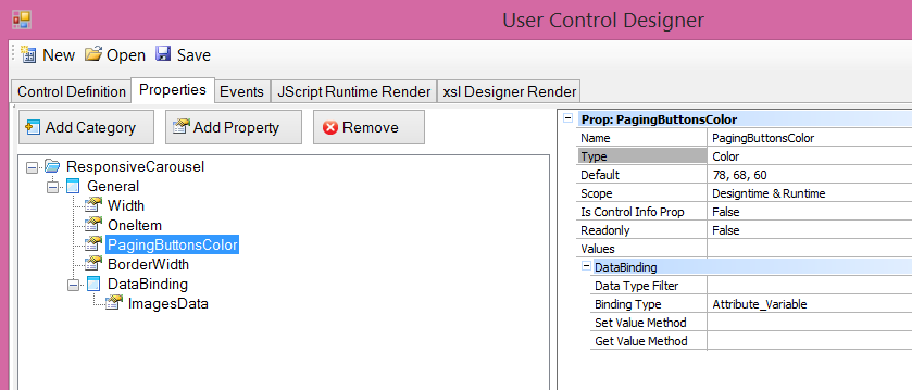
| Color |
Indicates that the property values will be displayed as a "color chooser" dialog. |
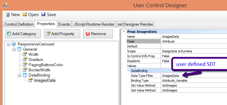
| Attribute |
Indicates that the property will be bounded to an attribute, variable or SDT. See Data Binding properties for further information. |
Note:
In many cases you might want properties bound to a .NET data type that you own.
This can be accomplished by editing the properties.xml file of your control and setting your full class name and assembly name in the CustomType "tag", as follows: <Full qualified class name>,<assembly>
        <Prop>
          <Id>TreeNode</Id>
          <Name>TreeNode</Name>
          <Type>Custom</Type>
          <CustomType>Artech.Packages.Genexus.Common.CustomTypes.ControlAttVarReference, Artech.Packages.Genexus.Common</CustomType>
          <Metadata>
            <Value name="FlagSetValueMethod">SetTreeNode</Value>
            <Value name="FlagGetValueMethod">GetTreeNode</Value>
            <Value name="FlagDataTypeFilter">TreeNode</Value>
            <Value name="FlagHideVariables">False</Value>
            <Value name="FlagHideAttributes">true</Value>
          </Metadata>
        </Prop>
The assembly must be located under the GeneXus installation directory.
Take into account that this data type must be displayed in the property grid, so your type will have to specify its class editor (UITypeEditor), converters (TypeConverter) and so on (see Microsoft PropertyGrid control, UITypeEditor and Type converters for further help).
Defines the data type that can be bound to this property. Here you may specify any native GeneXus data type (numeric, character, dates and so on) or any SDT. Consequently, when working in GeneXus and having to assign an att/var to this property you will only be allowed to select an attribute or variable of the same type as your DataTypeFilter.
Indicates what type of object can be bound to the property. The possible values are:
| Attribute_Variable |
Either attributes or variables may be bound to the property |
| Attribute |
Only attributes can be bound to the property |
| Variable |
Only variable can be bound to the property |
Defines the name of the "getter" method for this data bound property. GeneXus invokes this method to retrieve the property value when posting the page. See How does a User Control work? for further information.
Defines the name of the "setter" method for this data bind property. GeneXus invokes this method to pass the property value to your control when displaying the page. See How does a User Control work? for further information.
This link shows the properties file for the Hello World control example. You can find more examples by opening the properties file of GxChart, FCKEditor and other user controls located under the UserControls directory.