The Responsive Web Design (RWD) is based - among other features- on flexible layouts (which consists of the contents of the page being capable of dynamically resizing to any width). The basis for that is to use relative length units (usually percentages).
With the Abstract Layout, the GeneXus user can set widths in percentages for the elements of the form.
Also, other relative length units called CSS Viewport Units are available. Viewport units are supported in GeneXus as well as absolute units such as px and pt.
The viewport is the area of your browser where the actual content is displayed – that is, the web browser without its toolbars and buttons. The units are as follows:
- vw Represents 1% of the viewport’s width.
- vh Represents 1% of the viewport’s height.
- vmin 1% of viewport’s smaller dimension.
- vmax 1% of viewport’s larger dimension.
They all represent a percentage of the browser (viewport) dimensions and scale accordingly on window resize.
For example, suppose that we have a web page where the footer and header will each take 20% of the total height of the screen. In this case, using percentages for the height isn't useful because it won't take effect. (*)
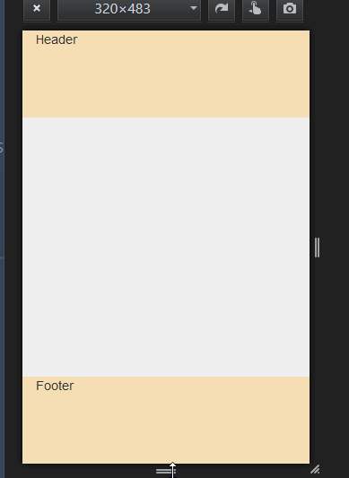
The definition of each section class would be as follows:
.FooterSection {
    height: 20vh;}

.HeaderSection{
    height: 20vh;}

.ContainerForm{
    height: 60vh;}
These units can be used anywhere you can specify a value in pixels, such as width, height, margin, font-size, etc. They will be recalculated by the browser on window resize or device rotation.
See Browser's support here.
HowTo: Take up the full height of a page
HowTo: Responsive vertical centering
HowTo: Resize the font size depending on the viewport size
(*) What's the condition for the percentage of the div's height to take effect?
The percentage of your div is connected to the div that contains it.
For instance:
<div id="wrapper">
<div class="container">
adsf
</div>
</div>
#wrapper {
height:100px;
}
.container
{
width:80%;
height:50%;
background-color:#eee;
}
Here the height of your .container will be 50px. It will be 50% of the 100px from the wrapper div.