Download from here
Control Description
With this User Control you can add functionality to open a popup panel, showing some information retrieved from a configured URL, when the mouse pointer is over a control in the form. You can attach the User Control to any control in the object, including standard grids controls !!. In addition the User Control can draw the control itself, using an image or a text block.
Using the control
There are four different ways to use the User Control, depending on the value configured in the ControlType property.
This is the more simple way to use the control, and also, this is the default value for the property. You just need to assign the AttachedControl property to any existing form control InternalName (i.e. HoverPanel.AttachedControl = &PlayerName.InternalName) and the functionality will be set. Then when the mouse pointer is over the control, the popup panel will be opened using the values configured in the other properties.
In this case, we need to use the User Control attached to a control in a standard grid. Unlike when working with free style grids, User Controls can not be included as a column in standard grids, so we need to use one User Control for all rows in the grids. That means that for all rows the same User Control properties will be applied. Anyway, we have some properties which will help us to have different URLs for the popup panel in each standard grid row.
As an example, check the following picture of the Uruguay National Team which played in the World Cup South Africa 2010.
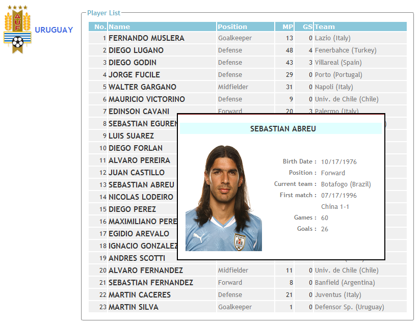
In this case, we have a standard grid with some players data (name, position, matches, team) and we want to show more detailed data when the mouse pointer is over the players name. In order to implement this, we will place a HoverPanel User Control in the form and configure the properties value as explained below :
- ControlType = ControlInGrid.
Here we are indicating that the User Control will be used in a control present in a standard grid.
- linkParameters = Variable.
Here we are indicating that the URL configured on the panelLink property will have different parameters for each grid row. The values for the parameters are indicated in the ParameterList property and only grid columns can be used as URL parameters. i.e. in this case we add PlayerId.InternalName to the list of parameters, then the UserControl for each grid row will open the panelLink URL passing the PlayerId value of the same row as a parameter. This allows us to show the information of a different player in each row .. using only one User Control !!
- ParameterList = ¶m.
Here we indicate which variable has the list of control names which will be used as parameter for the URL.
Note: when working with standard grids, those properties assigments which require the use of grid controls properties (i.e. control.InternalName in AttachedControl or ParameterList properties) have to be done in the Load event (if they are placed on Start event those properties will return an empty value). Following this the grid load event in the example above is as detailed below :
Event Grid1.Load
HoverPanel1.panelLink = PlayerDetail.link()
HoverPanel1.AttachedControl = PlayerFullName.InternalName
¶ms.Add(PlayerId.InternalName) // ¶ms is assigned to ParameterList property
EndEvent
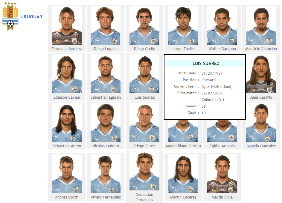
In this case, instead of attaching the User Control functionality to an existing control in the form, we will also draw the control in the form, as an image. So an image will be placed on the form, using the value of the image property, with the indicated Height and Width and having the configured popup panel functionality. In the image below, you can see the same information about the Uruguay National Team in the World Cup but in this case, using a free style grid with a HoverPanel User Control with ControlType=Image in each row.
In this last case, we also draw the control but as a text block using the values configured on the properties controlText, face, color and size.
Example
You can download the Uruguay National Team sample from here, or download the Knowledge Base from the public GeneXus Server using this link. It includes the two showed samples using standard grid (with two HoverPanel attached) and the free style grid with images, in addition to other simple examples of the different ways available to use the User Control.
Control Properties
The control has the following properties :
- Width : Width of the control on the form. Only has effect when controlType=Image
- Height : Height of the control on the form. Only has effect when controlType=Image
- AttachedControl : Name of the control which will have the popup panel functionality on the mouseover event. Has effect only if controlType=Control or controlType=ControlInGrid
- controlType : Type of the control to insert in the Web Form, possible values are Control, ControlInGrid, Image or TextBlock. Check the Using The Control section for more information.
- ControlName : Name for the User Control inserted in the form.
- linkParameters : Has effect only if controlType=ControlInGrid. Indicates if the URL for the popup panel will be the same for all grid rows (Fixed value) of will have different parameters for each row (Variable value).
- ParameterList : Has effect only if controlType=ControlInGrid and linkParameters=Variable. The property indicates the variable which store the parameters name collection. Only grid columns control names are valid as collection members. When the User Control is placed on the form, a domain with Type=Character(20) and Collection=True is created in the KB and a variable based on this domain is created in the object and assigned to this property.
- image : Image which will appear in the Web Form and will have the mouse over panel configured. Apply only if controlType=Image
- controlText : Text to show in the TextBlock if controlType=TextBlock
- face : Font type for the text
- size : Text size
- color : Text color
- fontstyle : Allows writing the text with bold and/or italics font
- panelLink : Link to the HTML page which will be opened in the panel when passing the mouse over the control. Using the GeneXus link function, this value can be created with any KB object.
- clickToFix : Indicates if the user will be able to fix the popup panel clicking over the control. When fixing a panel, other HoverPanel controls popup are disabled and it is necessary to click over the panel or the image again to return to the initial behavior.
- position : Type of position for the popup panel, it can be Relative to the control (default value) or a Fixed position in the screen.
- topPos : Y coordinate of the top left corner of the popup panel (apply only if position=Fixed)
- leftPos : X coordinate of the top left corner of the popup panel (apply only if position=Fixed)
- verticalPos : Relative vertical position of the popup panel, possible values are : Above (all the panel is displayed above the control), AlignTop (control and panel top border is aligned), Centered, AlingBottom (control and panel bottom border is aligned) and Under (all the panel is displayed under the control). Apply only if position=Relative.
- horizontalPos : Relative horizontal position of the popup panel, possible values are : Left (all the panel is displayed on the control left side), AlignLeft (control and panel left border is aligned), Centered, AlignRight (control and panel right border is aligned) and Right (all the panel is displayed on the control right side). Apply only if position=Relative. Not all the combinations of verticalPos and horizontalPos have sense (if the user does not want to overlap the control and the panel). In the following table all the correct combinations to not overlap control and panel are marked.
| verticalPos horizontalPos |
Above |
AlignTop |
Centered |
AlignBottom |
Under |
| Left |
X |
X |
X |
X |
X |
| AlignLeft |
X |
|
|
|
X |
| Centered |
X |
|
|
|
X |
| AlignRight |
X |
|
|
|
X |
| Right |
X |
X |
X |
X |
X |
- verticalOffset : Size of the space between the control and the panel on the vertical axis (apply only if position=Relative and verticalPos= Above or Under)
- horizontalOffset : Size of the space between the control and the panel on the horizontal axis (apply only if position=Relative and horizontalPos=Left or Right)
- panelWidth : Popup panel width
- panelHeight : Popup panel height
- effect : Effect that will be used when the popup panel is displayed when passing the mouse over the control. When Internet Explorer is used, 10 values are available for this property, but when FireFox is used only the None and Fade values apply (when using a different value the behavior will be the same as using Fade).
- hasTitle : Indicates if a title will be included for the popup panel. Possible values are Yes and No.
- titleText : Text for the title
- title_Fore_Color : Title font color
- title_Back_Color : Title background color
Implementation
The control is based is some javascript code published in this place. The code use DHTML windows to implement the panels and it has been adapted for the User Control purpose
The User Control set the attached control onmouseover, onmouseup and onmouseout events (if controlType=Image or controlType=TextBlock the controls are previously inserted on the form). AJAX technology is used to call the configured URL and display the response content in the popup panel using the configured design (position, size, title) and effect.
To Do List
A lot of things can be done in order to expand and improve the User Control functionality. Comments, critics, suggestions, bug reports, etc. are very welcome.
- Review control, properties and values names.
- Automatic size of panel depending on link content (Autoresize property)
Known Issues
Here are listed some issues which have appear when using the User Control. We will try to fix them in following versions.
- When using the control inside a WebComponent, a javascript error is showed in Internet Explorer. In order to avoid this problem, please add the following line to the Start event of the WebComponent container object Form.HeaderRawHtml= '<script type="text/javascript" src="HoverPanel/dhtmlwindow.js"></script>'
- A strange effect happens if the panel is displayed over the control.
- Grids on the popup panel object are not loaded.
- In standard grids, when clicking a column name to order the grid rows, the User Control functionality is lost.
Change Log
03/09/2010 : Fixes included to mantain User Control functionality when filtering a standard grid. A domain is automatically added to be used in the linkParameters property.
13/08/2010 : New control version added with support of any kind of controls and the possibility of use it with standard grid .. and more important .. updated example !! :-) (which was also uploaded to public GeneXus Server)
15/07/2008 : FontStyle property added and fixes for control use in grids. Sample uploaded.
05/09/2007 : More fixes over relative position properties.
03/09/2007 : Fixes over relative position properties.
31/08/2007 : ClickToFix property added and support for relative position of the panel to the control.
29/08/2007 : First version.
To Install It
Please visit: Default Installation Instructions for User Controls.
Please send feedback to fbonilla@genexus.com