Every Theme is composed of a group of predefined classes corresponding to GeneXus controls.
Each class has a set of properties configurable in order to constitute a "design" for a type of GeneXus control.
Classes allow defining some aspects only once (by setting properties), in order to apply them to many controls of the same type at the same time.
Your application controls are associated with these classes (through the control Class property), and they inherit the properties configured there.
Later, when deciding to change the appearance of one type of control, you only have to set it in a single place (in the corresponding class of the Theme associated with the object).
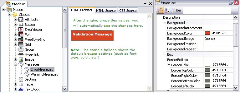
The "Messages" Class is an exception in the sense that it does not correspond to a GeneXus control, but it is used to configure the settings of web client-side validation messages displayed on the screen.
ErrorMessages: All "error" rules are associated with this class.
WarningMessages: All "msg" rules are associated with this class.
You have to configure the properties of this class, like in any other class. The difference here is that you have no GeneXus controls to associate with this class. The association with ErrorMessages and WarningMessages is automatic (to the error and messages rules, respectively).
Special Classes for Buttons
There are specific button classes, corresponding to those that are automatically generated by GeneXus in Web Transactions and Web Prompts. When such objects are created, the buttons are associated with the corresponding classes.
These classes are direct descendants of the "SpecialButtons" class, which is a child of the "Button" class:
· BtnCancel
· BtnCheck
· BtnDelete
· BtnEnter
· BtnFirst
· BtnGet
· BtnHelp
· BtnLast
· BtnNext
· BtnPrevious
· BtnRefresh
· BtnSelect
For each button class (or any descendant of it) you can configure its style through the "BorderStyle" property.
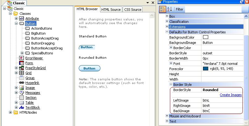
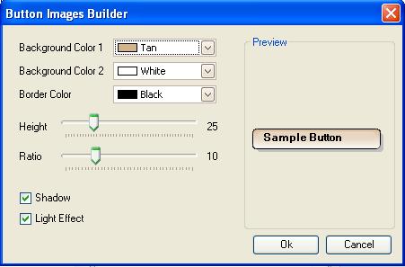
If the button has a rounded style, you can configure their Left, Right, and Back Image, simply by configuring those properties. Another possibility is to create your own image by using the following dialog, which is called by the "Create Images" link. That image will be part of the Knowledge Base, like any other image.
If you define a class in the Theme Editor (named X), derived from Attribute, four additional classes are created:
1. ReadOnlyX (descendant of X)
BLOBS:
2. BlobContentX (descendant of X)
3. ReadonlyBlobContentX (descendant of BlobContentX)
4. BlobInputX
BlobContentX and BlobInputX are classes assigned in runtime to blob controls. A blob control consists of the contents and the upload control (edit plus button). If the X class has been associated to the blob in design time, the BlobContentX class is assigned to the content, and the BlobInputX class is assigned to the upload control.
The settings cannot be seen in design time, only in runtime. The ReadOnlyBlobContentX class is assigned in runtime to read-only blobs, that were associated in design time to the X class. If a class is renamed (a father class), all the classes which were mentioned before, will be renamed accordingly. For instance, if X is renamed to Y, you will have:
1. ReadOnlyY
BLOBS:
2. BlobContentY
3. ReadOnlyBlobContentY
4. BlobInputY
You can create classes derived from predefined classes. To define a class, the developer right-clicks on the father class, and selects "Add Class." This displays a new class with the same name as the parent plus a sequential number. To change this, assign another name to this new class, and set up the properties corresponding to it.
Children or derived classes remain specifically linked in an inheritance relation to the classes they are derived from. Consequently, modifications made in the parent class will be reflected in the children classes, with some exceptions. Modifications consist of changing the values of some of the class properties.
The hierarchy at editor class level is not conceptually related to any class relation at CSS level. It is an "inheritance" relation intended to make it easier for the user to perform maintenance.
Any change made to the parent class will result in a change in the same property of the child.
On the other hand, not inheriting implies that a change made to the property in the parent class will not be reflected in the child class. Property value inheritance is lost when the property is altered in the child classes.
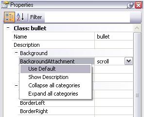
By default, all classes have the same property legacies as their parents. When you decide to change a property, the corresponding values are lost. If the value of the property of a class is changed, you can still revert the change. By right-clicking on the corresponding property and selecting "Use Default" the property will again inherit the value that that same property has in the parent class.
Class derivation and "heritage," in particular, make it easier for the user to perform maintenance in the Classes, besides providing design clarity.
For example, a class "Bullet" derived from Text Block is defined with the purpose of establishing text properties in lists with bullets.
Suppose now that you want another class for the texts nested in those associated to the "Bullet" class, and you want them to have the same characteristics that the "Bullet" class, except for the indentation. You call this class "SubBullet" and create it as a child of "Bullet". This class will only differ from its parent in the "TextIndent" property. Therefore, that will be the only property that will not be inherited, and the only property that, having been modified in the parent, will not be reflected in the "SubBullet" class.
For more information about the properties of the classes and their values read the CSS documentation.