Objects: Web Panels, Web Components and Transactions
Languages: .NET, Java, Ruby
Interfaces: Web
A basic toolbar control. It supports adding buttons, text fields, fillers, separators and submenus. It's an implementation of Ext.Toolbar.
How To : Basic example of use can be found here
How To : Load Toolbar using recursive data provider to use it as a milti-level menu can be found here
| Group |
Property |
Type |
Values |
Default |
Description |
| General |
ControlName |
Text |
- |
gxui_Toolbar1 |
Control name. |
| General |
Width |
Text |
- |
100 |
Control width. |
| General |
Height |
Text |
- |
100 |
Control height. |
| Data Bindings |
Data |
Custom |
- |
|
The variable where the buttons are stored. |
| (Runtime) |
ButtonPressedId |
Text |
- |
|
The button's identifier that was pressed. |
| (Runtime) |
EditFieldValue |
Text |
- |
|
The value of the edit field where the Enter key was pressed. |
| Name |
Description |
| ButtonPressed |
Fires when a button is pressed. The selected button id is stored in ButtonPressedId property. |
| Name |
Description |
| ChangeToolbar |
Allows changing variable where the buttons are stored at execution time. |
The control basically loads a SDT which contains the toolbar items. Consequently you will have to define a variable based on gxuiToolbar SDT which must be assigned to the Data property of the control. This variable will have a collection of items (gxuiButtons) that will be displayed in the toolbar.

Example of a data provider to load the items shown in the above image.
gxuiToolbar
{
    Buttons
    {
        Item
        {
            Id = !"DSP"
            Text = "Display"
            Tooltip = "Tooltip for Display Button"
            Type = gxuiToolbarItemTypes.Button
            Icon = ActionDisplay.Link()
        }
        Item
        {
            Id = !"UPD"
            Text = "Update"
            Tooltip = "Toltip for Update Button"
            Type = gxuiToolbarItemTypes.Button
            Icon = ActionUpdate.Link()
        }
        Item
        {
            Id = !"DLT"
            Text = "Delete"
            Tooltip = "Tooltip for Delete Button"
            Type = gxuiToolbarItemTypes.Button
            Icon = ActionDelete.Link()
            AskConfirmation = True
            Confirmation
            {
                Message = !"Please confirm this action."
                CancelButtonText = !"Cancel"
                OKButtonText = !"Delete"
            }
        }
        Item
        {
            Id = !"SEARCH"
            Text = "Search..."
            Tooltip = "Enter search query."
            Type = gxuiToolbarItemTypes.Edit
        }
    }
}
gxuiToolbar provides a ButtonPressed event that is fired when a button is pressed.
Event gxui_ToolbarBasic.ButtonPressed
SelectedBasicButtonId.Caption = !"Selected Button Id : " + gxui_ToolbarBasic.ButtonPressedId + iif(gxui_ToolbarBasic.ButtonPressedId = !"SEARCH", !" Value : " + gxui_ToolbarBasic.EditFieldValue, "")
EndEvent
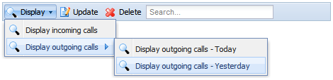
gxuiToolbar also supports the creation of a multi-level menu as shown in the above image.
Example of a data provider to load the items shown in the above image.
gxuiToolbar
{
    Buttons
    {
        Item
        {
            Id = !"DSP"
            Text = "Display"
            Tooltip = "Tooltip for Display Button"
            Type = gxuiToolbarItemTypes.Menu
            Icon = ActionDisplay.Link()
            Items
            {
                Item
                {
                    Id = !"DSP11"
                    Text = "Display incoming calls"
                    Tooltip = "Tooltip for display incoming calls button"
                    Type = gxuiToolbarItemTypes.Button
                    Icon = ActionDisplay.Link()
                }
                Item
                {
                    Id = !"DSP12"
                    Text = "Display outgoing calls"
                    Tooltip = "Tooltip for display outgoing calls button"
                    Type = gxuiToolbarItemTypes.Menu
                    Icon = ActionDisplay.Link()
                    Items
                    {
                        Item
                        {
                            Id = !"DSP121"
                            Text = "Display outgoing calls - Today"
                            Tooltip = "Tooltip for display outgoing calls Today button"
                            Type = gxuiToolbarItemTypes.Button
                            Icon = ActionDisplay.Link()
                        }
                        Item
                        {
                            Id = !"DSP122"
                            Text = "Display outgoing calls - Yesterday"
                            Tooltip = "Tooltip for display outgoing calls Yesterday button"
                            Type = gxuiToolbarItemTypes.Button
                            Icon = ActionDisplay.Link()
                        }
                    }
                }
            }
        }
        Item
        {
            Id = !"UPD"
            Text = "Update"
            Tooltip = "Toltip for Update Button"
            Type = gxuiToolbarItemTypes.Button
            Icon = ActionUpdate.Link()
        }
        Item
        {
            Id = !"DLT"
            Text = "Delete"
            Tooltip = "Tooltip for Delete Button"
            Type = gxuiToolbarItemTypes.Button
            Icon = ActionDelete.Link()
            AskConfirmation = True
            Confirmation
            {
                Message = !"Please confirm this action."
                CancelButtonText = !"Cancel"
                OKButtonText = !"Delete"
            }
        }
        Item
        {
            Id = !"SEARCH"
            Text = "Search..."
            Tooltip = "Enter search query."
            Type = gxuiToolbarItemTypes.Edit
        }
    }
}
ChangeToolbar method is available at execution time in order to change the variable that has the items to be shown.
Event 'YourEvent'
    gxui_ToolbarMenu.ChangeToolbar(&gxuiToolbarMenu)
EndEvent
For more information please visit: http://open.genexusserver.com/xev1/home.aspx?RSSReader,0