As an example of the implementation of this new feature, we are going to implement TableSorter control as a Custom Render control for grids.
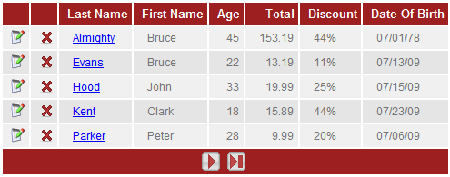
| Default grid using GeneXusX theme |
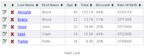
Implementation using TableSorter control |
 |
 |
Getting started
First of all, we need to download the full release of TableSorter from here.
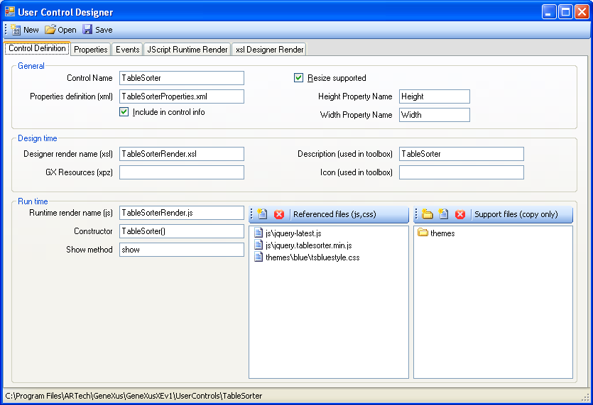
Now we need to create a new user control as usual including the relevant referenced files as shown on the following image.
Requirements:
In order to be able to select the new User Control as a CustomRender for a grid we need to set the following properties:
- Include in control info = True (Check the property in the control definition tab)
- Edit <UserControlName>.control file and edit ControlType tag in order to add "grid", the tag should be set as: <ControlType>grid</ControlType>
Now we need to know how we can obtain the information to populate our User Control with the relevant information.
This can be divided into three main sections:
- Getting the information of the columns
- Getting the information of the rows
- Display a paging section if is is applicable
Getting the Columns
//Get the columns
for (var i = 0; i < this.columns.length; i++) {
   //some code here
}
Getting the Rows and Cells
//Get the rows
for (var i = 0; i < this.properties.length; i++) {
    var row = this.properties[i];
    //some code here
    //Get the cells
    for (var j = 0; j < row.length; j++) {
        //some code here
    }
}
Display paging section
if (this.getRowCount() > 0) {
   if (this.usePaging) {
      if (!this.isFirstPage()) { //if this is not the first page
         //display go to first page button
         //display go to previous page button
      }
      if (!this.isLastPage()) { //if this is not the last page
         //display go to next page button
         //display go to last page button
      }
   }
}
Now lets put all the code together to accomplish the implementation of TableSorter, please take a look at Getting Started page to see the implementation required by TableSorter
this.show = function()
{
var buffer = new gx.text.stringBuffer();
buffer.clear();
// Generate unique grid identifier
var m_gridid = "tablesorter-" + (this.ParentObject ? this.ParentObject.CmpContext || "" + "-" + this.ParentObject.ServerClass || "" : "") + "-" + this.ControlName
// Append table container 1 row to render tablesorter and 1 row for pager
buffer.append("<table id='" + m_gridid + "Container'>");
buffer.append("<tr><td>");
buffer.append("<table id='" + m_gridid + "' class='tablesorter' cellspacing='1' cellpadding='0' border='0'>");
// Append grid headers
buffer.append("<thead>");
buffer.append("<tr>");
for (var i = 0; i < this.columns.length; i++) {
if (this.columns[i].visible) {
buffer.append("<th align=" + this.columns[i].align + ">");
buffer.append(this.columns[i].title + "     ");
buffer.append("</th>");
}
}
buffer.append("</tr>");
buffer.append("</thead>");
buffer.append("<tbody>");
// Append grid rows
for (var i = 0; i < this.properties.length; i++) {
buffer.append("<tr>");
var row = this.properties[i];
// Append row cells
for (var j = 0; j < row.length; j++) {
if (this.columns[j].visible) {
buffer.append("<td align=" + this.columns[j].align +">");
var cell = row[j];
if (cell.visible) { // If cell is visible append it
buffer.append(cell.getHtml());
}
buffer.append("</td>");
}
}
buffer.append("</tr>");
}
buffer.append("</tbody>");
buffer.append("</table>");
buffer.append("</td></tr>");
buffer.append("<tr>");
// Append Pager
if (this.getRowCount() > 0) {
if (this.usePaging) {
if (this.currentPage <= 0) {
this.currentPage = 1;
}
buffer.append("<td align='center'>");
//Here you can display your own customized paging section. For illustration purposes we are just showing hyperlinks for next, last
//previous and first actions with a descriptive text like "Go to First Page".
if (!this.isFirstPage()) {
buffer.append('<a href="' + this.getPaginEvent("FIRST") + '" class="ReadonlyAttribute" Title="Go to First Page"> First</>');
buffer.append('<a href="' + this.getPaginEvent("PREV") + '" class="ReadonlyAttribute" Title="Go to Previous Page"> Previous</>');
}
if (!this.isLastPage()) {
buffer.append('<a href="' + this.getPaginEvent("NEXT") + '" class="ReadonlyAttribute" Title="Go to Next Page"> Next</>');
buffer.append('<a href="' + this.getPaginEvent("LAST") + '" class="ReadonlyAttribute" Title="Go to Last Page"> Last</>');
}
buffer.append("</td>");
}
}
buffer.append("</tr>");
buffer.append("</table>");
// Render grid into html
this.getContainerControl().innerHTML = buffer.toString();
// Call the tablesorter plugin
$(document).ready(function(){
var m_tableid = "#" + m_gridid;
$(m_tableid).tablesorter({
widgets: ['zebra']
});
});
}
The complete source code of TableSorter User Control can be viewed and downloaded from User Controls repository here, or you can download and install the UC from here.
FAQ
- Properties of the grid
- this.usePaging: Indicates if automatic paging is enabled (there are not paging events defined by the user)
- this.pageSize: Number of rows per page
- this.gxVisible : Visibility of the grid
- How to access the list of columns of the grid ?
this.columns is an array that contains the columns. Some important properties are:
- gxAttName: Name of the attribute
- title: Column title
- gxTooltip: Tooltip text of the column.
- width: Width
- Visible: Visibility of the column
- type: Column type.
- Suggestion
You can use a javascript debugger to inspect all the properties and events available for <this> object. A complete list of available properties are listed here