In this document we'll explain how to create an Item User Control for Android to display the contents of an attribute or variable.
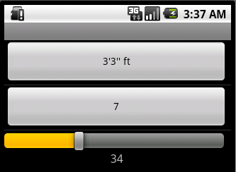
To do this, we are going to create a Slider User Control. This is how it looks:
Steps to create the user control
The user control has two components: a definition and an implementation.
The definition is similar to the definition of the web user controls, with some minor differences; check this article.
For the implementation, you'll need to code in Java, using the ADT plug-in for Eclipse. This document assumes you are familiar with it; set your development environment.
Definition
For the User Control definition, you can start by copying an existing User Control for SD definition.
What you'll need to do is:
-
Change the User Control name and description; for example SDSlider.
-
Set the Version tag to an initial value.
-
Set the Platform to "SmartDevices".
-
Add the name of the main class to the Android_ClassName tag (in this case, SDSlider).
<Android_ClassName>com.mycompany.extendedcontrols.SDSlider</Android_ClassName>
Check the Scanner.control file if you are in doubt. Add the following properties to the new User Control:
-
MinValue: Slider minimal value
-
MaxValue: Slider maximum value
-
Step: Slider step value.
Check this article for further information.
Implementation
-
For this control, we will be using the standard Android widget SeekBar.
-
Make sure your development environment is ready.
-
Open the FlexibleClient project, create the SDSlider class on the com.mycompany.extendedcontrols package, make sure it implements IGXEdit:
public class SDSlider extends LinearLayout implements IGxEdit
-
Add the following private properties to track internal data:
private TextView mTextCurrent;
private TextView mTextMin;
private TextView mTextMax;
private SeekBar mSeekBar;
private int seekBarMinValue;
private int seekBarMaxValue;
private Context mContext;
private LayoutItemDefinition mDefinition;
-
Add the following Class constructors; notice it references a specific layout "seekbarcontrol", we will come back to it later.
public SDSlider(Context context, LayoutItemDefinition def) {
  super(context);
  mContext = context;

  LayoutInflater inflater = (LayoutInflater)context.getSystemService(Context.LAYOUT_INFLATER_SERVICE);
     if(inflater != null){
        inflater.inflate(com.artech.R.layout.seekbarcontrol, this, true);
     }
     setLayoutDefinition(def); // defined later
}

public SDSlider(Context context, AttributeSet attrs) {
  super(context, attrs);
  mContext = context;

  LayoutInflater inflater = (LayoutInflater)context.getSystemService(Context.LAYOUT_INFLATER_SERVICE);
     if(inflater != null){
        inflater.inflate(com.artech.R.layout.seekbarcontrol, this, true);
     }
}
-
Implement the init method:
@Override
public void init() {
  mSeekBar = (SeekBar) this.findViewById(com.artech.R.id.seekBar);
  mTextCurrent = (TextView) this.findViewById(com.artech.R.id.textCurrent);
  mTextMin = (TextView) this.findViewById(com.artech.R.id.textMin);
  mTextMax = (TextView) this.findViewById(com.artech.R.id.textMax);
  mTextCurrent.setTextSize(16);
  //Calculate the resolution of the screen
  float displayWidth = ((WindowManager)mContext.getSystemService(Context.WINDOW_SERVICE)).getDefaultDisplay().getWidth();
  mSeekBar.setLayoutParams(new LayoutParams((int)(displayWidth * 0.97), LayoutParams.WRAP_CONTENT));
  mSeekBar.setOnSeekBarChangeListener(new SeekBar.OnSeekBarChangeListener(){

      @Override
      public void onProgressChanged(SeekBar seekBar, int progress,
        boolean fromUser) {
       mTextCurrent.setText(String.valueOf(progress + seekBarMinValue - 1));
      }

      @Override
      public void onStartTrackingTouch(SeekBar seekBar) {
      }

      @Override
      public void onStopTrackingTouch(SeekBar seekBar) {
      }
  });

}
-
Notice in this case we are filling the entire view and setting the seekbar widget listeners. The seekbar has three states: drag start, changing and drag ended, we will only make use of the third one. The method bodies can be left blank; for the sample we implemented the listener in the same class.
-
Implement the entire IGxEdit interface:
@Override
public String getGx_Value() {
  return (String) mTextCurrent.getText();
}

@Override
public void setGx_Value(String value) {
  mSeekBar.setProgress(Integer.parseInt(value));
  mSeekBar.setProgress(Integer.parseInt(value) - seekBarMinValue + 1);
  mTextCurrent.setText(value);
}

@Override
public String getGx_Tag() {
  return getTag().toString();
}

@Override
public void setGx_Tag(String tag) {
  setTag(tag);
}

@Override
public void setValueFromIntent(Intent data) {
}

@Override
public IGxEdit getListControl() {
  return new GxTextView(this.getContext(), mDefinition);
}

@Override
public IGxEdit getViewControl() {
  setEnabled(false);
  return this;
}

@Override
public IGxEdit getEditControl() {
  return this;
}

@Override
public void setEnabled(boolean enabled) {
  mSeekBar.setEnabled(enabled);
  mTextMin.setEnabled(enabled);
  mTextMax.setEnabled(enabled);
  mTextCurrent.setEnabled(enabled);
}

private void setEnabled(View view, boolean enabled) {
  view.setEnabled(enabled);
  view.setFocusable(enabled);
}
-
Define the setLayoutDefinition method referenced in the Class constructor, you will have to create some objects for each of the views:
private void setLayoutDefinition(LayoutItemDefinition layoutItemDefinition) {
  mDefinition = layoutItemDefinition;
  ControlInfo info = layoutItemDefinition.getControlInfo();
  if (info == null)
   return;
  seekBarMinValue = Integer.parseInt(info.optStringProperty("@SDSliderMinValue")); //$NON-NLS-1$
  seekBarMaxValue = Integer.parseInt(info.optStringProperty("@SDSliderMaxValue"));  //$NON-NLS-1$
  int seekBarStep = Integer.parseInt(info.optStringProperty("@SDSliderStep"));   //$NON-NLS-1$
  mSeekBar.setMax(seekBarMaxValue - seekBarMinValue + 1);
  mSeekBar.incrementProgressBy(seekBarStep);
  mTextMin.setText(String.valueOf(seekBarMinValue));
  mTextMax.setText(String.valueOf(seekBarMaxValue));
}
-
Notice the optStringProperty method from the ControlInfo Class to get property values from the GeneXus User Control.
-
In general you will get the UC property values and bind to specific platform specific controls, in this case specific SeekBar and TextView properties.
-
The complete Class implementation is ready. Now, you need to create the layout.
-
Create a new file under res/layout called seekbarcontrol.xml.
Add the following contents:
<?xml version="1.0" encoding="utf-8"?>
<merge xmlns:android="http://schemas.android.com/apk/res/android">
<LinearLayout
   android:orientation="vertical"
   android:layout_width="fill_parent"
   android:layout_height="fill_parent"
   >
<SeekBar
   android:layout_width="fill_parent"
   android:layout_height="wrap_content"
   android:layout_margin="10dp"
   android:id="@+id/seekBar"
   android:max="100"
   android:progress="50"
   />
<LinearLayout
      android:orientation="horizontal"
      android:layout_width="fill_parent"
      android:layout_height="wrap_content"
      android:layout_weight="1">
      <TextView
         android:id="@+id/textMin"
          android:layout_width="wrap_content"
          android:layout_height="wrap_content"
          android:layout_weight="1"/>
      <TextView
         android:id="@+id/textCurrent"
          android:gravity="center_horizontal"
          android:layout_width="wrap_content"
          android:layout_height="wrap_content"
          android:layout_weight="1"/>
      <TextView
         android:id="@+id/textMax"
          android:gravity="right"
          android:layout_width="wrap_content"
          android:layout_height="wrap_content"
          android:layout_weight="1"/>
  </LinearLayout>
</LinearLayout>
</merge>
-
After you've declared and saved the XML layout in the project's res/layout/ directory, it will be compiled so you can reference it as com.artech.R.layout.seekbarcontrol (check the Class Constructor code).
-
As you can see from the first image, the interface for this User Control is nothing more than three textviews to hold the Minimum, selected and Maximum values and the seekbar widget.
-
Once you have tested it, you can package your UC to be deployed in other GeneXus installations, check this article.