This guide explains how to create a design time render file for DatePicker user control based on Kendo UI (DatePickerIdeRender.xsl). See Building a User Controls library based on Kendo UI for more information.
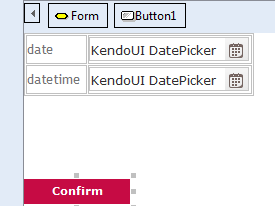
The design time render file is where you define how the control will be rendered in the Genexus IDE web form editor. We will create the file to make our control render like this, emulating how the control looks in runtime:
The language used to create the design time render is XSLT, and when finished the design time render file will look like this:
<?xml version='1.0'?>
<xsl:stylesheet version="1.0" xmlns:xsl="http://www.w3.org/1999/XSL/Transform"
xmlns:msxml="urn:schemas-microsoft-com:xslt"
xmlns:gx="urn:shemas-artech-com:gx"
exclude-result-prefixes="msxml gx"
xmlns:gxca="urn:GXControlAdap">
  <xsl:output method="html"/>
  <xsl:template match="/GxControl[@type = 'KendoUI DatePicker']">
  <input type="text" value="KendoUI DatePicker">
  <xsl:attribute name ="style">
    <xsl:text>font-family: Verdana, Arial;</xsl:text>
    <xsl:text>font-size: 12px;</xsl:text>
    <xsl:text>color: rgb(46, 46, 46);</xsl:text>
    <xsl:text>height:24px;</xsl:text>
    <xsl:text>width:160px;</xsl:text>
    <xsl:text>padding-top:5px;</xsl:text>
    <xsl:text>border: 1px solid rgb(197, 197, 197);</xsl:text>
    <xsl:text>border-radius: 4px;</xsl:text>
    <xsl:text>background-repeat:no-repeat;</xsl:text>
    <xsl:text>background-position:center right;</xsl:text>
    <xsl:text>background-image:url(</xsl:text>
    <xsl:value-of select='gxca:GetMyPath()'/>
    <xsl:text>\controls\DatePicker\DatePickerTrigger.png)</xsl:text>
  </xsl:attribute>
  </input>
  </xsl:template>
</xsl:stylesheet>
Internally, the XSLT will be applied to a XML containing a single element, like this:
<GxControl type="KendoUI DatePicker"/>
For that reason, you need to define a XSLT template matching this node:
<xsl:template match="/GxControl[@type = 'KendoUI DatePicker']">
Inside the template write the code to generate the control rendering. In this case, we have to generate a HTML input element, with the text “KendoUI DatePicker” as its value, and some CSS styling to determine how the control looks in runtime.
It is possible to access some helper functions provided by GeneXus.
In this case, it is used the gxca:GetMyPath() method to get the path of the User Control in the file system, to build the URL of the background image used to emulate the trigger icon of the field.
    <xsl:text>background-image:url(</xsl:text>
    <xsl:value-of select='gxca:GetMyPath()'/>
    <xsl:text>\controls\DatePicker\DatePickerTrigger.png</xsl:text>
What is a User Control?