GeneXus allows designing Responsive Web Applications in a very intuitive manner. The solution uses BootStrap, one of the most popular Front-End Development Frameworks.
Even though the elements of responsive design (fluid grids, flexible media, and CSS media queries) are features that GeneXus users need not be concerned about, here we explain the basic concepts of Bootstrap, as well as the mapping to the GeneXus tools that help in designing and developing a RWD.
As told before, an RWD site uses fluid grids, flexible images, and CSS3 media queries, so we'll explain each of these concepts below.
- Fluid Grids
Fluid grids flow within the dimensions of its parent container. The grid is divided into a specific number of columns. Each element has proportional widths instead of pixel-based dimensions. So, whenever the device or screen size is changed, elements will adjust their widths by the specified proportions to its parent container.
In sum, the fluid grid concept calls for page element sizing to be in relative units like percentages, rather than absolute units like pixels or points. Besides, the elements inside the grid can change their position depending on the screen size.
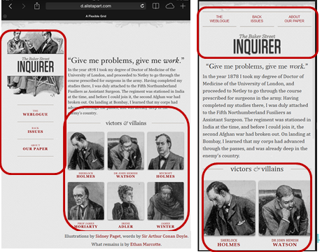
In the following example, the same HTML page (that uses a fluid grid) is shown in a tablet and in a cellular phone, and it looks different in both.
Fluid grids are achieved in GeneXus using the Responsive Table and the Responsive Sizes property as it's explained in more detail below.
- Flexible images
Flexible images are sized in relative units, so as to prevent them from displaying outside their containing element.
Flexible images are achieved in GeneXus by using the ResponsiveImage Theme Class for RWA.
- CSS Media queries
They allow the page to use different CSS style rules based on characteristics of the device the site is being displayed on, most commonly the width of the browser.
CSS Media queries are achieved in GeneXus through the Conditional Class Properties for Themes.
Bootstrap includes a fluid grid system that scales up to 12 columns as the device or viewport size increases. If more than 12 columns are placed in a single row, each group of extra columns will, as one unit, wrap onto a new line.
The fluid grids are generated by GeneXus using div tags. The GeneXus Responsive Table is generated as a Bootstrap fluid grid.
The Responsive Sizes dialog offers twelfths given in percentages to configure the column width.
Bootstrap considers four screen sizes:
- Extra small devices: Phones (<768px)
- Small devices: Tablets (≥768px)
- Medium devices: Desktops (≥992px)
- Large devices: Desktops (≥1200px)
The Responsive Sizes dialog allows the user to select those values from a combo box.
The Bootstrap framework includes predefined classes to give the cells the necessary width in percentages for each screen size. For example, the col-xs-12 class gives 100% width to the column when the viewport is extra small:
.col-xs-12 {
  width: 100%;
}
Behind the scenes, when the GeneXus user configures the width of a cell for each screen size, some of the Bootstrap predefined classes are assigned to that cell at runtime.
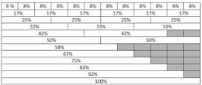
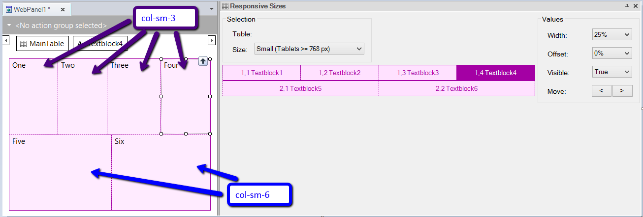
Each of the predefined classes represents the number of columns than an element will span. For example, four equal columns will use four col-sm-3. And two equal columns will use two col-sm-6. See the following image for an example and the graphic representation below:
| |
|
|
|
|
|
|
|
|
|
|
|
| col-sm-3 |
col-sm-3 |
col-sm-3 |
col-sm-3
|
To sum up, the Bootstrap predefined classes are as follows:
| |
Extra small devices Phones (<768px)
|
Small devices Tablets (≥768px) |
Medium devices Desktops (≥992px) |
Large devices Desktops (≥1200px) |
| Class prefix |
.col-xs |
.col-sm |
.col-md |
.col-lg |
The media queries defined in the Bootstrap CSS create the key breakpoints in the grid system.
For example, the following media query defines the width for the col-md-* classes for medium devices.
@media (min-width: 992px) {
  .col-md-1, .col-md-2, .col-md-3, .col-md-4, .col-md-5, .col-md-6, .col-md-7, .col-md-8, .col-md-9, .col-md-10, .col-md-11, .col-md-12 {
    float: left;
  }
  .col-md-12 {
    width: 100%;
  }
  .col-md-11 {
    width: 91.66666667%;
  }

...........
Grid classes apply to devices with screen widths greater than or equal to the breakpoint sizes, and override grid classes targeted at smaller devices. For example, applying any .col-md-* class to an element will not only affect its styling on medium devices but also on large devices if a .col-lg-* class is not present.
This inheritance behavior is explicit in the Responsive Sizes dialog.
Bootstrap sets basic defaults - typography, links, paddings, etc - which were adopted by the Flat theme.
See Reference of Theme Classes used in Responsive Web Applications.