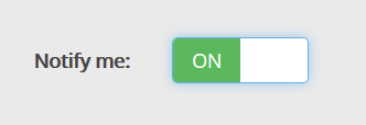
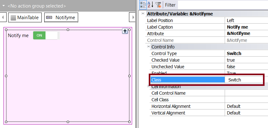
The Switch control is presented as a toggle that allows selecting one of two possible values: on or off.
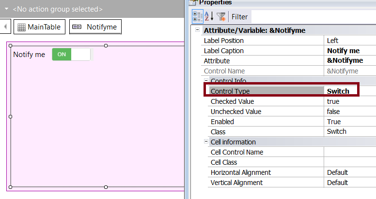
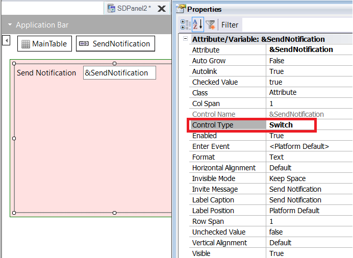
It is one of the built-in controls and can be selected from the Control Type property.
It may be used as a replacement for the traditional Check Box control, and it's available for Panel objects and for Web Panel objects.
Only the Abstract Layout supports this control.
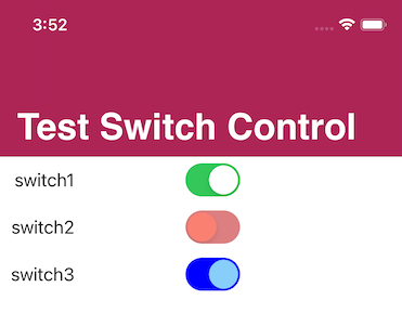
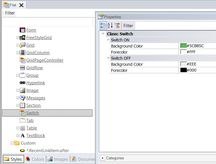
As of GeneXus 17 Upgrade 5, both Web and Native Mobile applications support configuring the visual aspect of the control via a Theme Class.
| Name |
Description |
| Auto Grow (only for Native Mobile apps) |
Auto Grow property |
| Checked Value |
Indicates the "switch on" value |
| Unchecked Value |
Indicates the "switch off" value |
| ON Text (only for Web apps) |
Indicates the text displayed when the ON value is selected |
| OFF Text (only for Web apps) |
Indicates the text displayed when the OFF value is selected |
ControlValueChanged event
The ValueChanged event for the Switch control in iOS has been deprecated. The ControlValueChanged event must be used instead.