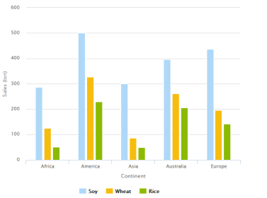
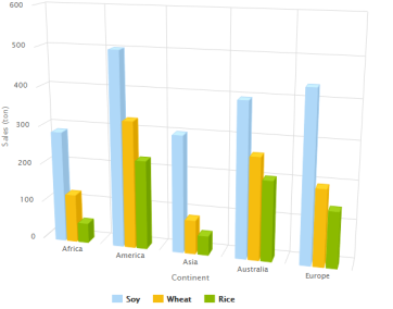
Column charts display data as vertical bars (columns) between the X and Y axes. The length of the different bars represents the different values of the data.
A column chart displays data in columns. When displaying more than one series, columns of the different series are clustered for each value.
| Simple |
3D |
 |
 |
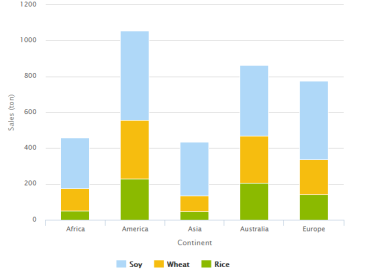
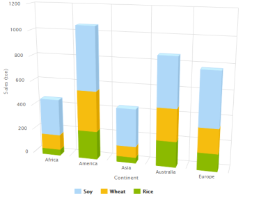
A stacked column chart works similarly to a column chart, but it stacks the columns for each value instead of clustering them (if there is more than one value per element, they will be displayed in a single stacked column).
| Simple |
3D |
 |
 |
A 100% stacked column chart stacks the columns as the stacked column chart does, but it extends the height of the stacks to the same height and shows the relative percentage of the values instead the actual values.