The Tab control for Web Panels appearance can be configured using the following properties:
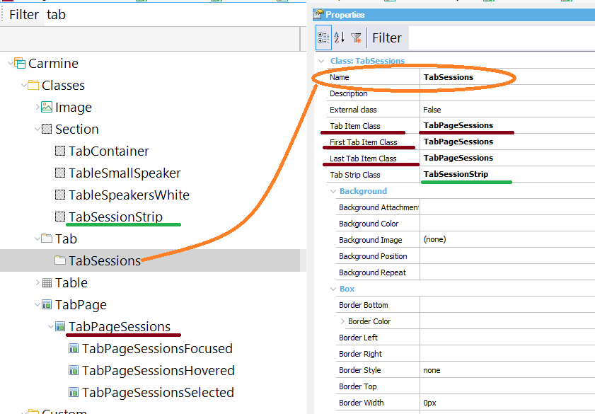
It's a control property that determines the Theme Class that will be associated with the Tab control. The predetermined class for Tab controls is "Tab", but you can create other classes under the Tab class in the Theme. See the pictures below.

The control's tab pages can be styled using class properties which are grouped under the Tab Class (or any of its descendants).
These properties are as follows:
- Tab Item Class: Configure the style of the tab control's tab pages.
- First Tab Item Class: Configure the style of the tab control's first tab page.
- Last Tab Item Class: Configure the style of the tab control's last tab page.
- Tab Strip Class: Sets the style for the strip containing all the tab pages. It's a Section class.

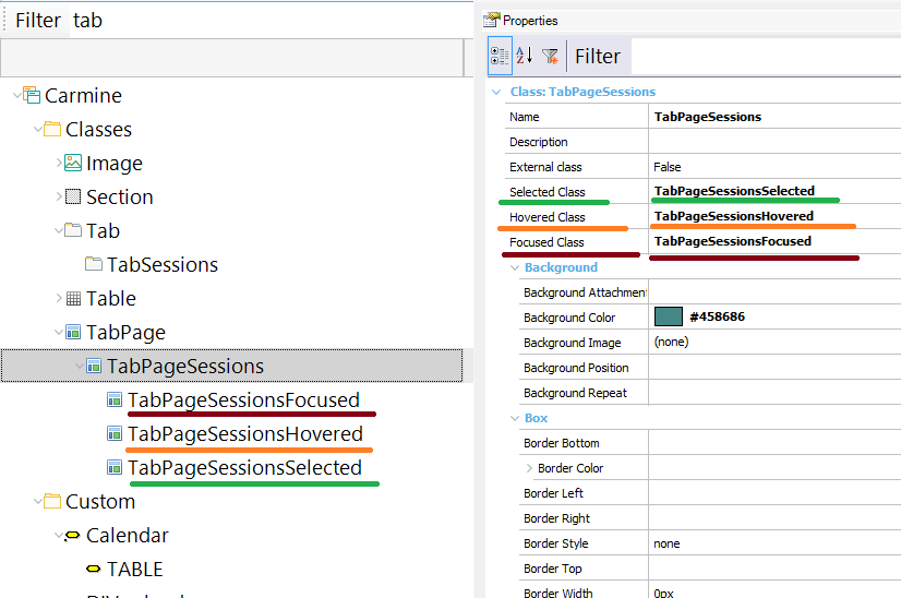
Tab pages can change their style when the user hovers over any them, or when he selects or sets the focus on a tab page.
This is achieved using the following class properties which are grouped under the TabPage class:
- Selected Class
- Hovered Class
- Focused Class
These classes should be TabPage classes or their descendants.

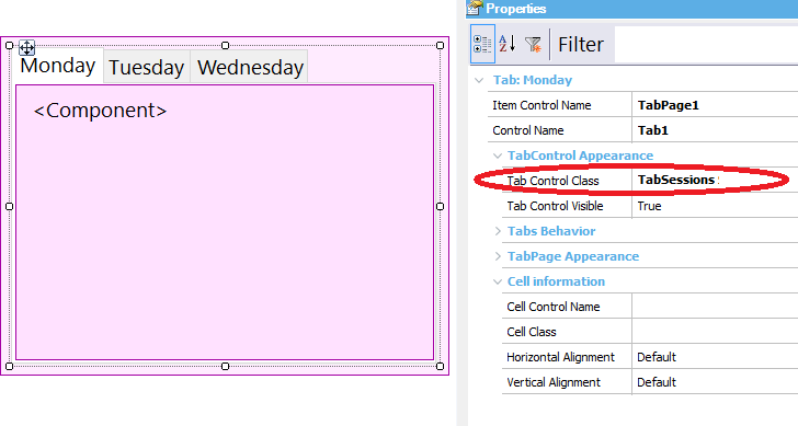
Suppose that you need to have the tab control shown in the following picture:

The Tab Control Class property is "TabSessions" in this example. The TabSessions class has the following associations:
- Tab Item Class = TabPageSessions
- First Tab Item Class = TabPageSessions
- Last Tab Item Class= TabPageSessions
- Tab Strip Class = TabSessionStrip
The TabPageSessions and the TabSessionStrip property have the background color set to #458686 and the following font properties:
.TabPageSessions
{
background-color: #458686;
text-decoration: none;
color: white;
text-transform: uppercase;
}
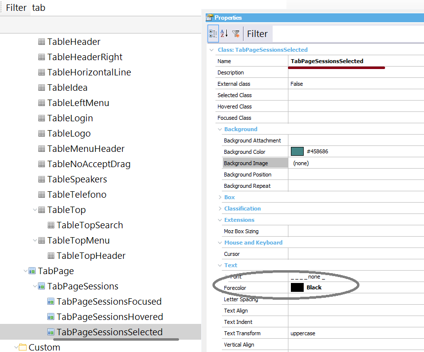
The TabPageSessions "Selected Class property" is set to TabPageSessionsSelected class. This class sets the ForeColor property to black, as it is the desired design for the selected tab pages.
