The Action Group Control for the Web can be displayed as a navigation bar, based on Bootstrap Navbars.
This feature is available for Responsive Web Design applications, and it's supported by the Abstract Layout.
At first, the Navbar is collapsed (and toggleable) in mobile views and becomes horizontal as the available viewport width increases (for desktop screens).
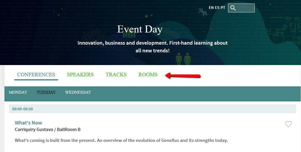
So, in small, medium and large screens it looks as follows:
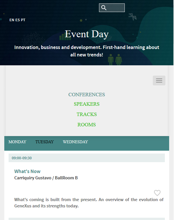
But in extra small screens it is displayed as a collapsible menu:
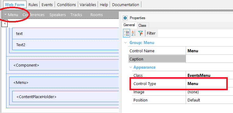
1. Add an Action Group
2. Configure the Action Group's Control Type property to "Menu".
3. Then, you can configure the Navigation Bar style in the Theme, through the following classes:
- ActionGroup Class and its descendants
- ActionGroupItem Class and its descendants
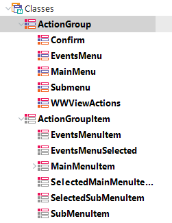
There are special class properties which may be very useful. They are all listed in the following table (all of them should be ActionGroupItem or a descendant):
| Item Class |
Class for each item of the action group. |
| Selected Item Class |
Class for the selected item (if any) of the action group |
| Link Class |
Class to be used for items that contain TextBlocks that have their Link property set, or when the TextBlock is bound to an event. |
- If a control (e.g a textblock) is inside the Navigation Bar, you should leave the class property of the control empty. On the other hand, it won't take the settings of the Item Class, Selected Item Class, or Link Class.
- The click of the items has to be defined using the link property. If you use a user event, the Selected Item Class is not considered.