GeneXus Markup Language (GXML) is an XML-like descriptive language for describing GeneXus' layouts.
The drag-and-drop concept in GeneXus makes it far easier for the average user to understand how to design apps by describing their components in an abstract way, without worrying about the lines of code that it may entail. Either way, for those adventured users, the GXML syntax aims to be very simple to understand, providing views, controls, and layout structures for declaring your app's user interface. This document pretends to be a guideline for those intrigued users that wants to analyze a GeneXus object from another point of view.
The GXML is a standard for defining layouts GeneXus' objects such as Panels, Stencils, and Master Panels objects. The purpose of this format is to structure content in a way that is semantically meaningful and readable for both humans and machines The fact of being a markup language means that uses tags to describe the structure and semantics of a layout rather than focusing on how it should be visually presented. In this way, the key advantages of using an abstract representation of the user interface are as follows:
- Structure: Organizes the content into logical sections to make it easier to understand how the user interface is defined.
- Accessibility: Uses semantic elements to help readers and other assistive technologies interpret the content.
- Coss-Platform: Encapsulates the user interface logic by being agnostic of the target platform and ensuring consistent user experience.
The structure of a GXML document consists of a series of elements represented by tags. The relationship between elements is defined by their nesting resulting in a hierarchical structure. The element that contains another element is called the "parent", while the contained element is referred to as the "child", and elements at that same level in the hierarchy are called "siblings".
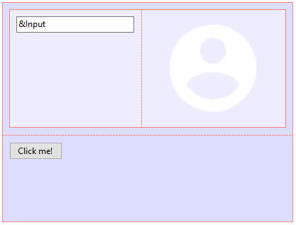
For instance, the following layout and GXML document are equivalent:
 |
<panel id="D034848F-DB64-4622-88CD-F93EF77DFC03"
name="MyPanel">
<smart name="MyPanel"
width="100%"
height="219px"
columnsStyle="100%"
rowsStyle="128px;91px"
class="my-panel-class">
<tr height="128px">
<td class="table-cell"
hAlign="Left"
vAlign="Top">
<smart name="MyTable"
class="table-class"
width="189px"
height="24px"
columnsStyle="165px;24px"
rowsStyle="24px">
<tr height="24px">
<td class="table-cell"
hAlign="Left"
vAlign="Top">
<input attribute="&MyInputText"
class="edit-class"
labelPosition="None"
inviteMessage="Placeholder...."
readonly="False"/>
</td>
<td class="table-cell"
hAlign="Right"
vAlign="Middle">
<img name="MyUserIcon"
class="image-class"
Image="UserIcon" />
</td>
</tr>
</smart>
</td>
</tr>
<tr height="91px">
<td class="table-cell"
hAlign="Left"
vAlign="Top">
<action controlName="MyButton"
onClickEvent="'MyButton'"
caption="Click me!"
class="button-class" />
</td>
</tr>
</smart>
</panel>
|
Describes the beginning of a Layout definition for a Panel object, Web Panel object, or Master Panel object.
| Permitted parents: |
None |
| Permitted content: |
Layout element (<view>). |
| Permitted attributes: |
|
|
id
|
String
Unique identifier.
|
|
description
|
String| optional
Short description.
|
Describes a specific layout when defining Multiple Layouts in Panels or a Web Layout
| Permitted parents: |
Panel element (<panel>). |
| Permitted content: |
Any container element. |
| Permitted attributes: |
|
|
platform
|
String| default: any
Target platform.
Values: any, android, ios, web.
|
|
device
|
String| default: any
Target device.
Values: any, tablet or phone, tv, watch.
|
|
size
|
String| default: any
Target size.
Values: any, small, medium, large.
|
|
orientation
|
String| default: any
Target orientation.
Values: any, landscape, portrait.
|
Describes a Canvas control.
| Permitted parents: |
Any container element. |
| Permitted content: |
Any control or container element. |
| Permitted attributes: |
|
|
name
|
String
Control name.
|
|
class
|
String
Control style class.
|
|
width
|
String
Control width expressed in px, dip, or %.
|
|
height
|
String
Control height expressed in px, dip, or %.
|
|
isSlot
|
String| default: false
Defines if the container is a slot or not.
Values: false, true.
|
|
background
|
String
Background image object full name.
Note: This only applies to non-Web layout context.
|
Describes a Flex control.
| Permitted parents: |
Any container element. |
| Permitted content: |
Any control or container element. |
| Permitted attributes: |
Extends <canvas> element's attributes. |
|
flexDirection
|
String| default: row
Establishes the main axis, thus defining the direction flex items are placed in the flex container.
Values: row, row-reverse, column, column-reverse.
|
|
flexWrap
|
String| default: nowrap
Controls whether the flex container is single-line or multi-line, and the direction of the cross axis.
Values: nowrap, wrap, wrap-reverse.
|
|
justifyContent
|
String| default: flex-start
Defines the alignment along the main axis.
Values: flex-start, flex-end, center, space-around, space-between.
|
|
alignItems
|
String| default: stretch
Defines the default behavior for how flex items are laid out along the cross-axis on the current line.
Values: stretch, flex-start, flex-end, center, baseline.
|
Describes a Responsive Table control.
| Permitted parents: |
Any container element. |
| Permitted content: |
Any control or container element. |
| Permitted attributes: |
Extends <canvas> element's attributes. |
|
heights
|
String
Row heights.
|
|
sizes
|
String
Responsive sizes.
|
Describes a Section Control.
| Permitted parents: |
Any container element. |
| Permitted content: |
Extends <canvas> element's attributes. |
| Permitted attributes: |
|
|
semanticContent
|
String| default: general
Determines de HTML attribute generated for this content.
Values: general, address, footer, header, main, nav, article, aside, h1, h2, h3, h4, h5, h6.
|
Describes a Smart Table control.
| Permitted parents: |
Any container element. |
| Permitted content: |
Table row element (<tr>). |
| Permitted attributes: |
Extends <canvas> element's attributes. |
|
columnsStyle
|
String
Column widths expressed in px, dip, or %, separated by semi-colons.
Note: The number of columns must match the number of <td> elements in the <tr> element with the most elements.
|
|
rowsStyle
|
String
Row heights expressed in px, dip, or %, separated by semi-colons.
Note: The number of rows must match the number of <tr> elements.
|
Describes a Table control.
| Permitted parents: |
Any container element. |
| Permitted content: |
Any control or container element. |
| Permitted attributes: |
Extends <canvas> element's attributes in a Web layout context; otherwise extends <smart>. |
|
header
|
String
Header displayed above the table.
Note: This only applies to Web layout context.
|
Shorthand a Table element (<table>) or Smart element (<smart>) when it has a single row.
| Permitted parents: |
Any container element. |
| Permitted content: |
Any control or container element. |
| Permitted attributes: |
Extends <canvas> element's attributes. |
|
columnsStyle
|
String
Column widths expressed in px, dip, or %, separated by semi-colons.
|
Shorthand a Table element (<table>) or Smart element (<smart>) when it has a single column.
| Permitted parents: |
Any container element. |
| Permitted content: |
Any control or container element. |
| Permitted attributes: |
Extends <canvas> element's attributes. |
|
rowsStyle
|
String
Row heights expressed in px, dip, or %, separated by semi-colons.
|
Describes a table row.
| Permitted parents: |
Table element (<table>) or Smart element (<smart>). |
| Permitted content: |
Table cell element (<td>). |
| Permitted attributes: |
|
|
height
|
String
Table row height.
|
Describes a table cell.
| Permitted parents: |
Table row element (<tr>). |
| Permitted content: |
Any control or container element. |
| Permitted attributes: |
None. |
|
hAlign
|
String| default: left
Horizontal alignment.
Values: left, center, right, justify.
|
|
vAlign
|
String| default: top
Vertical alignment.
Values: top, middle, bottom.
|
Describes an Hyperlink control.
| Permitted parents: |
Any container element. |
| Permitted content: |
None. |
| Permitted attributes: |
|
|
name
|
String
Control name.
|
|
class
|
String
Control style class.
|
Describes a Button control.
| Permitted parents: |
Any container element. |
| Permitted content: |
None. |
| Permitted attributes: |
|
|
name
|
String
Control name.
|
|
class
|
String
Control style class.
|
|
caption
|
String
Button caption.
|
|
onClickEvent
|
String
Button event action name.
|
|
image
|
String
Image object full name.
|
|
imagePosition
|
String| default: above-text
Image position.
Values: above-text, below-text, behind-text, before-text, after-text.
Note: This only applies to non-Web layout context.
|
Describes a Action Group Control for Panels or Action Group Control for the Web.
| Permitted parents: |
Any container element. |
| Permitted content: |
Action element (<action>). |
| Permitted attributes: |
|
|
name
|
String
Control name.
|
|
class
|
String
Control style class.
|
Describes a Attribute/Variable base on Audio data type.
| Permitted parents: |
Any container element. |
| Permitted content: |
None. |
| Permitted attributes: |
|
|
name
|
String
Control name.
|
|
class
|
String
Control style class.
|
Describes a Attribute/Variable having Control Type property with 'Checkbox' value.
| Permitted parents: |
Any container element. |
| Permitted content: |
None. |
| Permitted attributes: |
|
|
name
|
String
Control name.
|
|
class
|
String
Control style class.
|
Describes a Attribute/Variable having Control Type property with 'Combobox' value.
| Permitted parents: |
Any container element. |
| Permitted content: |
None. |
| Permitted attributes: |
|
|
name
|
String
Control name.
|
|
class
|
String
Control style class.
|
Describes a Component control.
| Permitted parents: |
Any container element. |
| Permitted content: |
None. |
| Permitted attributes: |
|
|
name
|
String
Control name.
|
Describes a Content Holder control when the layout is defined for a Master Panel object.
| Permitted parents: |
Any container element. |
| Permitted content: |
None. |
| Permitted attributes: |
|
|
name
|
String
Control name.
|
Describes an Error Viewer control.
| Permitted parents: |
Any container element. |
| Permitted content: |
None. |
| Permitted attributes: |
|
|
name
|
String
Control name.
|
|
class
|
String
Control style class.
|
Describes a Grid control, Free Style Grid control, or Flex Grid control.
| Permitted parents: |
Any container element. |
| Permitted content: |
Any container element. |
| Permitted attributes: |
|
|
name
|
String
Control name.
|
|
class
|
String
Control style class.
|
|
scrollDirection
|
String| default: vertical
Scroll direction.
Values: vertical, horizontal.
|
|
multipleItems
|
String| default: single
Multiple items.
Values: single, multiple-quantity, staggered-quantity, multiple-size.
|
|
itempsPerRow
|
String| default: 1
Items per row.
Note: This only applies when multipleItems attribute has any of multiple-* values.
|
|
snapToGrid
|
String| default: false
Snap to grid.
Values: false, true. |
|
flexDirection
|
String| default: row
Establishes the main axis, thus defining the direction flex items are placed in the flex container.
Values: row, row-reverse, column, column-reverse.
Note: This overrides scrollDirection attribute and defines a Flex Grid.
|
|
flexWrap
|
String| default: nowrap
Controls whether the flex container is single-line or multi-line, and the direction of the cross axis.
Values: nowrap, wrap, wrap-reverse.
Note: This defines a Flex Grid.
|
|
justifyContent
|
String| default: flex-start
Defines the alignment along the main axis.
Values: flex-start, flex-end, center, space-around, space-between.
Note: This defines a Flex Grid.
|
|
alignContent
|
String| default: stretch
Aligns a flex container's lines within when there is extra space in the cross-axis.
Values: stretch, flex-start, flex-end, center, baseline.
Note: This defines a Flex Grid.
|
|
alignItems
|
String| default: stretch
Defines the default behavior for how flex items are laid out along the cross-axis on the current line.
Values: stretch, flex-start, flex-end, center, space-around, space-between.
Note: This defines a Flex Grid.
|
Describes a Group control.
| Permitted parents: |
Any container element. |
| Permitted content: |
None. |
| Permitted attributes: |
|
|
name
|
String
Control name.
|
|
class
|
String
Control style class.
|
Describes an Horizontal Rule Control.
| Permitted parents: |
Any container element. |
| Permitted content: |
None. |
| Permitted attributes: |
|
|
name
|
String
Control name.
|
|
class
|
String
Control style class.
|
Describes a Attribute/Variable base on Image data type or an Image control.
| Permitted parents: |
Any container element. |
| Permitted content: |
None. |
| Permitted attributes: |
|
|
name
|
String
Control name.
|
|
class
|
String
Control style class.
|
Describes a Attribute/Variable having Control Type property with 'Edit' value.
| Permitted parents: |
Any container element. |
| Permitted content: |
None. |
| Permitted attributes: |
|
|
name
|
String
Control name.
|
|
class
|
String
Control style class.
|
|
autogrow
|
String| default: false
Autogrow.
Values: false, true, |
|
inviteMessage
|
String
Invite message.
|
|
isPassword
|
String| default: false
Maks the user input while typing.
Values: false, true,
|
|
labelPosition
|
String| default: none
Label position.
Values: none, top, left.
|
|
labelWidth
|
String| default: 25%
Label width, in percentage, for each screen size in a responsive web application. The remaining space will be given to the control itself.
Values: n%, being n a positive integer.
Note: This only applies to Web layouts.
|
|
readonly
|
String| default: false
Value is read-write (false) or read-only (true).
Values: false, true,
|
Describes a Text Block control.
| Permitted parents: |
Any container element. |
| Permitted content: |
None. |
| Permitted attributes: |
|
|
name
|
String
Control name.
|
|
class
|
String
Control style class.
|
|
caption
|
String
Label caption.
|
Describes a Map User Control.
| Permitted parents: |
Any container element. |
| Permitted content: |
None. |
| Permitted attributes: |
|
|
name
|
String
Control name.
|
Describes a Stencil object instance.
| Permitted parents: |
Any container element. |
| Permitted content: |
Any element (representing overridden controls). |
| Permitted attributes: |
|
|
name
|
String
Control name.
|
Describes a Attribute/Variable having Control Type property with 'Swtich' value.
| Permitted parents: |
Any container element. |
| Permitted content: |
None. |
| Permitted attributes: |
|
|
name
|
String
Control name.
|
|
class
|
String
Control style class.
|
|
onText
|
String
Text displayed when the switch is on.
|
|
offText
|
String
Text displayed when the switch is off.
|
|
checkedValue
|
String
Checked value.
|
|
uncheckedValue
|
String
Unchecked value.
|
Describes a Tab control for Panels or Tab control for Web Panels.
| Permitted parents: |
Any container element. |
| Permitted content: |
None. |
| Permitted attributes: |
|
|
name
|
String
Control name.
|
|
class
|
String
Control style class.
|
Describes a tab-page and must be defined as a direct child of the Tab tag.
| Permitted parents: |
Any container element. |
| Permitted content: |
None. |
| Permitted attributes: |
|
|
name
|
String
Control name.
|
|
class
|
String
Control style class.
|
Describes a Attribute/Variable base on Video data type.
| Permitted parents: |
Any container element. |
| Permitted content: |
None. |
| Permitted attributes: |
|
|
name
|
String
Control name.
|
|
class
|
String
Control style class.
|
Describes the Applicatin Bars section for Panel object.
| Permitted parents: |
Any container element. |
| Permitted content: |
None. |
| Permitted attributes: |
|
|
name
|
String
Control name.
|
|
class
|
String
Control style class.
|
| Objects |
Panel, WebPanel, Stencil, MasterPanel. |