Allows you to define the display of an attribute/domain/variable in a Form. It can be modified for a particular form by using the Form Editor. So, an attribute can be used as a Combo Box in a form despite being defined as an Edit box type in another.
Control Type: Refers to the Attribute's edition Type. Attributes usually have a very large range of values (like name, price, etc.). For such cases, the most common data entry method used is allowing the user to enter an attribute's value and have the system validate it. This "Control Type" is called an Edit Box and it is the default 'Control Type'. However, there exist attributes with a clearly defined range of values that can be displayed beforehand. For these situations, users only need to choose one of the values from a list provided by the system. An example of these types of attributes is the attribute specifying an individual's gender: because it only has two possible values. Thus, the other available control types (Check Box, Combo Box, Dynamic Combo Box, Radio Button, List Box or Dynamic List Box and CK Html Editor) can be used for these types of attributes.
Sometimes the display of valid sets of values are not sufficiently descriptive (for our Gender example we might use 'F' or 'M' to indicate the two possible values) and we will want to display a description associated to each valid value ('Female' for 'F' and 'Male' for 'M').
Regardless of the Control Type selected to define them, they all allow the inclusion of colors. To enhance the design of your application, you can define the Fore (Foreground) Color and Back (Background) Color of your Control Type
Control Type used by attributes with a very large range of values. This is the data entry method most commonly used. The user enterd the attribute's value for the system to validate it.
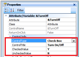
Control Type used by attributes whose values can correspond to True/False value types. For these cases one description is all you need ('Can the account be overdrawn?') and one of two possible values can be selected: if true - the check box will be Checked - and Unchecked if false. The value displayed by the 'Check Box' will be the one assigned to the attribute when user selects it (by checking the box). Otherwise, the assigned value will be the one indicated by the 'Unchecked Value'.

Radio Button Setup
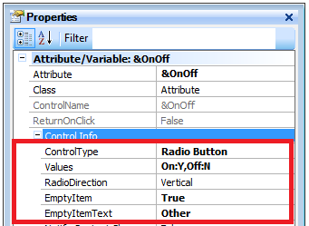
Control Type used by attributes that can have two or more valid values. All valid values are displayed (what i actually displayed are the descriptions associated to the values) and only one value can be selected. Its name originates in old car radio buttons where you were only able to select one button at a time (when one is selected the others where automatically de-selected).
The Radio Options allow you define the text and value for each option, there must be at least one option.
| Values: |
Open the window to load or display the possible values. |
| RadioDirection: |
Horizontal or vertical alignment. |
| EmptyItemText: |
It automatically adds another radio button (depends on the value of the EmptyItem property (True)). |


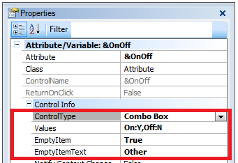
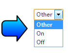
Control Type used generally by attributes with a greater range of values than what a Radio Button could offer (from a practical point of view). For these cases an Edit type field will be displayed. Upon pressing the button on the right of the Edit field, a list of valid values will be displayed. It is called Combo Box because it is a combination (combo) of Edit and List types. The Combo Box Setup allows you to define the text and values for each option of the combo box. There must be at least one option. Options are detailed in the
Radio Button Options section.


A list box is similar to a combo box, but it is always open. The most significant advantage of this type of control is that it allows list management. With this control (programming events, methods, etc.) you can present several lists on the form and remove values, move/copy from a list to another, etc. Most particularly, there are several cases where you will need more than one grid, but what is really needed is more than one list box rather than a Grid. The List Box Setup allows you to define the text and values for each option in the list box,. There must be at least one option. Options are detailed in the
Radio Button Options section.
See FCK Editor.