Deprecated: Since GeneXus 15.
The purpose of this document is to explain how to create a user control for Native Mobile Generator, in this particular case, a user control for BlackBerry.
To develop user controls for BB you'll need the following:
- a PC
- BlackBerry Java Plug-in for Eclipse
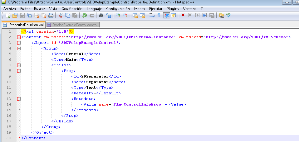
To be able to use the user control in GeneXus, you need to provide the user control defintion. This definition is similar to that of the web user controls, with a few additional properties:
- BB_SupportFiles: is a collection of folders and files with extension .java (libraries).
<BB_SupportFiles>
<Directory>BB</Directory>
</BB_SupportFiles>
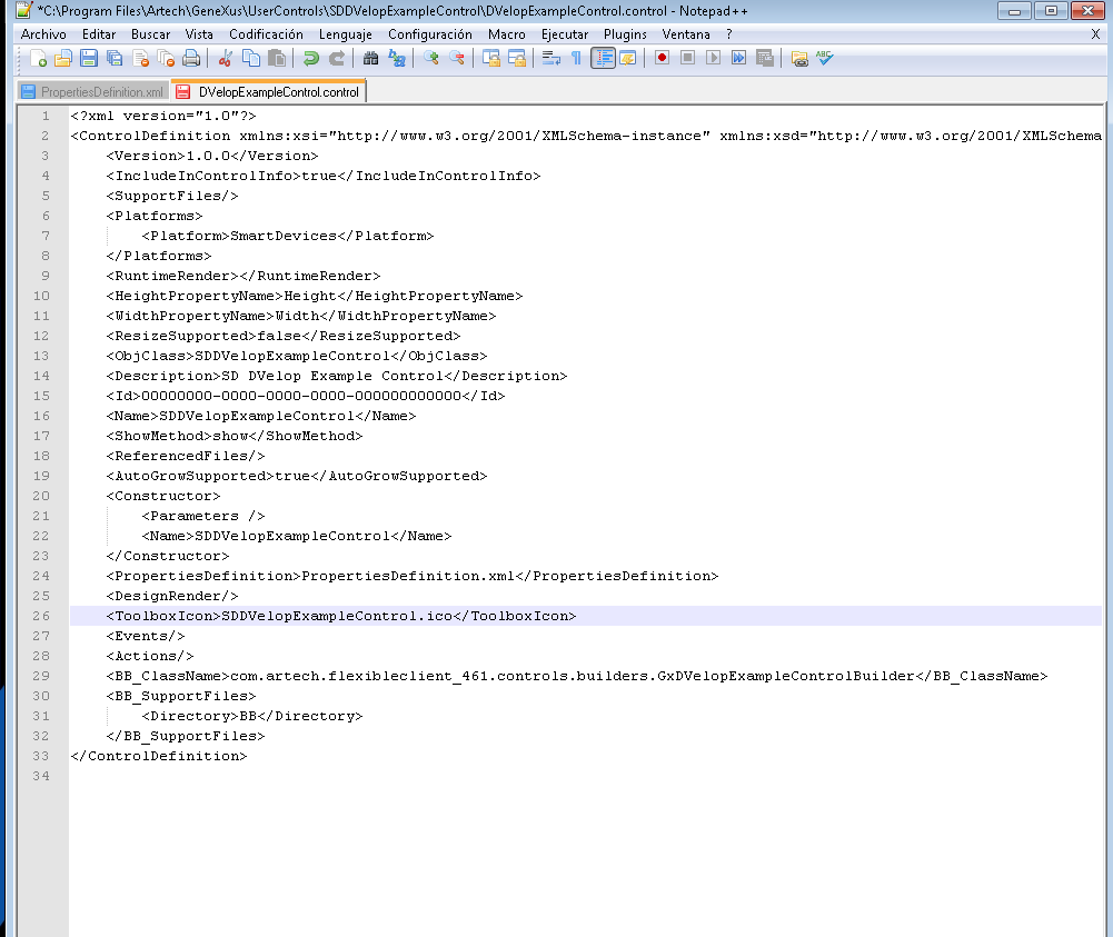
- BB_ClassName: is the name of the class to be called by the application when it needs to display the user control
<BB_ClassName>com.artech.flexibleclient_461.controls.builders.YOUR_CLASS_NAME</BB_ClassName>
or if you want to user 5.0 capabilities
<BB_ClassName>com.artech.flexibleclient_500.controls.builders.YOUR_CLASS_NAME_50</BB_ClassName>
Also, there are some differences with the web user controls:
- Under Platforms, you need a Platform named "SmartDevices"
- <Platforms><Platform>SmartDevices</Platform></Platforms>
To create a List User Control, you'll need to subclass GxUserControlBuilder and override the this methods:
Use this to create a List UC: public IGxEdit buildListUserControl()
Use this to create a Detail UC: public IGxEdit buildDetailUserControl()
This properties are going to be available if you extend the GxUserControlBuilder class, if you don’t need these properties it is not necesary, just create a class with an empty default constructor.
protected String mRawValue;
//Actual String value
protected String mFormatedValue;
//Actual String formated value
protected String mLabelPosition;
public static final String DISPLAY_LAYOUT_NONE
public static final String DISPLAY_LAYOUT_LEFT
public static final String DISPLAY_LAYOUT_TOP
You can use this method if you don’t want to take care about the label of the control createFieldManager(IGxThemeField gx)
protected boolean mIsEnabled;
//Boolean to show if UC is enabled or not;
protected short mFormMode;
protected short mUCMode;
DisplayModes
public static final short VIEW
public static final short EDIT
public static final short DELETE
public static final short INSERT
public static final short DEFAULT
protected DynamicProperties mDynProperties;
In both methods buildListUserControl() and buildDetailUserControl() you will be able to manipulate these features:
if (mDynProperties != null)
mDynProperties.setPropertiesFor(mItemLayout.getName(), field);
ThemeClassDefinition theme = null;
if(mItemLayout != null)
theme = mItemLayout.getThemeClass();
// Use the defined theme for the layout
else
theme = PlatformHelper.getThemeClass("YOUR THEME CLASS NAME");
// Use a custom Theme of your own
field.applyTheme(theme);
package com.artech.flexibleclient_461.controls;
import net.rim.device.api.ui.Field;
import com.artech.flexibleclient_461.controls.GxFieldActionsCallback;
import com.artech.flexibleclient_461.controls.IGxEdit;
public class GxTestControl extends Native Class or Custom implements IGxEdit {
//Define a constructor in order to create your control that suits your needs.
public GxTestControl (){
super();
//Initialize your control.
}
public String getGx_Value() {
// Returns the value of the control. It can be the value of a native control
// or you can store the value in a property.
}
public void setGx_Value(String value) {
// Sets the value of the control. It can be the RawValue or the FormatedValue used
// in the builder.
}
//private String mId;
public String getGxId() {
// Gets the Id of the control. It is used to update controls of the screen for example.
return mId;
}
public void setGXId(String id) {
// It is recommended to store this value in a custom property if it is going to be used as an
// edit control too.
mId = id;
}
public void setGxFieldActions(GxFieldActionsCallback ac) {
// Use this to override some contro events, like clicks of field change events.
}
public Field getField() {
// Do your stuff!!!
return somevariable // Your created control here!!!;
}
This interface extends the IGxEdit interface, so you have to define the methods of both interfaces.
public void applyTheme(ThemeClassDefinition classDef) {
//Receive the ThemeClass and apply them to your control
}
public void applyTheme(ThemeClassDefinition classDef, int style) {
//Receive the ThemeClass and apply customize what is going to be applied
if((style & FONT) == FONT)
//Do your stuff!!!
if((style & BORDER) == BORDER)
//Do your stuff!!!
if((style & BACKGROUND) == BACKGROUND)
//Do your stuff!!!
if((style & BOUNDS) == BOUNDS)
//Do your stuff!!!
}
public static final int FONT
public static final int BORDER
public static final int BACKGROUND
public static final int BOUNDS
public void setVisible(boolean visible) {
// Return if your control is visible or not.
}
public boolean getVisibility() {
// Return if your control is visible or not.
}
public void setEditable(boolean enabled) {
// Make your control editable or not
}
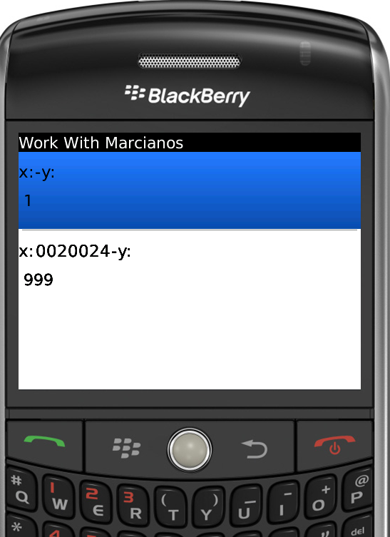
DVelop Example Control Code
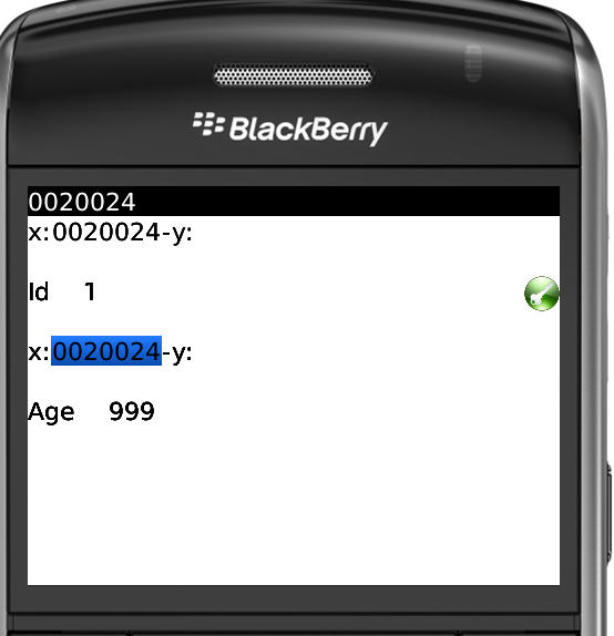
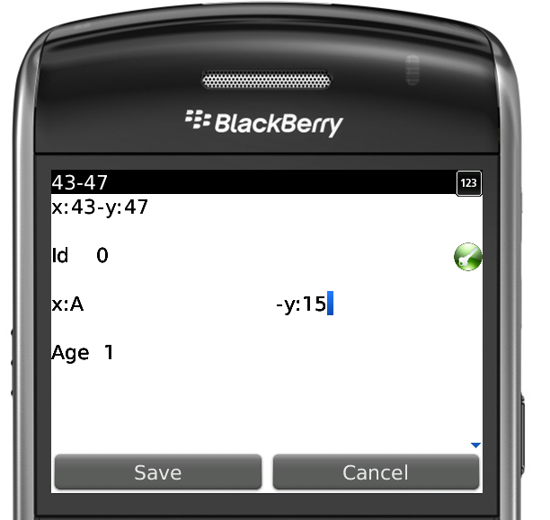
This example shows how to build a simple user control. It is a control with two input boxes for display coordinates of a battleship game.
The current file contains the classes:
GxDVelopExampleControl.java
GxDVelopExampleControlBuilder.java
And other files needed to deploy this HelloWorld example.