Indicates if the Action Group will be rendered as a Bar, a Menu, or an Action Sheet.
| Action Sheet | The Action Group will be rendered as an Action Sheet. |
| Bar | The Action Group will be rendered as a Bar. |
| Menu | The Action Group will be rendered as a Menu. |
Generators: Android, Apple, Angular
Controls: Action Group
Below are described the different behaviors depending on the selected value.
| Bar |
Default value.
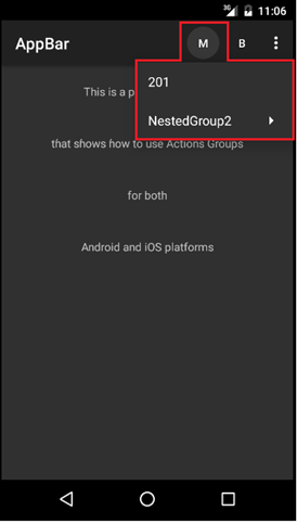
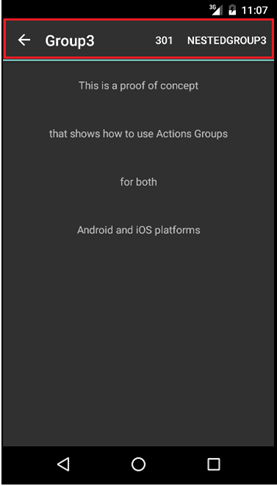
The group is visualized as an Action bar.
On iOS, it may be split into two bars depending on the properties of its contents.
This Control type support nested groups with any control type. |
| Action Sheet |
Its visualization depends on the platform. This control type will not show nested groups; it is only for simple grouping actions. |
| Menu |
This control type is used to display a group of contextual actions with a user interface very similar to the Overflow Menu (which is as low priority actions shown) |
Notes
On iPhone or Ipad with Split Navigation on the left, the Menu Type will be shown as an Action Sheet. On the rest of the targets, it will be shown as Menu. -This is an iOS standard.
The Bar Type for secondary action groups is available only for Android.
This property applies only at design time.
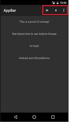
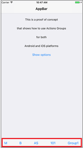
Suppose the application bar with the following options:
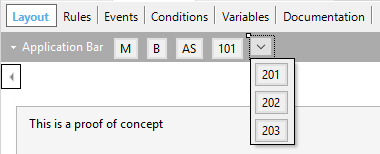
where 'M', 'B', 'AS', '101' are buttons and the last one an ActionGroup within the ApplicationBar with 3 options ('201','202','203').
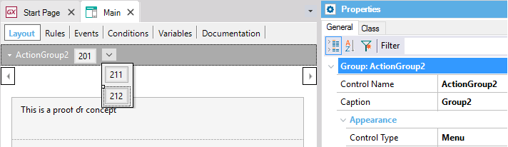
- Button 'M' (Menu) calls ActionGroup2 as 'Menu'.
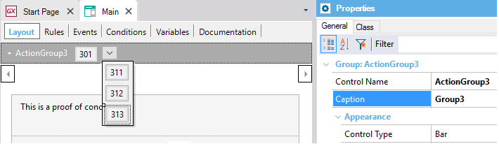
- Button 'B' (Bar) calls ActionGroup3 as 'Bar'.
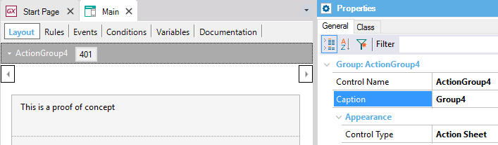
- Button 'AS' (ActionSheet) call ActionGroup4 as 'Action Sheet'.
Sample Code
Event 'Menu'
    ActionGroup2.Show()
Endevent

Event 'Bar'
    ActionGroup3.Show()
Endevent

Event 'AS'
    ActionGroup4.Show()
Endevent
and the following design:
| ActionGroup2 - Menu |
 |
| ActionGroup3 - Bar |
 |
ActionGroup4 - Action Sheet
Note: Nested groups are not allowed. |
 |
The application bar with the initial options are detailed as follows:
| Android - Default Layout |
iOS - Default Layout |
 |
 |
Once you select the options:
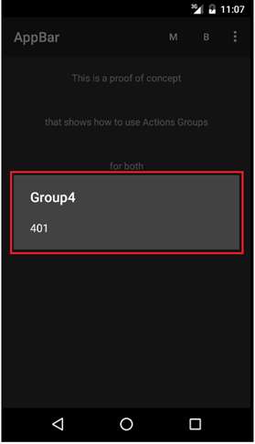
| Android - Menu |
Android - Bar |
Android - Action Sheet |
 |
 |
 |
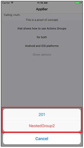
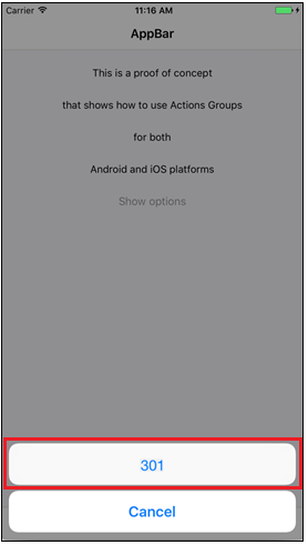
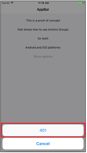
Remember that iOS (iPhone and iPad split) displays the Menu as ActionSheet; Bar is not implemented, so the result is:
| iOS- Menu |
iOS - Bar |
iOS - Action Sheet |
 |
 |
 |
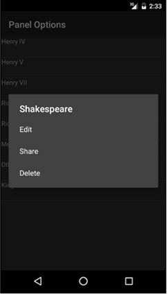
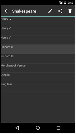
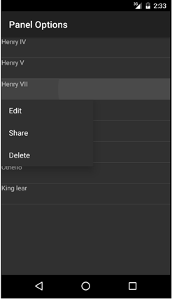
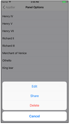
Define an ActionGroup with the following options
The following sample details an ActionGroup with the Edit, Share and Delete options for Android (its three alternatives) and iOS (action sheet only).
| Android - Action Sheet |
Android - Bar |
Android - Menu |
iOS - Action Sheet |
 |
 |
 |
 |
Action Group Control for Panels