In Responsive Web Applicationss only the relevant information is shown for mobile applications. This implies that some elements which are present in desktop screens will not be included in phone screens.
Consider the following example where a list of tourist attractions is displayed. In small screens and wider screens (> 768px), each element of the list is displayed with its photo. On the other hand, in extra small screen devices the photo is not shown.
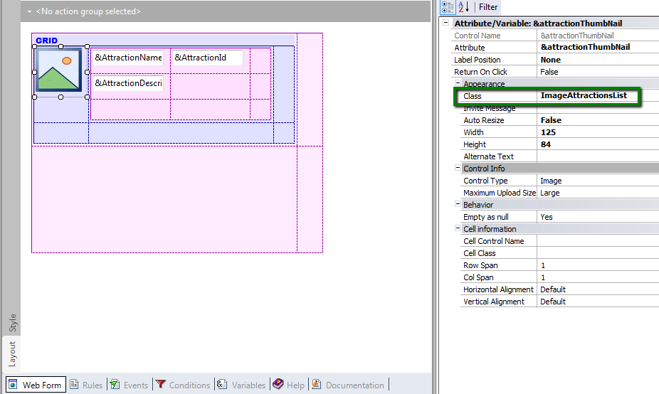
In this case the list of tourist attractions is loaded in a Free Style Grid that includes a photo of each tourist attraction.
The photo and other elements of the grid (&AttractionName, &AttractionId, and &AttractionDescription variables) are inside a Table control nested into the Free Style Grid.
Since the element that is going to be hidden is not inside a cell of the Responsive Table, but inside a common table, we use Conditional Class Properties for Themes to solve this problem.
To do so:
First, assign a class to the image control:
Next, edit the Theme and define a conditional rule. For that conditional rule and the class you've just defined, configure the class property "display = none", as shown below:
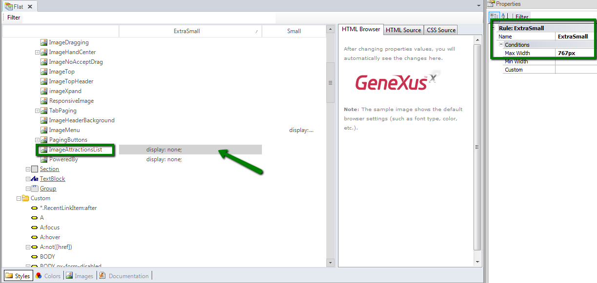
And that's all! The reason is that the conditional class rule will be triggered and its settings will be applied depending on the size of the screen.
How to use the Abstract Editor: Hiding a cell in the Responsive Table
How to design a Responsive Web Application: Hiding a column in a grid