This document is focused to guide you on how to display a menu in a responsive application.
In a RWD, wide screens have plenty of space to display a menu, and that's why it is shown on the left or right side of the web page. However, in small screens (like phone screens) the contents of the web page and the menu may not be appropriate to be displayed together.
So, in the case of extra small screens (<768px), by using a button or an image the user can make the menu appear smoothly on one side of the screen, overlapping with what is shown in the page. After selecting a menu option, the menu disappears, and the page shows the information according to the user's selection.
The button to make the menu appear is the same button used to make it disappear from the screen.
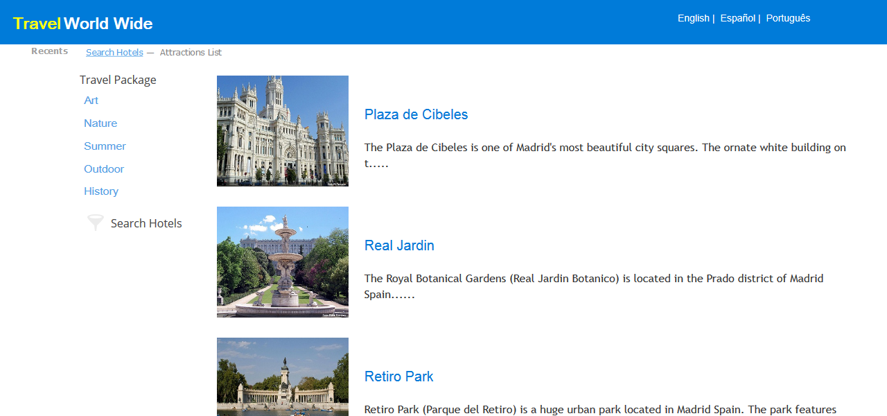
In the GeneXus Web Laboratory example, the menu is shown on the left side of the screen; in the case of wide screens:
When the web page is displayed in cell phone screens, there is a button in the top right corner of the screen for the user to call the menu.
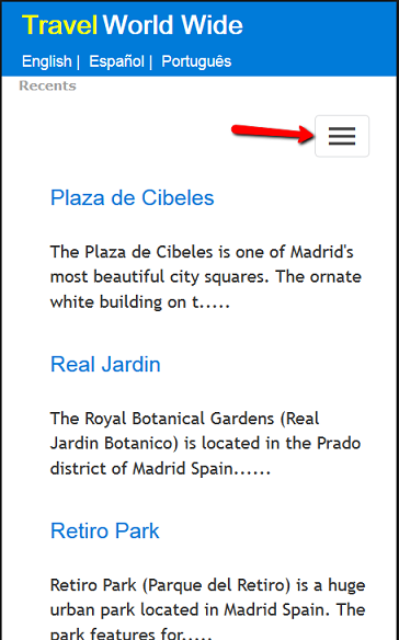
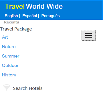
When the user clicks on the button, the menu appears on the left, overlapping with the contents of the page:
The Work With for Web pattern generates this solution for the case of work with objects that have many filter options.
The same happens with default prompts that have filters and ordering conditions.
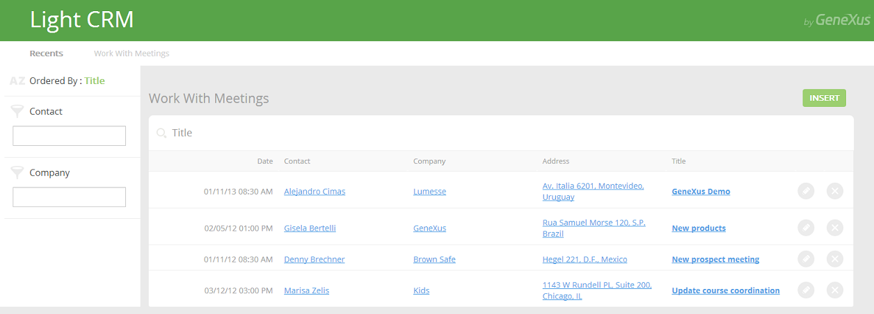
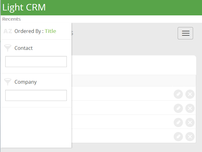
The following example is an automatically generated prompt for the Meeting Transaction of the LightCRM Knowledge Base.
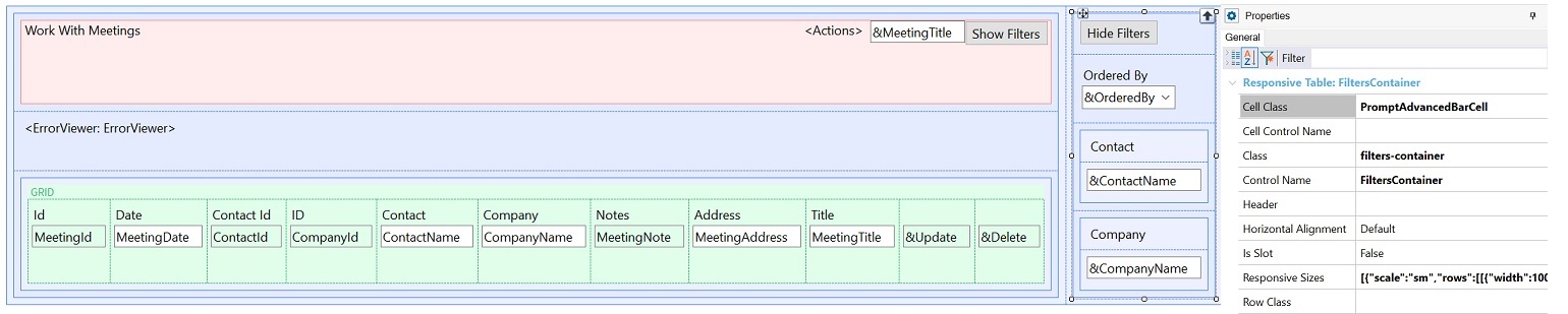
The Abstract Layout of the prompt is shown in the picture below.
Note that:
1. The Responsive Table is called "FiltersContainer" on the right side contains the different filters for the selection list.
The FiltersContainer table is going to be shown by default only for small screen devices and bigger (>=768px), not for extra small screen devices (like phones).
In the case of phones, the user will have the "Toggle" button to press and make the FltersContainer table appear.
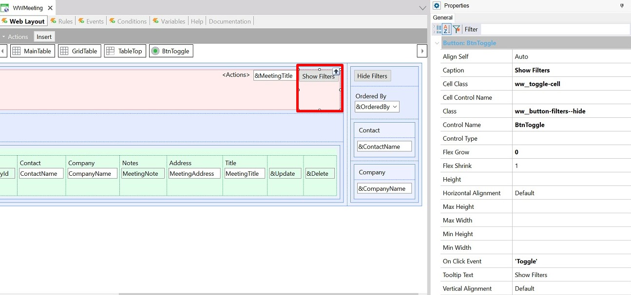
So, the toggle button is visible only for extra small screens.
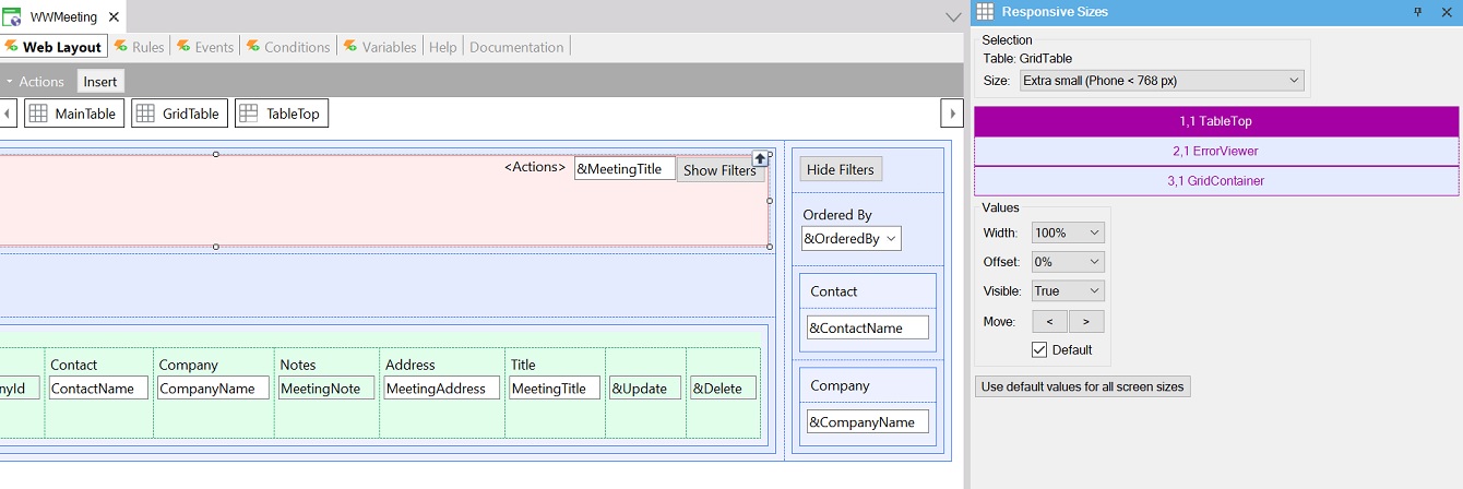
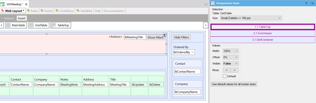
The following pictures show how the Responsive Sizes property is configured to achieve the desired behavior.
2. The following code is associated with "Toggle" on click event:
Event 'Toggle'
    if FiltersContainer.Class = StyleClass:filters-container
        FiltersContainer.Class = StyleClass:filters-container + !" " + StyleClass:filters-container--visible
        GridCell.Class = StyleClass:ww__grid-cell + " col-xs-12 col-sm-9 col-md-10"
        BtnToggle.Class = StyleClass:ww__button-filters--hide
        BtnToggle.Caption = "Hide Filters"
        BtnToggle.TooltipText = "Hide Filters"
    else
        FiltersContainer.Class = StyleClass:filters-container
        GridCell.Class = StyleClass:ww__grid-cell--expanded + " col-xs-12 col-sm-3 col-md-2"
        BtnToggle.Class = StyleClass:ww__button-filters--show
        BtnToggle.Caption = "Show Filters"
        BtnToggle.TooltipText = "Show Filters"
    endif
EndEvent
When the Toggle button class is FiltersContainer, the FiltersContainerVisible Class is added to the list of classes of the FiltersContainer table.
On the contrary, when the class is FiltersContainerVisible, the FiltersContainer class is associated with it.
The effect is that the table appears and disappears when the button is clicked.
The FiltersContainerVisible and FiltersContainer classes are predefined classes, descendants of the Table class.
Basically, the FiltersContainerVisible and FiltersContainer class properties are as follows:
.FiltersContainerVisible {
      display: inherit;
}
.filters-container, .filters-container--visible {
         visibility: hidden;
         opacity: 0;
         padding-left: 20px;
         padding-right: 20px;
         position: absolute;
         right: -15px;
         background-color: $colors.surface;
         width: 100%;
}

.FiltersContainer {
    display: none;
    background: $colors.surface;
    padding: $spacing.inset-m;
    border: solid $borders.extra-small;
    box-shadow: $shadows.m;
}
Additionally, the FiltersContainer responsive table has the Cell Class property set to ".PromptAdvancedBarCell", which is a class with the following settings:
.PromptAdvancedBarCell {
      border-right-width: 1px;
      border-right-style: solid;
      border-right-color: $colors.gray01;
}
Note:
- For a customized example, it may be necessary to adjust the settings of the left property, and the z-Index CSS property of the FiltersContainerVisible class.
- The CSS transition is defined as a Custom property.
The LightCRM is a sample KB where you can find the WW pattern applied to all the web transactions, and the prompts that have filters and ordering conditions are examples where the menu displays differently depending on the screen size.
Look and feel of responsive web applications
Action Group Control for the Web
Responsive Web Applications