Customize column display in Free Style Grids with the Responsive Rendering Mode by setting the number of columns for different screen sizes during design time.
Controls: Free Style Grid
It enables the customization of column displays based on screen device sizes during design time. With this setting, you can specify the number of columns shown for each screen device size.
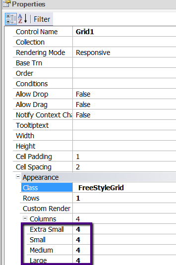
The possible screen sizes are as follows:
- Extra Small (Phones < 768 px)
- Small (Tablets >= 768 px)
- Medium (Desktop >= 992 px)
- Large (Desktop >= 1200 px)
Note: The total number of records shown in all the screen sizes is the same, and it's the greatest number of records depending on the Columns property configuration for some screen sizes.
The Rows property also affects the resulting number of records to be loaded.
This property applies only at design time.
If the Free Style Grid has the Rows property set to 3 and it shows 2 columns for small devices and only one column for extra small devices, 6 records are going to be shown in both screens (remember that in extra small screens, all columns will be shown in only one column).
Rendering Mode property in Free Style Grids
Responsive Web Applications