The concept of Timeline refers to a chart where the X axis is always time. So, a timeline chart offers a way to display the variation of a series of values over time, allowing to see easily and compare the evolution of a process or focus on a defined period.
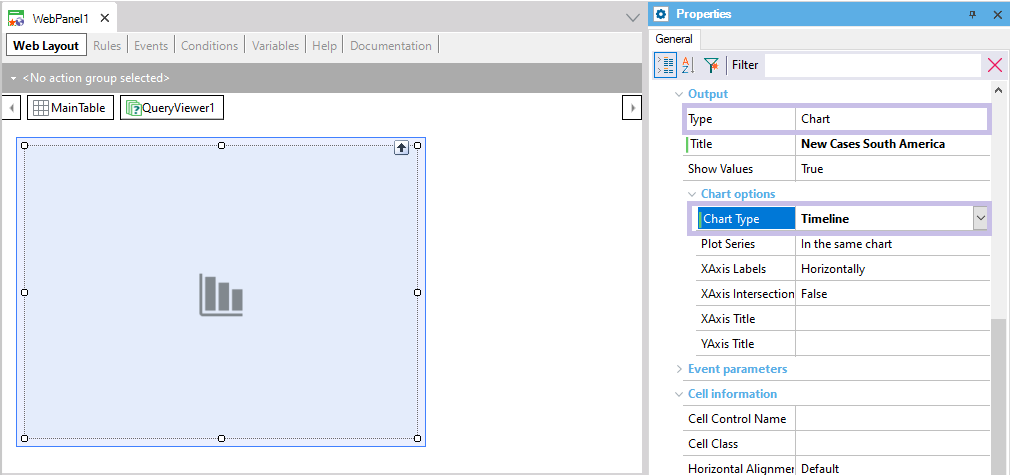
GeneXus developers can define this type of chart by using the QueryViewer control. To do so, a QueryViewer control (inserted in a web form) must have its Type property set to Chart, so that its Chart Type property may be set to Timeline:
A Timeline chart can only be used for queries that have a single attribute (or expression) of Date or DateTime type as an axis and nothing else. Meanwhile, it can have any number of attributes or expressions that act as data.
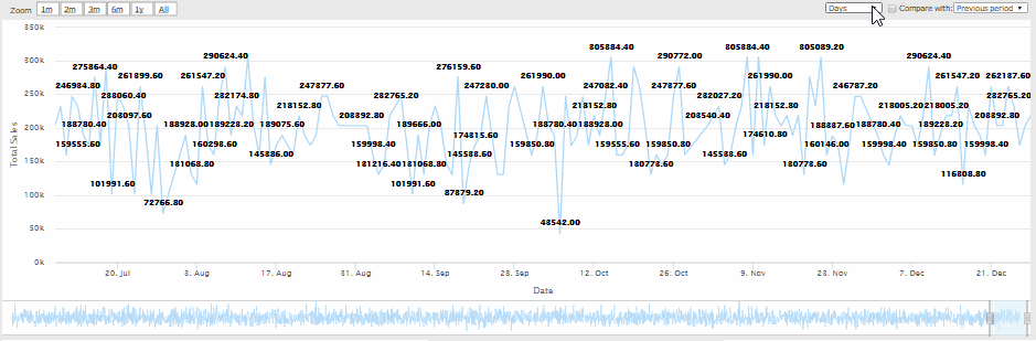
The Timeline chart is dynamic, in the sense that it has several controls in the upper section to better analyze the data; for example:
- Zoom: It allows setting the time window to the previous year, 6,3,2 or 1 months, or the full range.
- Group: It allows aggregating (adding, averaging, counting, maximizing or minimizing, depending on the aggregation defined in the data being charted) the values by day, week, month, quarter, semester or year. For DateTime data types, they can also be aggregated by second, minute or hour.
- Compare, whether with the previous year or period (determined by the width of the selected time window).
At the bottom, it provides a couple of cursors to select a time window of any width and origin (different than those provided by the Zoom button).
As an example of use of this type of Chart, the animation below shows the sales made by a company in a determined period:
- Step Timeline: a step timeline chart is similar to a line chart, with the X axis representing the time as a continuum. This chart type uses vertical and horizontal lines to connect the data points in a series forming a step-like progression.
- Smooth Timeline: a step timeline chart is similar to a line chart, with the X axis representing the time as a continuum. The smooth timeline chart connects the data points with a spline (curved line) instead of with a straight line.