Scatter charts are useful for comparisions among diferenes values. Scatter Chart Control is an interactive chart, try clicking on the different section or on the legend entries to know values and percentages.
The user control is really simple, you just need to set one property in order to get the control working.
To show a simple bar chart to illustrate a comparision between Sales and Expenses for certain years, you need just :
- Drag and drop Google Charts Control.
- Set Scatter Chart to property named Type.
- Assign to the Data property a variable based on GoogleChartData data type (this SDT is automatically imported when dropping the control to a web form).
- Load the information that will be shown by the chart using a variable based on GoogleChartData.
//Sample code for GoogleCharts
Sub 'LoadGoogleChartData'
 &GoogleChartData.Categories.Add("2005")
 &GoogleChartData.Categories.Add("2006")
 &GoogleChartData.Categories.Add("2007")
 &GoogleChartData.Categories.Add("2008")

 &GoogleChartSeries.Name = "Sales"
 &GoogleChartSeries.Values.Add(3045)
 &GoogleChartSeries.Values.Add(4246)
 &GoogleChartSeries.Values.Add(6537)
 &GoogleChartSeries.Values.Add(2537)
 &GoogleChartData.Series.Add(&GoogleChartSeries)

EndSub
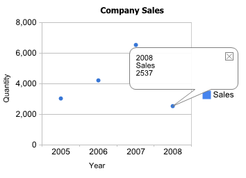
It looks like :
This implementation is analog to Column chart for more details about adding series, customizing or handling events please refer to Column Chart Control
Scatter Chart Control is based on the Google Scatter Chart Control.