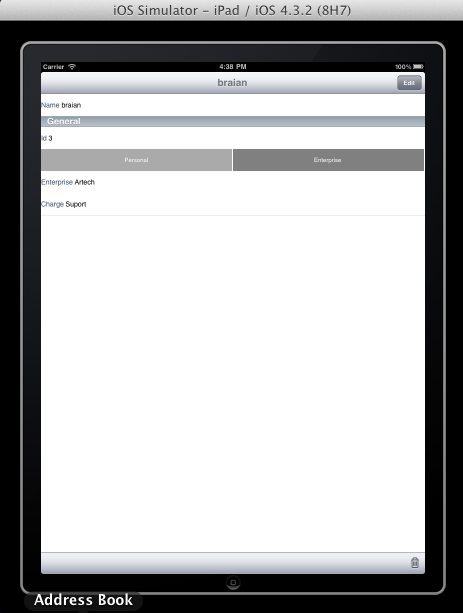
Use the Tab Control whenever you need to organize your information into different tabs as it is used to display a set of controls grouped into different tabs.
In this article, you will see an example of how this control is used.
Properties (each Tab)
| Caption |
Sets the name that will be shown to the user at the top of the tab. |
| Image |
Sets an Image beside the caption.
If the Caption field is filled, the image's size will be 24x24dips. Otherwise, the size will be 44x44dips
|
Steps
1. Create a User Transaction object as shown below.
User
{
     UserId*
     UserName
     UserAddress
     UserCompany
     UserJobPosition
}
2. Apply the Work With Pattern to the Transaction (see Applying Work With Pattern).
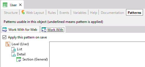
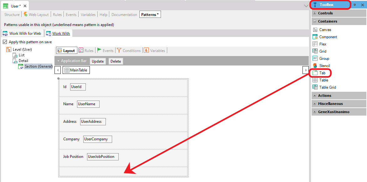
3. In the General Section, below the Detail node, change how the information is displayed by including a tab control in your Layout. To do so, drag the Tab control from the toolbox:
4. After doing this, you should obtain something similar to the following:
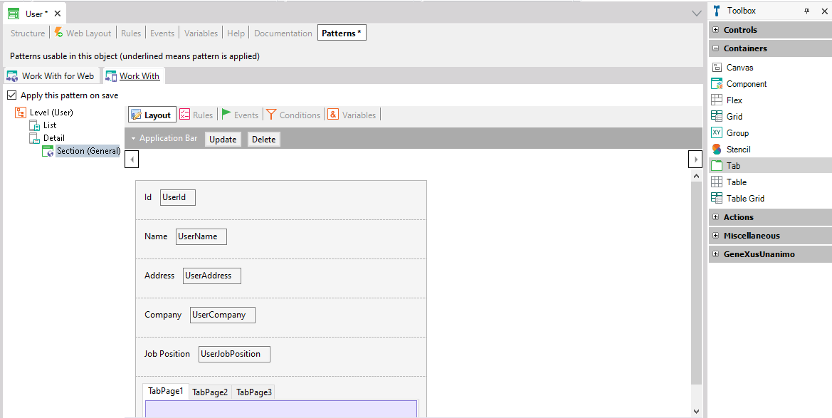
5. Now you have the tab control in your layout. Customize it to your needs:
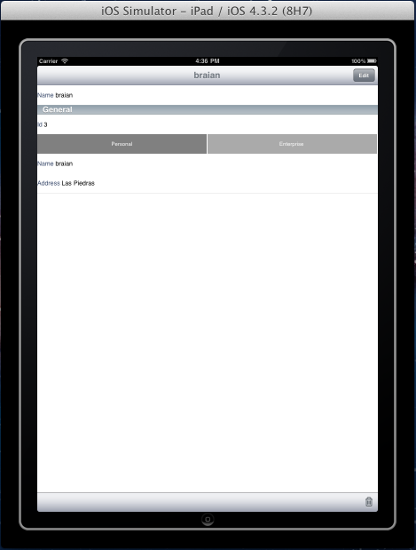
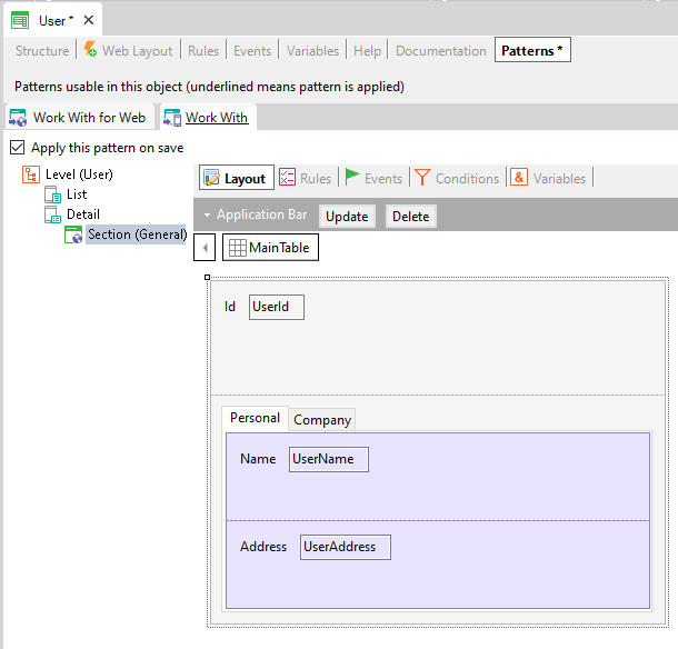
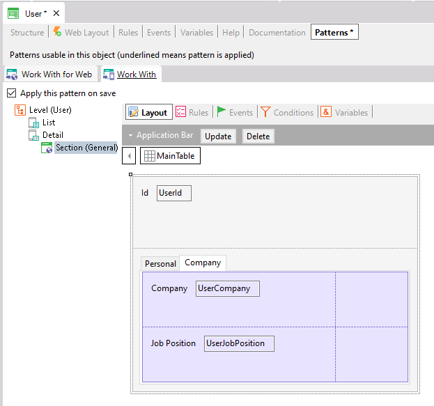
- Using the Caption property, enter "Personal" to name the first tab and "Company" for the second tab. Also, delete the 3rd tab (not necessary for this example). Now you have to add the Attributes/Variables you want to show on your tabs and to do so you simply drag each control to any tab you want.
- Drag "UserName" and "UserAddress" to the Personal Tab, and "UserCompany" and "UserJobPosition" to the CompanyTab.
- You can also insert a Tab control into another Tab control, taking into account the spacing for both controls.
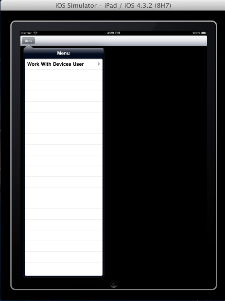
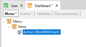
6. Create a Menu object and add the WorkWith from User Transaction to it.
Done! You have your attributes grouped.
