The Text Block control allows you to insert text in forms with multiple functions. For example, to show short texts next to other controls, or to show messages, warnings, etc.
- This control can be seen as text directly inserted into the form.
- You can change its appearance (its back color, content, etc.) dynamically (at runtime) by setting properties.
For example, the following code changes the text and the back color of the Text Block named TextBlock1:
Event Start
  TextBlock1.Caption='Hello world!'
  TextBlock1.BackColor=RGB(255,000,000)
EndEvent
- Drag the Text Block icon from the GeneXus Toolbox.
- Drop it into the desired part of the form.
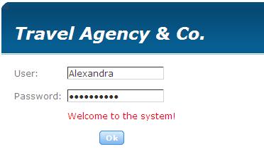
In the following example, you can see a user login screen. If the user name and password entered are correct, a success message will be displayed in the Tb_Msg Text Block present in the form. Otherwise, the following message will be displayed: "Password incorrect. Please retry." in the same Text Block.
In the event associated with the button, the following code has been defined:
Event 'Ok'
  &PassIsValid=PassIsValid()
  Do case
     case &PassIsValid = True
          MsgTB.Caption = 'Welcome to the system!'
     otherwise
          MsgTB.Caption = 'Invalid password. Please retry...'
  EndCase
EndEvent
You can associate a link to a Text Block control, like the following code shows:
Event Start
    CustomersTB.Link = Link(WWCustomer)
    ProductsTB.Link = Link(WWProduct)
    ProductTypesTB.Link = Link(WWProductType)
    SuppliersTB.Link = Link(WWSupplier)
Endevent
In particular, in the previous example, there are four Text block controls (named CustomersTB, ProductsTB, ProductTypesTB, and SuppliersTB) that were included inside an Action Group Control to show them in the Form inside a Toolbar, as the following image shows:
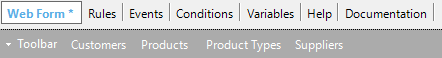
When the user clicks on each Text Block, the corresponding Work With for Web object will be opened at runtime.
Text Block properties
Action Group Control for the Web
Action Group Control for Panels