Defines a specific UI control (in addition to the predefined in the GeneXus toolbox).
- It provides the possibility to define User Controls in a built-in way into the Knowledge Base.
- Allows you to base its appearance on a style provided by a designer, CSS Framework, etc.
- Generates server-side HTML code, which means power, since it is easier to scale a server than the clients.
A User Control object contains three tabs:
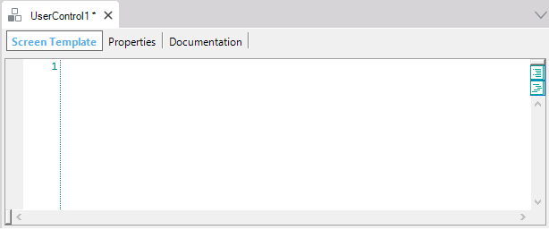
- Screen Template: In this section, you have to include the HTML (or XML in some libraries) code provided by designers or CSS Frameworks.
- Properties: In the Screen Template section you can replace static data (hard-coded) with properties names defined by you bounded by {{ }} with the objective of dynamizing the User Control. These properties names defined by you will appear in the Properties section, so that you can indicate their data types, default values, etc. In addition, in the Screen Template section, you can define properties names defined by you bounded by {{{ }}} (triple mustache); you will find them also in the Properties section defined with a string data type, and their objective is to be able to assign raw HTML code to them.
- Documentation: Here you can write local documentation about the object.
Also, something very important you must set for the User Control is its Base CSS property in User Control object.
The following sample describes a use case to be generated with the GeneXus Java, .NET, or .NET Framework generators. Read Creating Angular User Controls in GeneXus if your use case is using the Angular generator.
Suppose that you want to integrate SemanticUI controls to achieve the design of this Card:

SemanticUI provides the HTML corresponding to this widget:
<div class="ui card">
   <div class="image">
      <img src="/images/avatar2/large/kristy.png"> </div>
      <div class="content">
         <a class="header">Kristy</a>
         <div class="meta"> <span class="date">Joined in 2013</span> </div>
         <div class="description"> Kristy is an art director living in New York. </div>
     </div>
   <div class="extra content">
       <a> <i class="user icon"></i> 22 Friends </a>
   </div>
</div>
Therefore, the necessary steps are as follows:
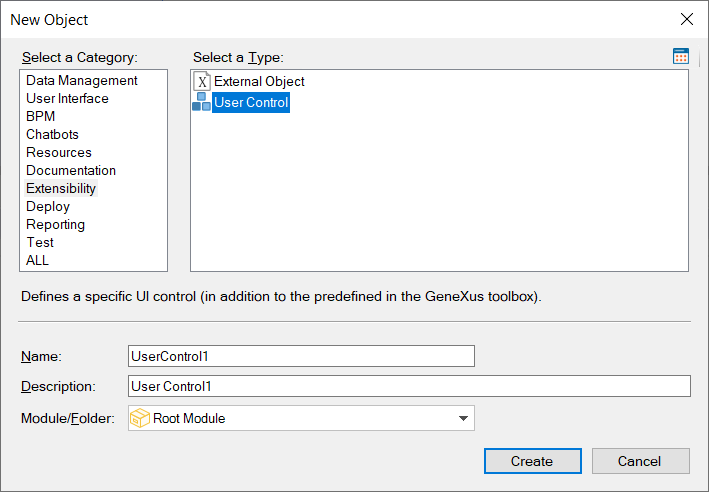
1. Create a User Control object (by selecting in the main GeneXus Menu File > New > Object):
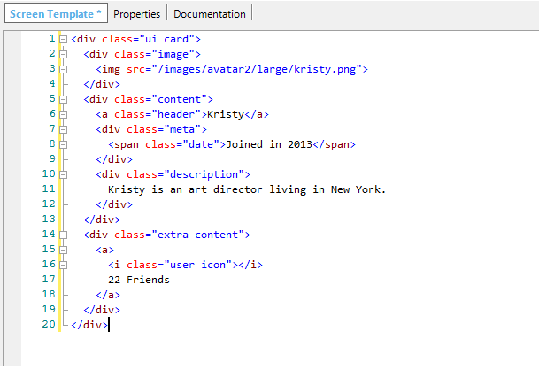
2. Paste the HTML code stated above in the Screen Template section of the User Control object:
3. Proceed to replace fixed data with properties names defined by you enclosed between {{ }} to dynamize the User Control object.
e.g. {{ImageUrl}}, {{Title}}, {{MetaInfo}}, {{Description}} and {{ExtraContent}} are properties called with those names:
<div class="ui card">
   <div class="image">
      <img src="{{ImageUrl}}"> </div>
      <div class="content">
         <a class="header">{{Title}}</a>
         <div class="meta"> <span class="date">{{MetaInfo}}</span> </div>
         <div class="description"> {{Description}} </div>
     </div>
   <div class="extra content">
       <a> <i class="user icon"></i> {{ExtraContent}} </a>
   </div>
</div>
Note that those properties are created in the Properties User Control tab, and there you can define their data types, default values, etc.
Once the object has been saved, it is ready to be used in a Web Panel object.
4. When creating a Web Panel, in the toolbox you will see, within the Controls section, the User Control button. Drag & drop it on the object's Web Layout. The Select Object dialog will be displayed showing the list of User Control objects available to be added to the Web Panel Web Layout. Select the desired User Control.
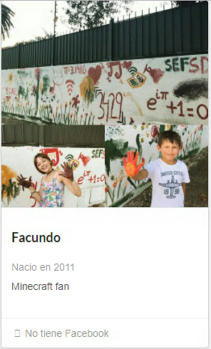
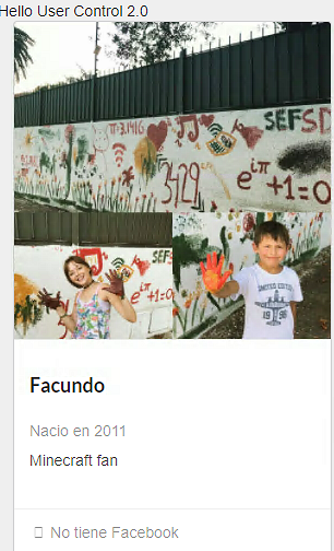
Then, you can set the User Control properties in any GeneXus event. For example, in the Start event you can define:
Event Start
    card1.Title = "Facundo"
    card1.MetaInfo = "Born 2011"
    card1.Description = "Minecraft fan"
    card1.ExtraContent = "Doesn't have a Facebook account"
    card1.ImageUrl = "https://genexususa.com/wp-content/uploads/2017/08/Gaston-Milano-GeneXus-CTO-cropped.jpg"
EndEvent
You can set the properties at both Design Time and Runtime.
The result of running it is as follows :
It is possible to define events in the HTML code elements. The events available are the DOM (Document Object Model) events.
Applying the above concept and using the Click event as an example, the code would look as follows:
<div class="ui card" {{OnClick}} >
   <div class="image">
      <img src="{{ImageUrl}}"> </div>
      <div class="content">
         <a class="header">{{Title}}</a>
         <div class="meta"> <span class="date">{{MetaInfo}}</span> </div>
         <div class="description"> {{Description}} </div>
     </div>
   <div class="extra content">
       <a> <i class="user icon"></i> {{ExtraContent}} </a>
   </div>
</div>
and in the User Control events section, the OnClick event will be available.
Suppose in the Web Panel the following is programmed:
Event card1.OnClick
    msg("Hello User Control Object!")
EndEvent
Finally, when selecting Run, you will see that interactivity and connectivity have been generated in your control.
For more details about event management, read User Control Object - Handling events.
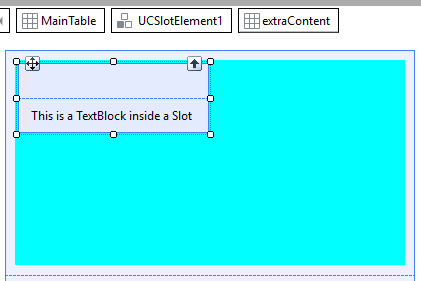
In the previous case, there is a rather specific control in the elements contained by the Card. Assuming that instead of entering something fixed in the extra content section you want to be free to include whatever you want in that slot, what should you do?
GeneXus allows doing this with the HTML 5 standard element called: slot. A slot must be added to the extra content section (a div within the User Control) to be filled by the control's user.
The modified code is as follows:
<div class="ui card" {{Click}} >
   <div class="image">
      <img src="{{ImageUrl}}"> </div>
      <div class="content">
         <a class="header">{{Title}}</a>
         <div class="meta"> <span class="date">{{MetaInfo}}</span> </div>
         <div class="description"> {{Description}} </div>
     </div>
   <div class="extra content">
       <a> <i class="user icon"></i> {{ExtraContent}} </a>
       <slot name="myContent" />
   </div>
</div>
When opening the Web Panel, you can see that now there is a table within the User Control called "myContent" to which any element of the toolbox can be dragged.
Suppose a TextBlock is added to define a new caption:
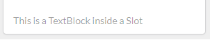
When running it after the change, you can see that the footer has changed and shows the text defined in the TextBlock added:
What if instead of wanting to show simple data you want to show a list?
For this purpose, there are properties of collection type.
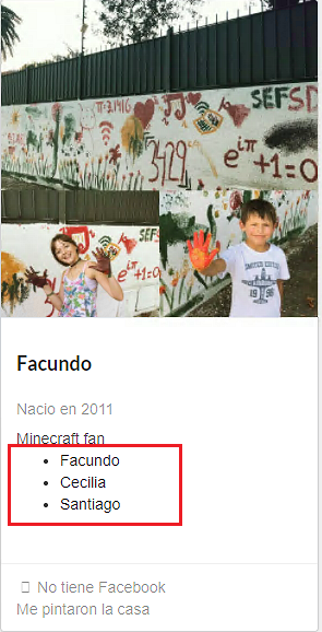
Suppose that in addition to the data for the Card a list of categories is received to be displayed in the extra content as an HTML list (UL). So, you want to generate something like this:
<UL>
<LI>Facundo</LI>
<LI>Cecilia</LI>
<LI>Santiago</LI>
</UL>
To model this situation, the properties of the Collection type will be indicated by adding a # as a prefix to the name.
By applying this to the Card control, the code will look as follows:
<div class="ui card" {{Click}} >
   <div class="image">
      <img src="{{ImageUrl}}"> </div>
      <div class="content">
         <a class="header">{{Title}}</a>
         <div class="meta"> <span class="date">{{MetaInfo}}</span> </div>
         <div class="description"> {{Description}} </div>
         <div>
            <UL>
            {{#Categories}}
               <LI>{{Name}}</LI>
             {{/Categories}}
             </UL>
         </div>
     </div>
   <div class="extra content">
       <a> <i class="user icon"></i> {{ExtraContent}} </a>
       <slot name="myContent" />
   </div>
</div>
When saving the control, GeneXus will realize that there is a new property of SDT Collection type and that each member of that collection needs a Name property.
Now you only need to define a variable of Collection type based on the SDT created, assign it to the Categories property of the control and load it in the Start event.
SDT:

Associating the SDT with the control (binding):

Code to perform the load:
Event Start
   &Item = new()
   &Item.Name = "Facundo"
   &CategoriesItems.Add(&Item)
   &Item = new()
   &Item.Name = "Cecilia"
   &CategoriesItems.Add(&Item)
   &Item = new()
   &Item.Name = "Santiago"
   &CategoriesItems.Add(&Item)
EndEvent
The result is as follows:
If you wanted to trigger the Click event in every element of the previous iteration instead of triggering it in the highest hierarchical element in the HTML (the outermost one), how would you do it?
GeneXus automatically infers that it is a repetitive element, and when triggering the event, it makes the index of the selected element available in a property.
So, the Click event can be programmed as shown below:
Event card1.Click
    &Name = &CategoriesItems.Item(card1.CategoriesCurrentIndex).Name
    msg(&Name)
EndEvent
Clicking on each name displays it.
Generators: .NET Framework, .NET, Java, Angular
SemanticUI Design System
 User control object presentation at #GX28 (in Spanish)