You can add your own Tokens or new classes in the Style section of the Design System Object and then assign these classes to the controls you use to build the UI.
For example, to create a new button style, you can create a new class in your Design System as follows:
styles NewKBName {
@import GeneXusUnanimo.UnanimoWeb;

.button-red {
            background-color: red;
            font-size: $fontSizes.s;
            font-family: $fonts.primary-semibold;
            color: $colors.on-primary;
            text-transform: uppercase;
            border:none;
            border-radius: 15px;
        }
}
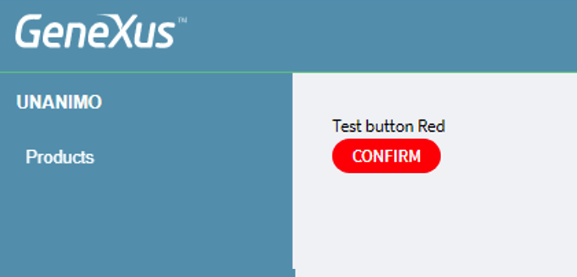
In this example, the class button-primary was copied from Unanimo Design System. Then the background color was changed to red, a border radius was added to give it a more rounded aspect, and the classes "Button button-red" were assigned in the Panel. At runtime, it looks like the image below:
In general, you need to first assign the base class—in this case, "Button"—and then the classes that you create to change the style.
Finally, you can extend the Design System by simply adding new Tokens or classes and applying these classes in the controls over your Panels.