The purpose of the Progress Indicator User Control is to be able to show an indicator of the activity of a process (or the progress of the process when the percentage of the advance is known).
Smart Devices apps are all about User Experience (UX), User Interface (UI) and Functionality. The apps have to be constantly interacting with the user, responding to what the user expects and activates with his gestures. Giving the user feedback of the action he triggered is one of the most important features a Smart Device App should have. An app that doesn't give feedback on the actions that are being performed misleads the user into thinking that it may have crashed, or his gesture wasn't properly recognized.
The same happens in web applications, where it is necessary to give feedback to the user in particular for processes that do not send an immediate response.
So Progress Indicator enables the application to give feedback to the user when batch processing is being done.
An External Object is included in Genexus so different methods and properties can be used to manage and display this control.
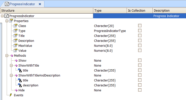
| Class |
To assign a Theme class to the control. |
|
|
The Progress Indicator can be determinate or indeterminate. Determinate indicators show the progress of the processing, while indeterminate ones don't inform you about the status during the process |
|
|
Main text shown on the progress Indicator |
|
|
More information shown on the progress indicator screen |
|
|
This property is used when the Type is Determinate. This property specifies the value for the task completion |
|
|
When the determinate type is used, this value is the current percentage of the processing task |
|
|
Invokes the progress Indicator screen |
|
|
Invokes the progress Indicator with a custom title |
|
|
Invokes the progress indicator with a custom title and description |
|
|
Closes the Progress Indicator screen.
Smart Devices: Every time a Progress Indicator is used, the Hide method is automatically added at the end of the composite block. If you want to set it manually to invisible, you can use the Hide method
|
The API used for Web and Smart Devices is the same.
&ProgressIndicator.Type = ProgressIndicatorType.Determinate
&ProgressIndicator.MaxValue = 100
&ProgressIndicator.Value = 10
&ProgressIndicator.ShowWithTitle("Progress..") //Show ProgressIndicator

//Processing
&ProgressIndicator.Value = 20

//Processing
&ProgressIndicator.Value = 30

//Processing
&ProgressIndicator.Value = 80

//Processing
&ProgressIndicator.Value = 100

//Processing
&ProgressIndicator.Hide()
The code shown above in case of web applications, has to be included in a Procedure object and this procedure has to be submitted (executed asynchronously) - it should be invoked using the Submit command.
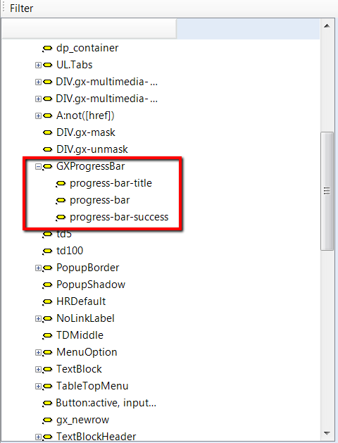
By default, the progress indicator for web is assigned to the GXProgressBar class under the custom nodes of the Theme.
The classes progress-bar-title and progress-bar are descendants of GXProgressBar, and may be customized if necessary by using the Theme editor.
You can make changes to that or create a child node of GXProgressBar and set the class to the control at runtime as follows:
&ProgressIndicator.Class = "progress-bar-success"
See HowTo: Use a Progress Indicator in a Panel for more information on the use of this control in Smart Devices.
In GeneXus X Evolution 2 Upgrade 1 it is available for iOS and in GeneXus X Evolution 2 Upgrade 2 for Android and Blackberry.
For web, it is available in GeneXus X Evolution 3.