Displays data associated with several records in such a way that each data item to be displayed is included as a column.
Objects: Panel object
Generators: Angular
The Tabular Grid control allows you to display records in such a way that each data item to be displayed is included as a column. The control allows you to drag and drop columns to reorder them.
Attributes are always read-only and variables may be edited.
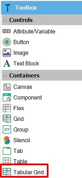
To add a Tabular Grid to a Panel, drag the Tabular Grid Control Icon from the Toolbox to the Layout.

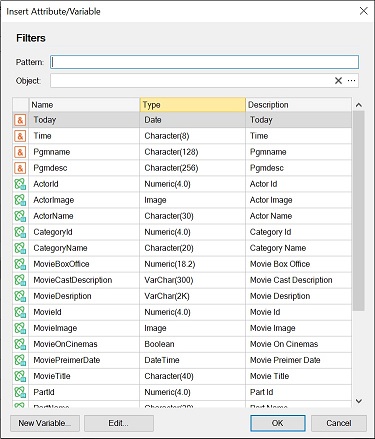
The Selector window will open to choose which attributes/variables you want to include in it:

The Tabular Grids allow end users to move the columns inside it.
Below is a list of properties that can be configured to style the Tabular Grid control.
gx-grid-header-row-class
gx-grid-column-class
gx-grid-row-class
gx-grid-even-row-class
gx-grid-odd-row-class
gx-grid-selected-row-class
gx-grid-hover-row-class
gx-grid-focused-row-class
You can configure them in the Style tab of the Design System Object which is assigned to the Style property for Platforms.
This control is available since GeneXus 18 Upgrade 3.
Enable Multiple Selection property
Selection Type property
Tabular Grid Navigation and Selection