Sets the class that styles all the Grid's / Tabular Grid's columns.
Level: Design System Style Class
You have to configure this property in the Styles tab of a Design System Object with a class defined by you.
This property applies only at design time.
Suppose your Knowledge Base is named "KBTest", and therefore a predefined Design System Object is created with the same name.
In the Styles tab of your "KBTest" Design System object, you define a class named .GridProduct.
styles KBTest {
@import GeneXusUnanimo.UnanimoWeb;
.GridProduct
    {
     gx-grid-column-class: GridProductColumn;
    }
.GridProductColumn
    {
     background-color: #0F0;
    }
}
For the .GridProduct class, you have to configure the gx-grid-column-class property with a class defined by you. So, for example, define the .GridProductColumn class, set its background-color property to a specific color, and finally assign the .GridProductColumn class to the gx-grid-column-class property as explained before.
Finally, to add style to an entire Grid (included in a Web Panel) or an entire Tabular Grid (included in a Panel), you have to assign the .GridProduct class to the Class property of the control you are working with.
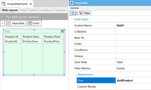
The following image shows a Web Panel Grid with its Class property set to .GridProduct:
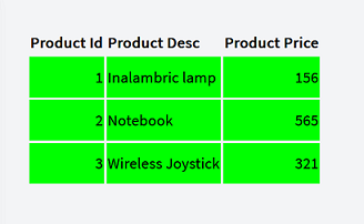
When you run the Web Panel, its entire Grid is shown as follows:
Angular supports the Tabular Grid as from GeneXus 18 Upgrade 3. Therefore, this property is available for Angular as from the same version.
DSO properties that begin with gx- and end with class