Indicates the column size (depending, for example, on screen size or other details). In addition, the end user can change the column size at runtime.
Generators: Angular
Level: Design System Style Class
The gx-grid-column-size property can be configured inside a class defined in the Styles section of a Design System Object. Next, the class for which this property is configured must be indicated for the Column class property of a Tabular Grid column. In addition, the Column Size property of the same Tabular Grid column must be set to "From ColumnClass".
The possible values for this property are:
-
<length>: Indicates the column size in a certain unit of measurement; for example, 150px.
-
<percentage>: Indicates the column size with a percentage value; for example, 20%.
-
<flex>: Indicates the column size with a flexible value; for example, 1fr.
-
max-content: Indicates that the column size will be determined based on its largest content. The column width will expand to accommodate the widest content within it.
-
min-content: Indicates that the column size will be determined based on the minimum required content. In other words, the column will automatically adjust its width to accommodate the smallest content within it.
-
minmax(<min>, <max>): Indicates that the column size will be a variable size between the values given for min and max.
-
auto: The column will automatically expand or shrink its size based on the available space in the layout or container. It allows the column to dynamically adjust its width to fill the available space while considering the content within it.
The behavior of this property is equivalent to the Column Size property for Tabular Grid Columns. However, when using the gx-grid-column-size property, you have the advantage of being able to resize a column based on a with a wider range of options.
So, if you need to to configure a certain size for a column indicating the most usual alternatives, set the Column Size property for Tabular Grid Columns. Otherwise, solve it using a Design System Object and the gx-grid-column-size property.
This property applies only at design time.
Suppose your Knowledge Base is named "BillingSystem", and therefore a predefined Design System Object is created with the same name.
Look at the Style tab of your "BillingSystem" Design System object:
styles BillingSystem {

@import GeneXusUnanimo.UnanimoWeb;

}
Define a class named "GridColumnClass" with its "gx-grid-column-size" configured as follows:
      .GridColumnClass {
           gx-grid-column-size: 300px;
    }
    @media (max-width: 960px) {
       .GridColumnClass {
            gx-grid-column-size: 100px;
        }
    }
Note that by using the media rule you define that if the screen size is smaller than 960 px the column size will be 100px. Otherwise, it will be 300px.
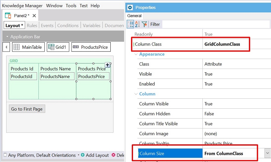
Consider a Web Panel object that contains a Tabular Grid control with columns.
Select the ProductsPrice attribute column and set its Column Class property to GridColumnClass. For the same column, set its Column Size property to "From ColumnClass".
Build the Panel and run it. You will see the ProductsPrice column with the corresponding size.
This property is available since GeneXus 18 Upgrade 7.