Sets the class that styles a column of a Grid included in a Web Panel or a column of a Tabular Grid included in a Panel.
Generators: .NET, Java, Angular
For each column of a Grid included in a Web Panel or a Tabular Grid included in a Panel, you can set the Column Class property (with the name of a class) to give a style to it.
This property applies both at runtime and at design time.
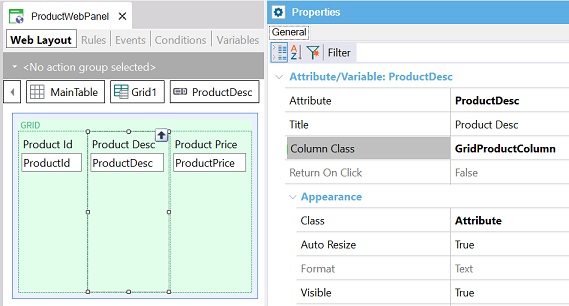
The following image shows a Web Panel that contains a Grid in its Web Layout. For each column of the Grid, the Column Class property can be set.
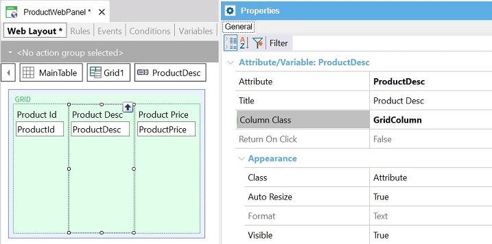
As you can see, for the second column of the Grid (ProductDesc attribute), the Column Class property is set to GridColumn. GridColumn is the name of a predefined class included in every Web Theme object.
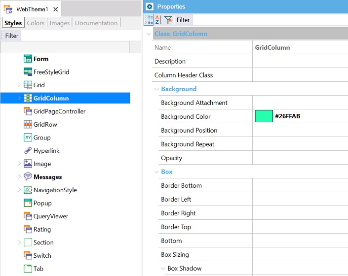
Suppose that for the GridColumn class of the Web Theme you are using you set the Background Color property, as shown below:
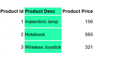
At runtime, the second column (ProductDesc attribute) of the Web Panel Grid will be shown as follows:
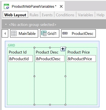
The Column Class property can also be set at runtime. For example, look at the following Web Panel object; in this case, it contains a Grid with variables.
To add the same style as the example above to the second column, you can define the following code:
Event Start
      &ProductDesc.ColumnClass = "GridColumn"
endevent
In addition, when setting the ColumnClass property at runtime, you can set it for a column, line by line.
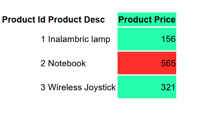
Suppose you need to set the column showing ProductPrice with a red background color for the rows of the Grid whose price is higher than 500.
The following code solves this requirement:
Event Grid1.Load
    For each Product
        &ProductId = ProductId
        &ProductDesc = ProductDesc
        &ProductPrice = ProductPrice
        if &ProductPrice >500
            &ProductPrice.ColumnClass = "RedColumn"
        else
            &ProductPrice.ColumnClass = "GridColumn"
        endif
        grid1.Load()
    endfor
endevent
Consider that the "RedColumn" class must be defined as a child node of the GridColumn predefined class.
At runtime, you will see:
The Column Class property can also be set to a class of a Design System Object.
To do so, follow the steps below.
Suppose your Knowledge Base is named "BillingSystem", and therefore a predefined Design System object is created with the same name.
Look at the Style tab of your "BillingSystem" Design System object:
styles BillingSystem {
@import GeneXusUnanimo.UnanimoWeb;
}
You only have to define there, a class (named for example "GridProductColumn") and set its "background-color" property as follows:
styles BillingSystem {
@import GeneXusUnanimo.UnanimoWeb;
    .GridProductColumn
    {
      background-color: #0F0;
    }
}
Finally, for the second column (ProductDesc) of the Grid included in your Web Panel, set its Column Class property to GridProductColumn class:
At runtime, the second column (ProductDesc attribute) of the Web Panel Grid will be shown as follows:
The Column Class property is very useful for developing Responsive Web Applications. See How to design a Responsive Web Application: Hiding a column in a grid.
gx-grid-column-class property
Class property