The Tab control is used to display a set of controls grouped in different tabs.
It is supported in Abstract Layouts.
Each tab has an implicit table inside that may be either a Responsive Table or a common Table control containing the controls in such tab page.
Properties
|
Control Name
|
Defines the name of the Tab control.
|
|
Item Control Name
|
Defines the name of each Tab page.
|
|
Tab Control Class
|
Sets the Theme class associated with the Tab control.
|
|
Tab Control Visible
|
Hides or shows the Tab control.
|
|
Caption
|
Text to be shown on the tab strip.
|
|
ActivePage
|
Active page index (first tab index is 1).
It's a property used to ask whether a page is active or not.
|
|
ActivePageControlName
|
Active page control name.
|
Methods
|
SelectTab(index)
|
Sets, as active, the tab page indicated as parameter.
|
|
HideTab(index)
|
Hides the tab page indicated as a parameter.
|
|
ShowTab(index)
|
Shows the tab page indicated as a parameter.
|
Events
|
TabChanged
|
Triggers an event upon selecting any tab page.
|
How to use the control
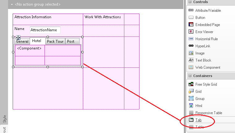
Drag the control from the toolbox to the abstract layout, as shown in the figure below:
How to configure the Tab Control style
Only for GeneXus 15, see : How to configure the Tab Control style on the WEB
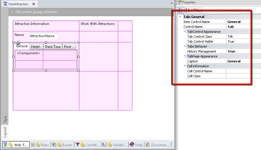
The Tab control is used in the Work With for Web pattern when it has been generated using the Abstract Layout. It is used specifically in View Objects, as shown below: