You can use Unanimo as a base for your own Design System. To do so, you can override the values of the Tokens defined in Unanimo Design System and the styles properties, as well as extend it by creating your own Tokens and Styles.
As described in How to use Unanimo, a Design System Object is created in your Knowledge Base and configured as the Default Style with the following content in the Style section:
styles NewKBName {

@import GeneXusUnanimo.UnanimoWeb;

}
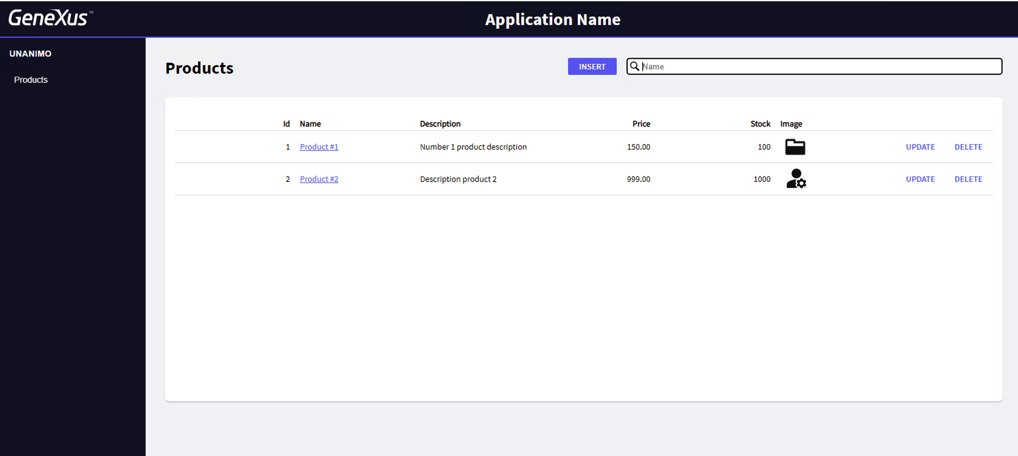
Then if you run your web application, by default looks as shown below:
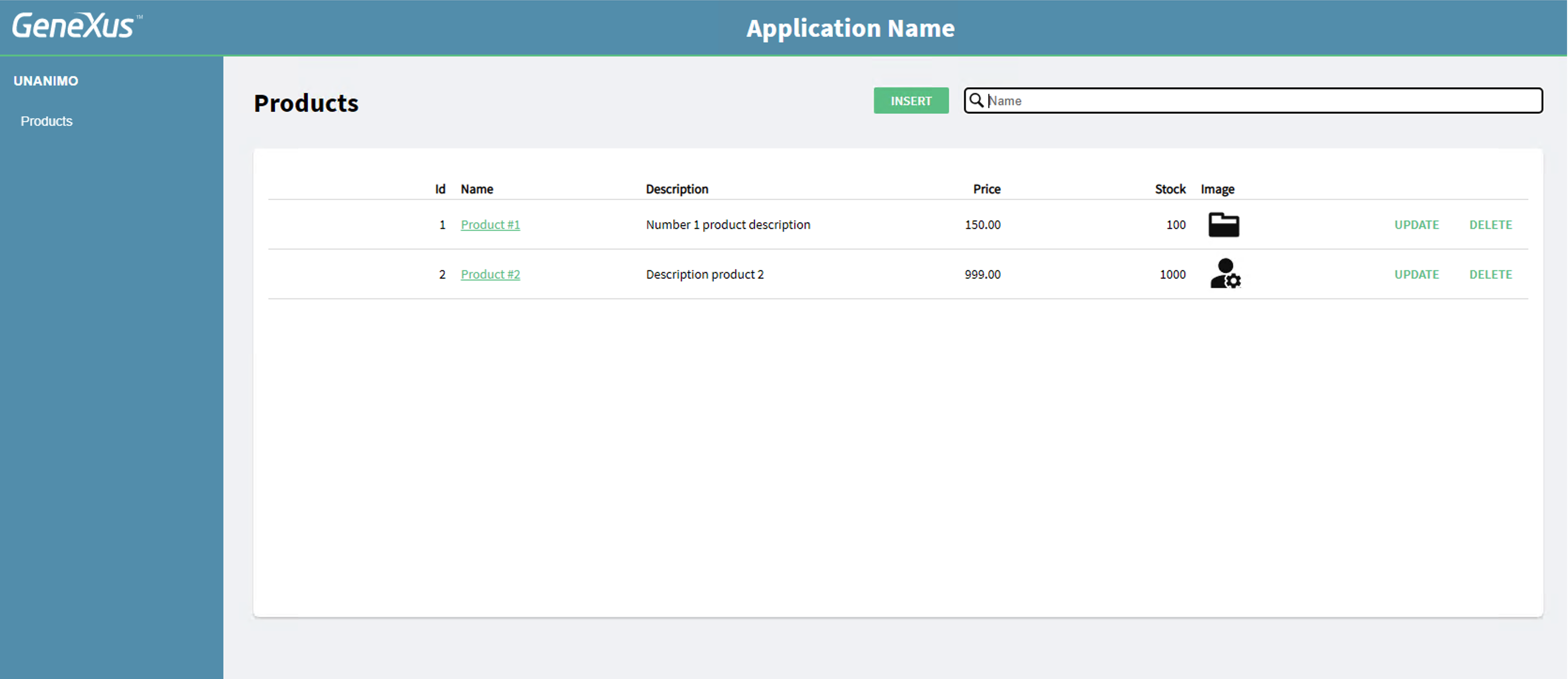
To change the primary and secondary colors as shown below (based on the same Tokens as Unanimo Design System), go to the Token section in the Design System configured as the default style and type the following:
tokens NewKB (color-scheme:[light]|dark)
{
    //COLORS
    @color-scheme = light {
        #colors
        {
            #region Unanimo_Colors
                primary: #6AC796;
                secondary: #639FBA;
            #endregion
        }
    }
}
Note: In this example, only the light color-scheme is customized.
In this way, you are overriding the definition of the Token value.
After saving the changes in the Design System, you can force the reload of the browser and the Work With will look as shown below:
The same applies to any Token that is defined in Unanimo.
See how to change some styles defined in Unanimo with your own customizations.
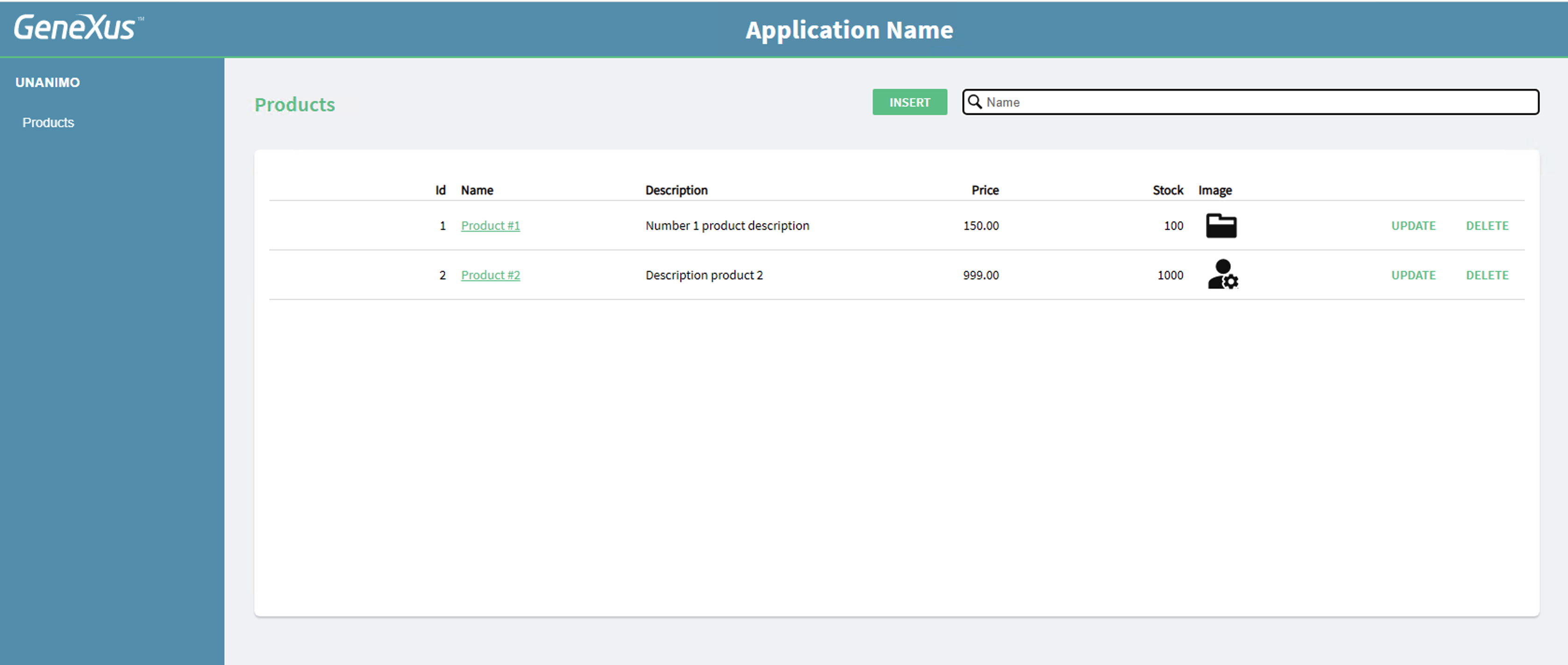
For example, to change the style for the title, you can add the definition for the class heading-01 in the Design System used for the KB as the default style and customize any property.
styles NewKBName {
@import GeneXusUnanimo.UnanimoWeb;
.heading-01 {
font-family: $fonts.primary-semibold;
font-size: $fontSizes.l;
color: $colors.primary;
}
}
After saving these changes and forcing the reload of the browser, you can see that the title “Products” looks smaller and with a different color.
You can customize any of the classes defined in Unanimo Design Systems in this way.
See Design System Object to learn more about how to work with Tokens and Styles; in particular, the Include style rule is very useful to customize classes.
Since GeneXus 18, you can customize the built-in UI that is distributed for GAM and GXflow. The same Design System that is customized for your application can be used to customize the built-in UIs.
See these documents to learn how to do it:
 UX Design. Introduction