When prototyping an application, one of the most time-consuming tasks is refining the Look&Feel (or User Interface, UI) and the User Experience (UX). To simplify this task, GeneXus has a feature that allows you to change the application state in real time from the IDE without saving the modified objects.
Native Mobile Applications support changes for the following objects, including properties and client-side events.
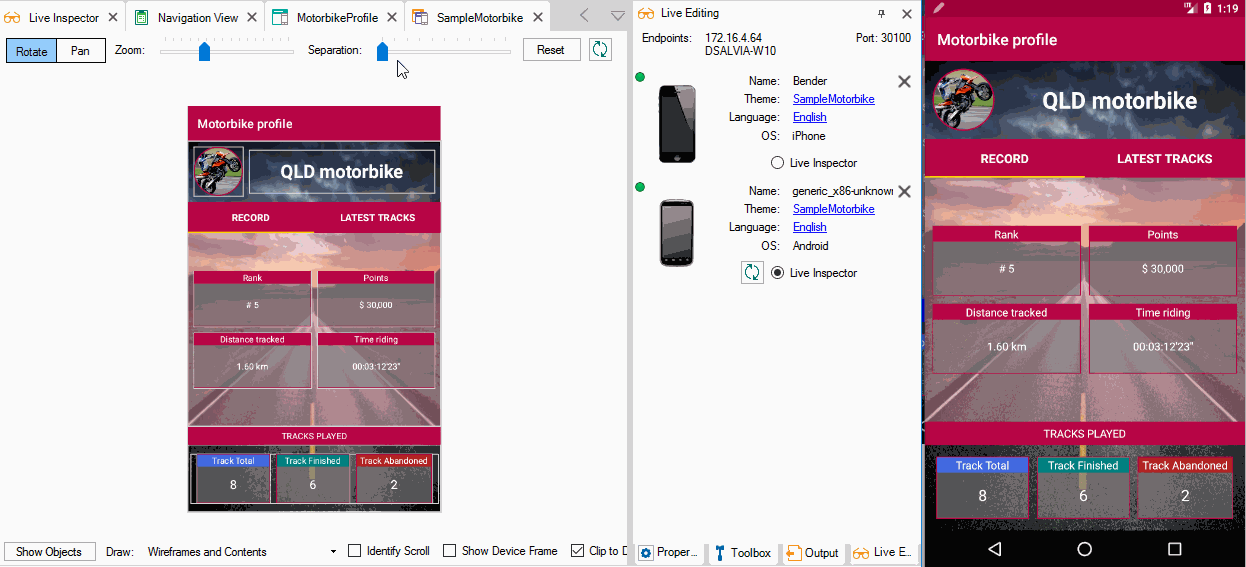
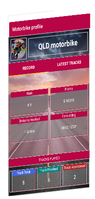
In this article, you can find the usage principles of this feature, the options provided, and how you can be more productive when designing a Native Mobile Application. But first, take a look at how it works. Note how changes from GeneXus (left side) are automatically displayed on the device (right side).
Live Editing is a revolutionary way to design applications: the moment you change the design, you can easily see its effect, giving your application development process a much more natural flow. It works as client-server architecture, where the client side will be a set of devices and the server side will be the GeneXus IDE. In these conditions, there must be a network connection between GeneXus and the devices.
To enable it, set Live Editing mode from the GeneXus Toolbar and press F5 to run your application.
Next, a Live Editing tab will be displayed showing every device (physical or simulator) attached to your application with other data described below.
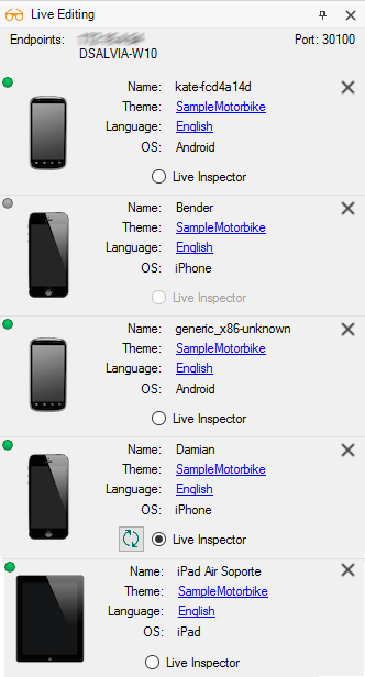
This information will be used for every device in order to be attached to GeneXus.
| Endpoints |
Endpoints list where GeneXus IDE resides (a set of IPs and hostnames). |
| Port |
Port number where Live Editing will serve. |
Every device detected by Live Editing will be displayed in a list. Those devices that are currently connected will appear with a green icon ( ), and those disconnected with a gray icon (
 ).
).
| Name |
Physical or simulator device name. |
| Theme |
Theme object used for this device. |
| Language |
Language object used for this device according to user preference language. |
| OS |
Operating system running on the device. In the image example, you have both Android and Apple. |
Also, every device will have a Live Inspector radio button for enabling real-time changes on that device when it is connected (refer to next section). There can be only one enabled device in this mode at a time, and there will be a refresh button ( ) in case you need to refresh Live Inspector content.
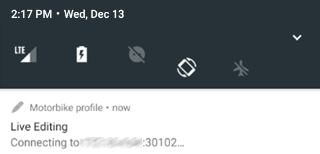
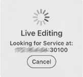
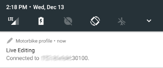
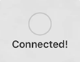
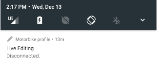
On the other hand, the device will inform you once it has been attached (or not) to GeneXus by displaying a message.
| Platform |
Android |
iOS |
| Connecting |
 |
 |
| Connected |
 |
 |
| Disconnected |
 |
 |
The Live Inspector will allow you to explore and map runtime objects with the design-time objects in a visual way to identify/locate objects and controls as well as change their appearance. Eventually, this inspection involves multiple objects (for example, with split or slide navigation style).
To activate the Live Inspector, the application must be in runtime mode with Live Editing enabled. Next, press the Live Editing tab's refresh button ().
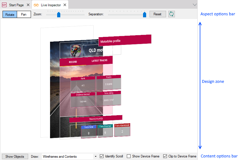
In the Live Inspector window, you can distinguish three zones.
A set of options that allow you to change how the application is shown in the design area.

| Rotate/Pan radio-button |
Set mouse scrolling behavior.
When Rotate is set, mouse gestures will rotate the layout displayed.
When Pan is set, mouse gestures will move the layout displayed.
Both can be used and switched by holding/releasing the CTRL key while moving the mouse. |
| Zoom slider |
Allows you to zoom in/out the layout displayed. |
| Separation slider |
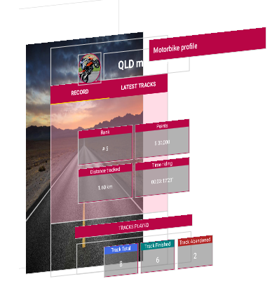
Allows you to separate layout layers.
| No separation |
Separated |
 |
 |
|
| Reset button |
Reset to default settings in Zoom terms. |
| Refresh button () |
Refresh the content of Live Inspector in relation to the device. |
A set of options that allow you to hide or display auxiliary content.

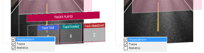
| Show/Hide Object button |
Show or hide objects/layers of the application when there is more than one (for example, Section of WorkWithDevices or Native Mobile Component control).
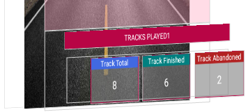
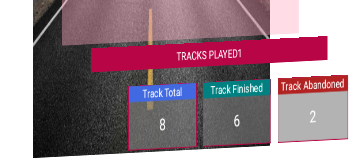
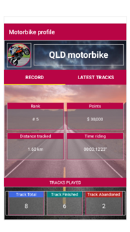
By clicking on this button, it will display a list of the objects embedded in that panel (all checked by default). If you clear the Tracks object, Live Inspector will not show it but will stay visible on the device.
 |
| Draw combo-box |
Indicate if Live Inspector will show only content, only wireframes, or both.
For example,
| Wireframes and Contents |
 |
| Wireframes |
 |
| Content |
 |
|
| Identify Scroll checkbox |
Display a scroll indicator. |
| Show Device Frame checkbox |
Simulate a device frame.
| Without frame |
With frame |
 |
 |
|
| Clip to Device Frame checkbox |
When it is checked, Live Inspector only displays the current content in the application. Still, if there is no visible content (for example, in an unselected tab) it can be displayed by clearing this option.
In the example, you have a tab control and the application is displaying only the first tab's content. By default, (option checked) Live Inspector will display only this content, but if you clear this option, you can display the hidden content on the second tab (in this case, a grid control).
 |
In this window section, you have the real-time preview of their application. In addition to being able to move/rotate the current layout or separate its layers, every content can be clicked on to display contextual information about it.
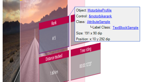
| Object |
Link to the current object. By clicking on it, this object will be opened. |
| Control |
Link to the selected control. When you click on it, it will display its respective properties that can be modified and viewed at runtime. |
| Class |
Link to the theme-class applied to the selected control. Applies the same behavior as Control link but for the theme-class properties. It may have other classes referenced by the main class (for example, TextBlocks for Label Class, or GridRows for Odd/even Row Class in Grid theme-class). |
| Size |
Size in dips of the selected control. |
| Position |
Position of the selected control, with <x,y> coordinates in dips. |
- Menu object is not supported.
- Server-side events (such as Start, Refresh, and Load) cannot be tested with Live Editing because they are executed on the server side (not on the device).
- Layout changes that require a server-side update can't be tested. For example, adding an attribute to a grid that changes the navigation; in that case, a message like this will appear in GeneXus' General output: error: Attribute <AttName> is not returned from the server (Panel 'ViewCountries', Detail).
- Live Editing only works with the compiled application. Knowledge Base Navigator (KBN) is not supported.
- Live Inspector doesn't work in Windows 7.
This feature is available as of GeneXus 15.
 GeneXus Meeting 26 - Live Editing: achieving a professional UX was never so easy