Indicates the semantic role of the control (what it is used for).
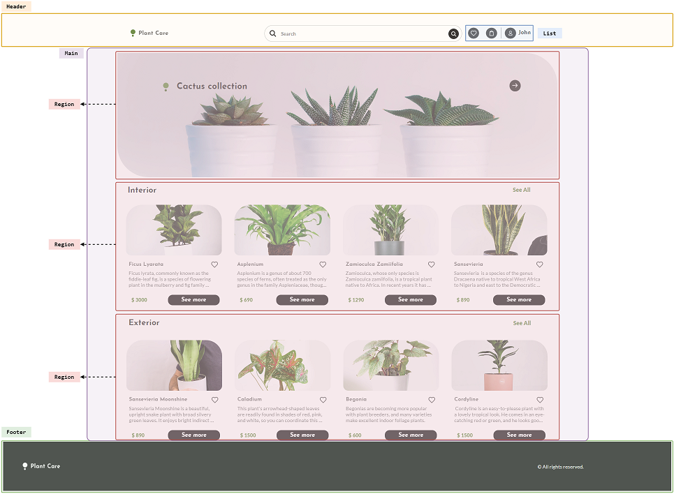
| Article | The control includes a self-contained section in an application, which is intended to be independently distributable or reusable. |
| Complementary | The control includes a complementary section related to the main content (control with Accessible Role = Main), but they can stand alone when separated. These sections are often presented as sidebar menus or callout boxes. |
| Footer | The control is used as a footer (containing identifying information such as copyright, navigation links and privacy statements of an application). |
| Header | The control is used as a header. |
| List | The control defines an unordered list of items. |
| Main | The control defines the main content of the application. |
| Region | The control defines a section or region of a web page. |
Generators: Angular
Controls: Canvas, Flex, Table
- There can only be one control with Accessible Role = Main on the entire page.
- When using Accessible Role = Region, you must set a value for the Accessible Name of the control. Otherwise, there will be a region in the application whose content you will not know.
- It is not always necessary for all containers to have a Role.
Note: This property does not impact in any way the performance or functionality of the controls in which it is used; it only provides semantics for them.
This property applies only at design time.
Sample PlantCare visually highlights the following Accessible Role of containers:
This property is available since GeneXus 18 Upgrade 5.
Accessible Name property