Applies a style to a focused row while navigating a Tabular Grid using the keyboard.
Generators: Angular
Level: Design System Style Class
Suppose your Knowledge Base is named "KBTest", and therefore a predefined Design System Object (DSO) is created with the same name.
In the Styles tab of your "KBTest" DSO, you define the following classes:
styles KBTest
{
    .Grid {
        gx-grid-row-class:GridRow;
        gx-grid-selected-row-class: GridRowSelected;
        gx-grid-hover-row-class: GridRowHover;
        gx-grid-focused-row-class: GridRowFocused;
    }
    .GridRow {
        padding: 5px;
        border: 1px solid transparent;
    }
    .GridRowSelected {
        background-color: #32CD32;
    }
    .GridRowHover {
        background-color: #30CCC1;
    }
    .GridRowFocused {
        border: 1px dotted red;
    }
}
Note the gx-grid-focused-row-class property configured inside the Grid class. It is set to the GridRowFocused class defined by you (which has its border property set to a specific style).
Note: Make sure that in KB Explorer > Customization > Platforms > Any Web Screen, the Style property is set to the KBTestDSO Design System Object.
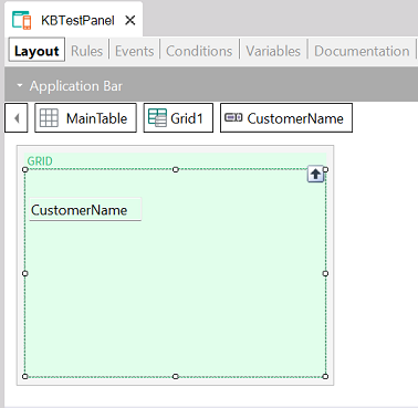
Create a Panel object (named KBTestPanel) with its Main program property set to True.
Next, drag a Tabular Grid to its Layout and include inside it, for example, the CustomerName attribute to query all the customer names.
When running the KBTestPanel, the behavior will be as follows:
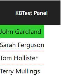
The currently selected row is highlighted in green. On the other hand, while you navigate through the rows using the keyboard, the focused row is underlined by a border style defined as 1px dotted red (because you gave it that style when setting the gx-grid-focused-row-class property for the Grid class of the DSO).
This property is available since GeneXus 18 Upgrade 9.
gx-grid-row-class property
gx-grid-selected-row-class property
gx-grid-hover-row-class property